
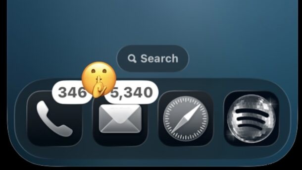
Since the launch of Liquid Glass, the Clear Icon feature has sparked debate among iPhone and iPad users. Some praise its aesthetic appeal, while others question its practicality.
While a few criticize Liquid Glass for its overall design, I’ve found Clear Icons to be one of my favorite aspects of the newer OS 26/27 interface.
I’m a strong advocate for Clear Icons on both iPhone and iPad because they provide a cleaner, more subtle look that enhances the overall user experience.
Beyond appearance, the primary benefit of Clear Icons is that they eliminate the intrusive neon hues that constantly compete for our attention, allowing us to focus on what truly matters.
Clear Icons = A Minimal‑Distraction Home Screen & No More Attention‑Grabbing Red Badges
Clear Icons not only strip away garish neon colors from app icons, but they also silence the bright red notification badges that appear when an app has unread alerts.
Red badges are notoriously hard to ignore, and there’s no universal way to disable them other than clearing the underlying notifications. Because they’re so attention‑seeking, they can become a source of frustration.
For example: the Phone app shows 240+ voicemails and 117 missed calls, many of which are spam; the Mail app displays 5,000 unread messages; Messages has dozens of unread chats; Instagram has over 200 unread messages; Gmail lists 17,000 unread emails; Telegram flags 800+ unread posts across a dozen groups; and the App Store indicates 80 apps that need updating.
In many cases, I’m not interested in acting on every alert, yet the bright red badges force me to look at them anyway. Clear Icons remove that visual noise without eliminating the notification itself.
With a clean Home Screen and subdued widgets, Clear Icons offer a welcome relief and make the iPhone and iPad far more pleasant to use.
My experience on macOS is slightly different. Because I rely on a hidden Dock and Spotlight for launching apps, I don’t encounter the same level of visual clutter. Still, if the Mac’s notification system ever becomes overwhelming, I’ll consider using Clear Icons to tone down the bright red indicators.
In short, Clear Icons are a personal favorite, especially on iPhone. Some users feel they reduce icon differentiation, but that hasn’t been an issue for me.
What are your thoughts on Clear Icons for iPhone, iPad, and Mac? Have you tried them, and if so, did you change your mind? Share your experience in the comments!