
Every digital ecosystem has its must‑use apps—those we rely on every day.
Yet most mobile apps fade quickly.
On average, 80‑90% of newly launched apps are abandoned after a single use, and about 77% of daily active users drop off within three days.
Churn is inevitable, but those figures can be dramatically reduced.
A powerful way to curb churn is to empower users with clear, actionable onboarding.
An astonishing 80% of users report deleting an app because they didn't know how to use it.
Imagine cutting churn by up to 80% simply by providing a comprehensive walkthrough.
A warm welcome can go a long way.
Below we explore five standout onboarding walkthroughs that inspire higher engagement and longer user lifespans.
What Defines an Exceptional Walkthrough?
A walkthrough is a deliberate onboarding experience that leaves no question unanswered, guiding new users through every feature.
Not all walkthroughs are created equal.
When poorly executed, a walkthrough can feel overbearing, disengaging users before they even finish the initial tour.
An exceptional walkthrough:
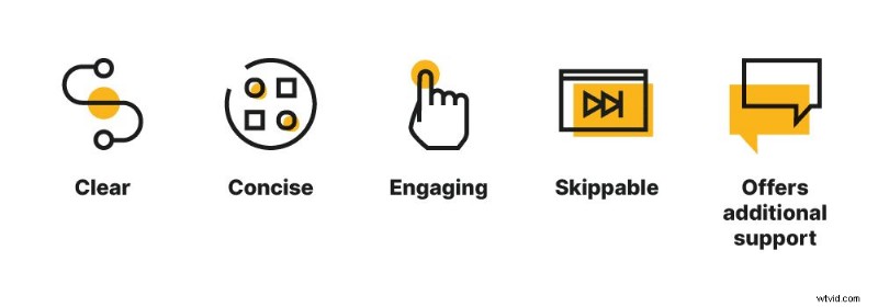
- Clear – precisely explain each feature.
- Concise – cover all bases without dragging.
- Engaging – let users interact instead of just watch.
- Skippable – accommodate fast learners.
- Supportive – offer live chat or help for those who need it.
5 Winning Walkthrough Examples
1. Grammarly
Grammarly, a leading writing assistant with 7 million daily active users, begins onboarding by asking new users to personalize their experience.
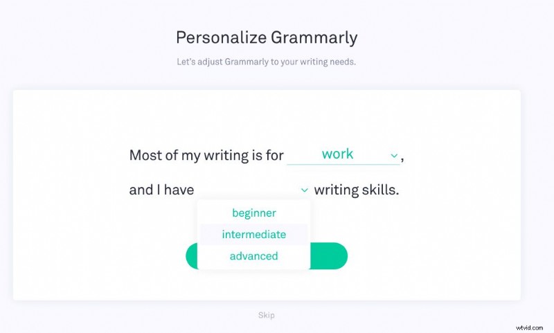
Offering a “Skip” button ensures users can opt out if they’re busy or confident.
Next, a quick video tour lets users navigate at their own pace, enhanced by engaging GIFs.
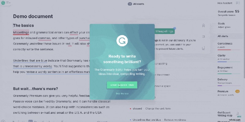
To prevent overwhelm, Grammarly highlights actions with pulsing blue hotspots and provides on‑hover explanations.
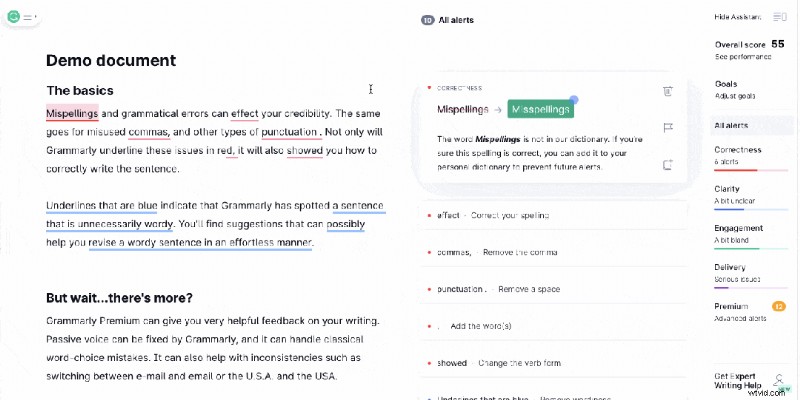
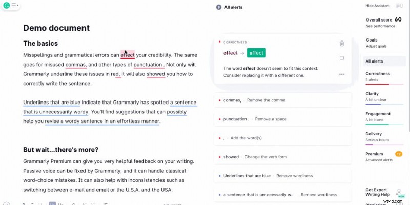
The final step invites users to interact with a demo document full of intentional mistakes, letting them see Grammarly’s corrections in real time.
2. MyFitnessPal
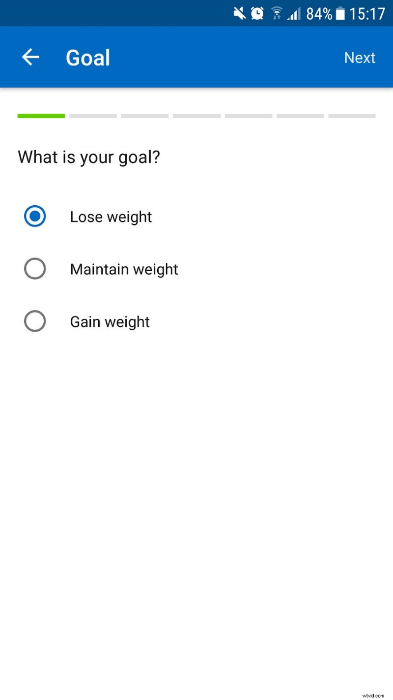
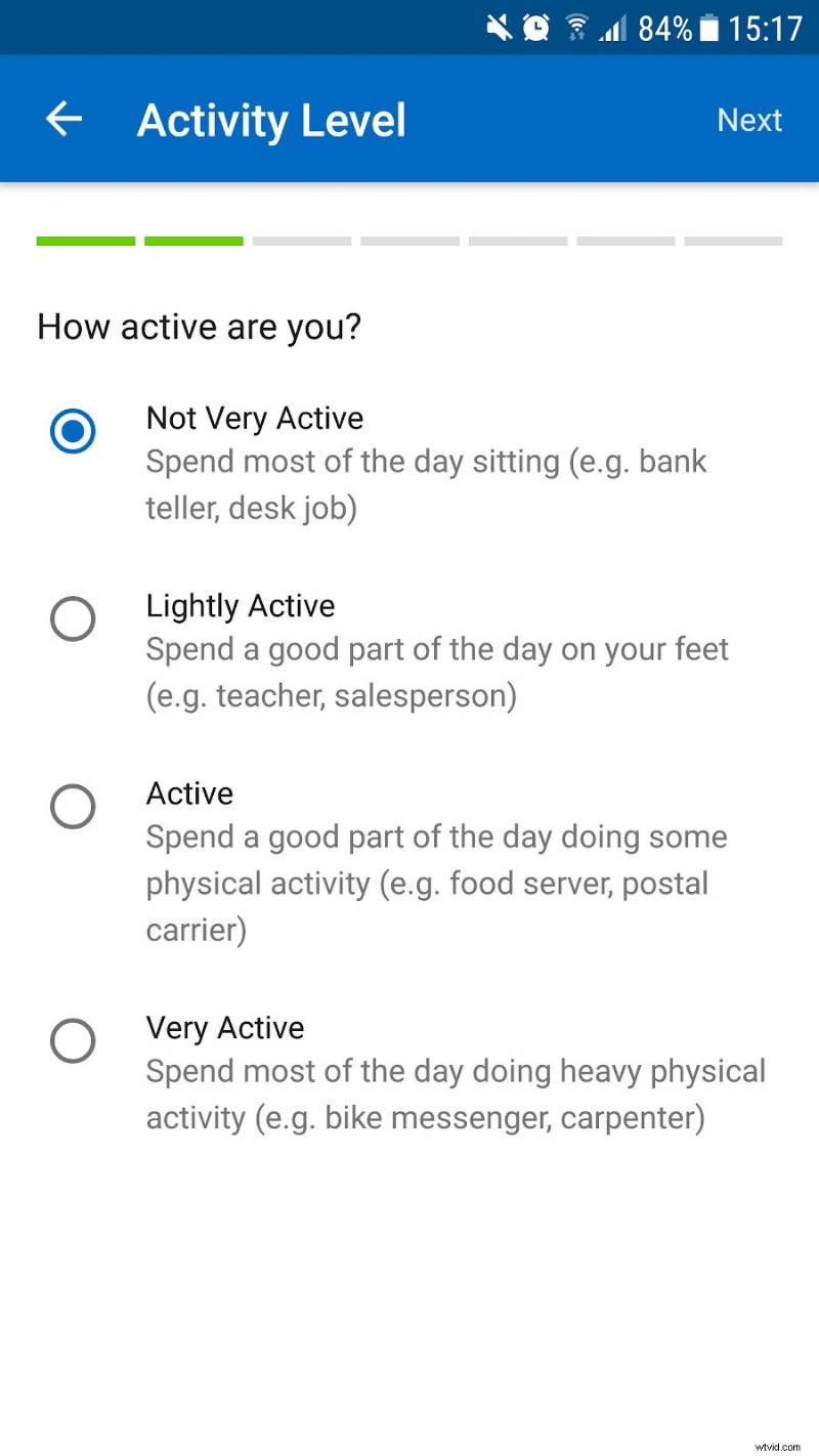
MyFitnessPal, a staple in the fitness app market, asks a few key questions before crafting a custom plan to help users reach their goals.
The global health and fitness industry generates $80 billion annually—making this a competitive space where a polished walkthrough can set you apart.
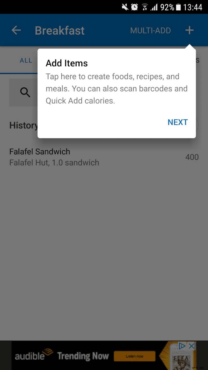
During onboarding, pop‑up boxes and directional arrows guide users through logging their first meal and exploring core features.
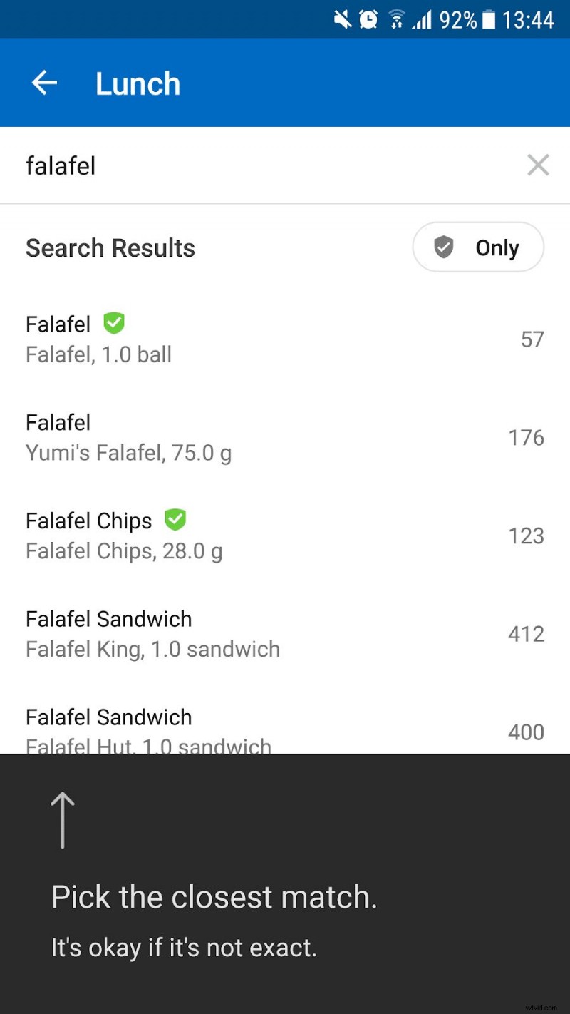
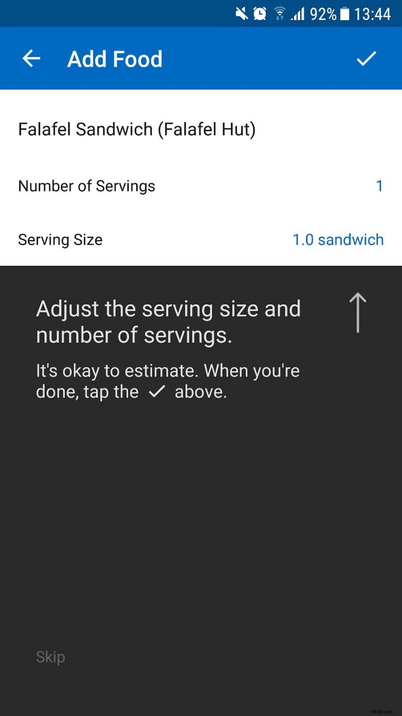
These contextual cues appear only when a feature is used for the first time, keeping the experience concise yet informative.
3. Diner Dash Adventures
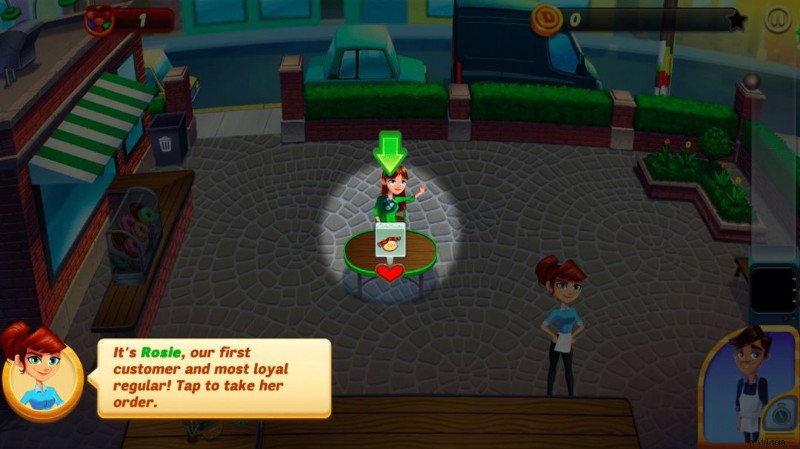
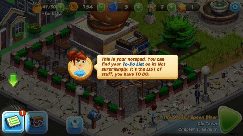
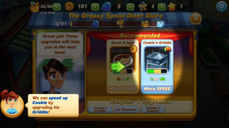
Diner Dash Adventures, a top‑rated mobile game, blends text pop‑ups with highlighted hotspots to walk users through a simplified level.
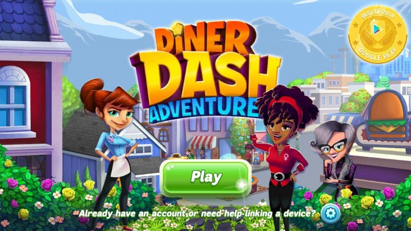
The app’s App Store rating of 4.4/5 from over 70 000 reviews and its “Best of 2019” award underscore its success.
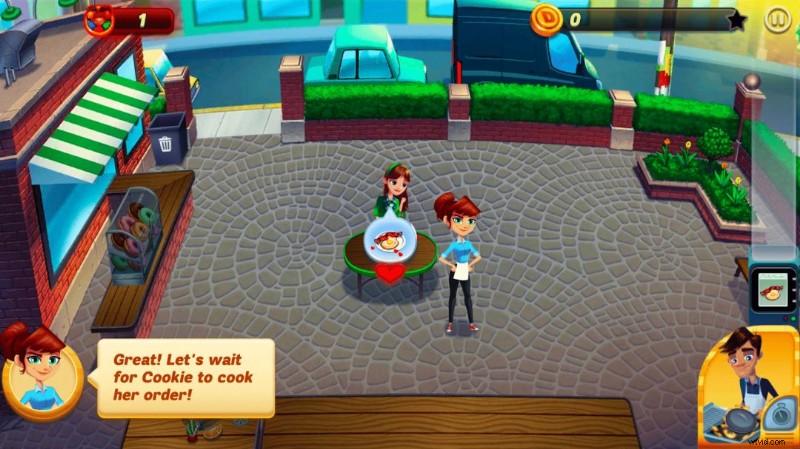
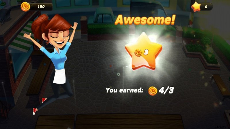
After completing the level, a celebratory screen encourages continued play.
As users progress, the onboarding lightens, only resurfacing for genuinely new features.
4. Honey
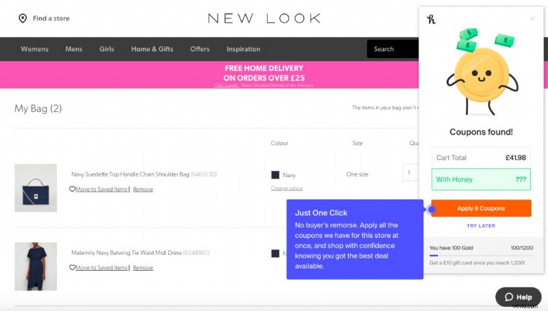
Honey, a Chrome extension that auto‑applies coupons, offers a quick GIF demo followed by a click‑through that shows users exactly how to save during checkout.
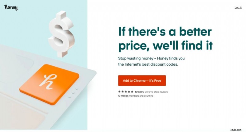
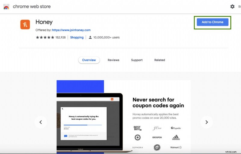
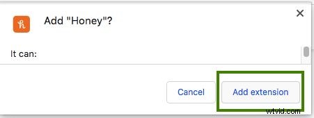
The demo includes a step‑by‑step walk‑through of the extension’s use on an eCommerce checkout page.
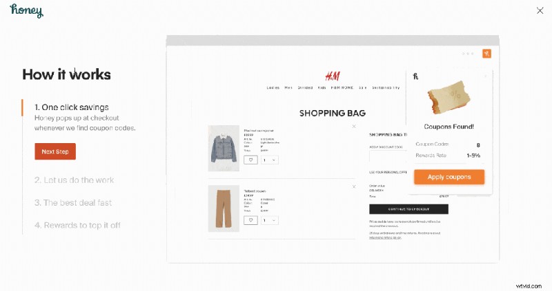
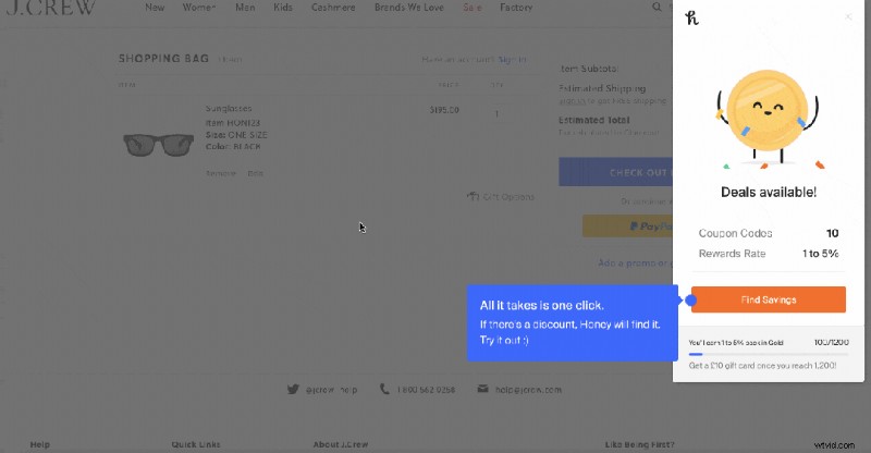
When a new user visits a checkout page for the first time, a concise pop‑up explains how to apply coupons, with an option to “Try Later” if they’re not ready.
5. Slack
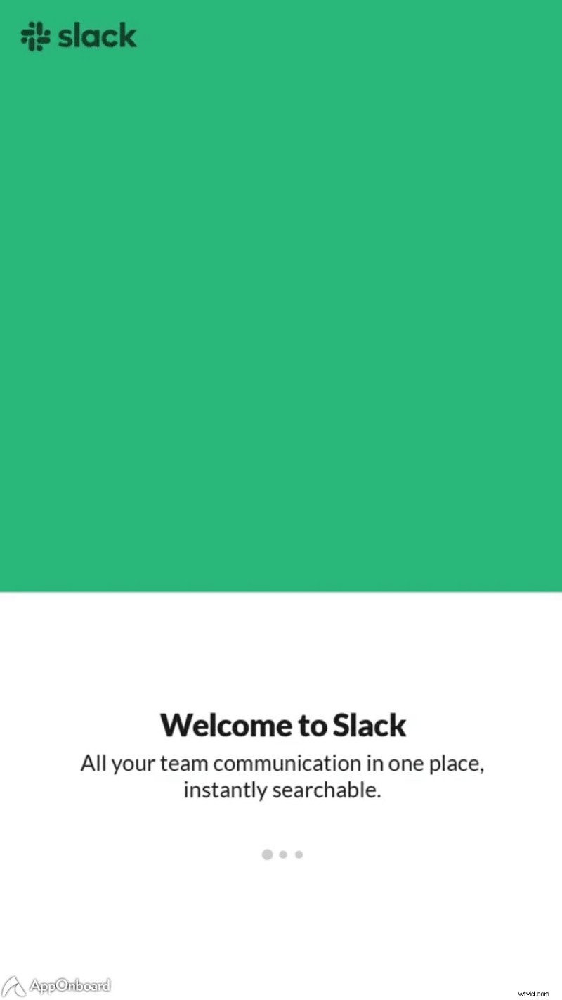
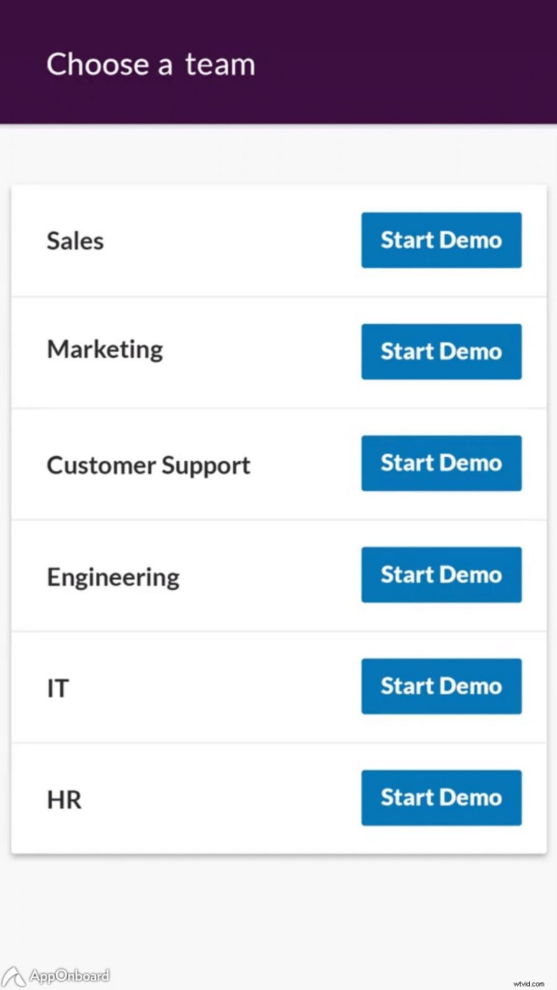
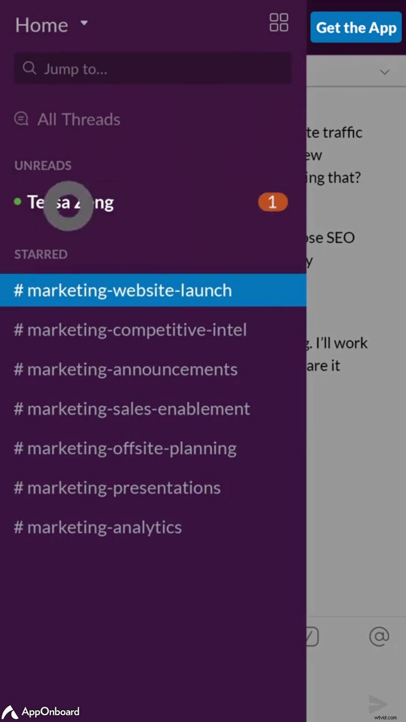
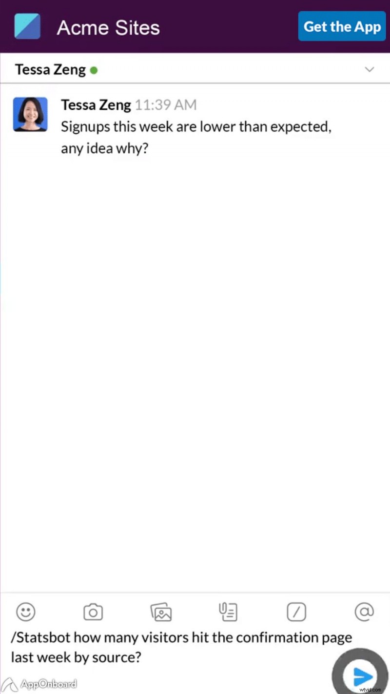
Slack’s mobile onboarding starts with succinct screens that highlight key features, then lets users pick a team and watch an interactive demo.
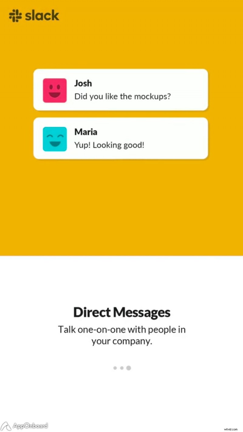
Hotspots guide users through the demo, reinforcing functionality before they start using the app independently.
Final Thoughts
A thoughtfully crafted walkthrough sets the tone for lasting engagement and helps you build a loyal user base.
Want to learn how to design onboarding that converts? click here to explore our onboarding video series.