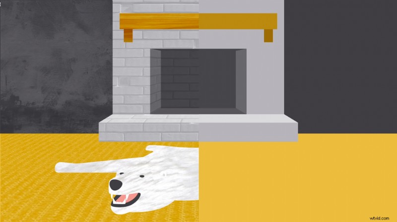
Don’t let your animation suffer by being poorly designed. Here are three videos to help elevate your next After Effects composition.
For many motion designers, the graphic design portion of a project can feel like an Achilles heel. Over the years, I’ve discovered that the best motion graphics started from a strong graphic design concept at the beginning. A concept that can translate to an animated deliverable and follow the fundamental elements of great design.
There’s no better way to up the value of your work than a solid color palette, good line work, exceptional layout, and typography—the core of graphic design.
These videos come from the Goodwill Community Foundation through their GCFLearner.org project, which has a wonderful mission to help educate people on various topics by taking deep-dives into those topics. They’re thoughtful and well-produced, a lot of thought and care goes into crafting them, and they present these concepts in a clear, concise way with wonderful visual examples.
Let’s dive in!
1. Fundamentals
The most cohesive feeling designs all have line, shape, form, texture, and balance elements to them. Executing these elements properly is what makes a design feel right. This video explores these fundamental elements.
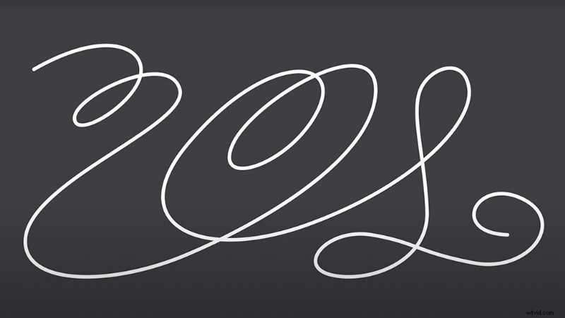
The way you animate line work can guide the viewer’s eye to specific content and create a guide for your audience to a focal point on the screen. Lines can be animated to form simple drawings. Utilizing them in your design is vital.
Lines can change weight, color, texture, and size—giving them a tremendous amount of animatable properties.
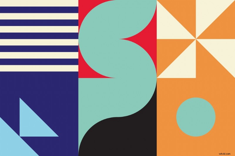
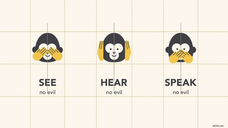
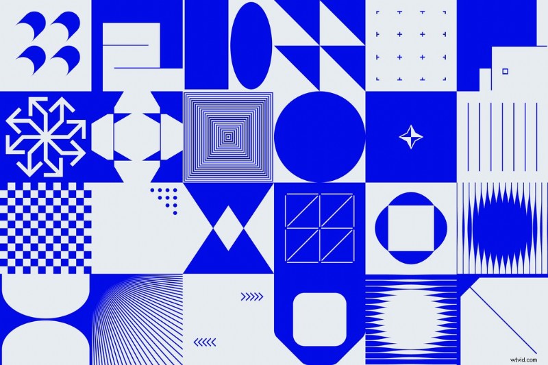
Shapes (often in the form of vectors in the motion design world) are the building blocks of graphic design. They make images recognizable and provide visual weight to a composition. Shapes are certainly one of the building blocks of visual communication.
Our minds understand many things like signs, app icons, and even fine art because of shapes. Play with shapes to help you organize and separate content, or even simple illustrations to add another layer to your animation.
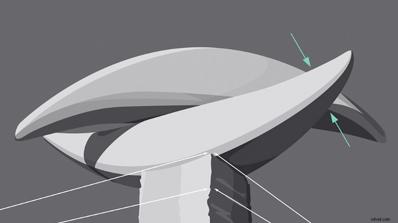
When a shape moves from the 2D space to the 3D space, the concept is referred to in graphic design as form. Forms use light, shadow, and perspective. You can apply form to almost any element in your design.
In both graphic and motion design, form makes it possible for realism. Even if your design is meant to be flat, there are subtle form elements you can add to make your design pop a bit more.
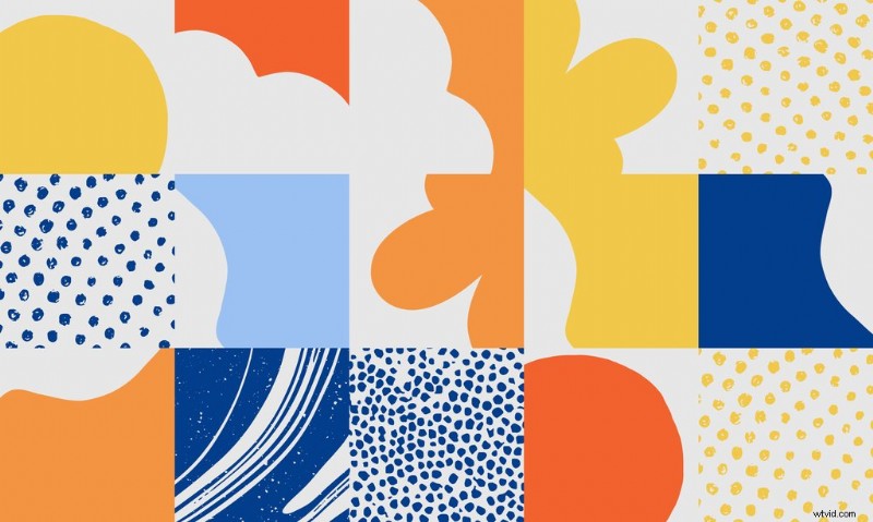
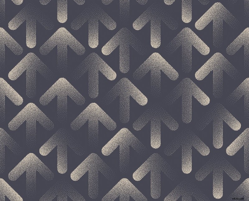
Texture is the tactile or physical quality of a surface. In design, it can be real or implied by shapes and line work. Texture can make your design feel more tangible to a viewer in the design world.
Textures also make excellent background elements and add another layer of depth to your motion design (as well as another element to animate to provide visual interest.)
Balance is the distribution of visual weight, and can be affected by color, size, number, and negative space. Good balance in a composition can take many forms. It can be symmetrical or not. It’s one of the harder graphic design elements to master because it requires intuition.
As you’re pulling inspiration for your designs and crafting your mood board—pay close attention to the visual balance of the pieces you choose. In no time, it’ll be instinctual for you, as well.
The rule-of-thirds can also be a helpful topic to explore when trying to master visual balance.
2. Color
Color can evoke emotion and help you visually communicate concepts without using any text. Color theory has been studied for centuries. Looking at color from a deliberate perspective can change everything about your design.
The Color Wheel is a combination of primary and secondary colors. Hue, saturation, and value can all be modified to adjust your color.
Hue is your color. Saturation is the intensity of that color. And value describes the darkness or lightness of the color.
There are several formulas to make visually appealing color palettes.
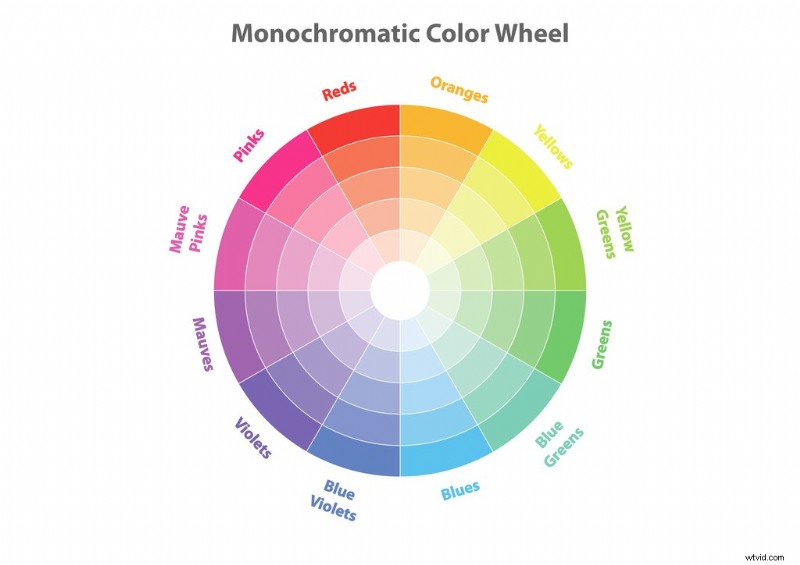
Monochromatic Color Formula
Monochromatic color schemes are the easiest to create. They focus on one color on the color wheel and then modify the lightness and darkness values.
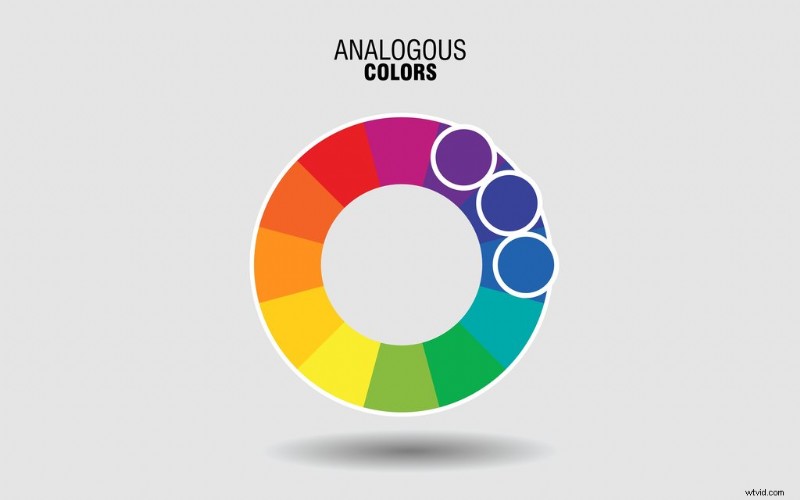
Analogous Color Formula
Analogous color schemes are made using colors next to each other on the color wheel.
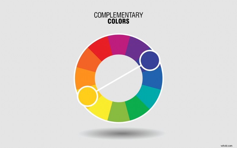
Complimentary Color Formula
Complimentary color palettes are formed by using colors that are on the opposite side of the color wheel from each other. To expand your color set outside of two colors, you can modify the saturation and value of the colors.
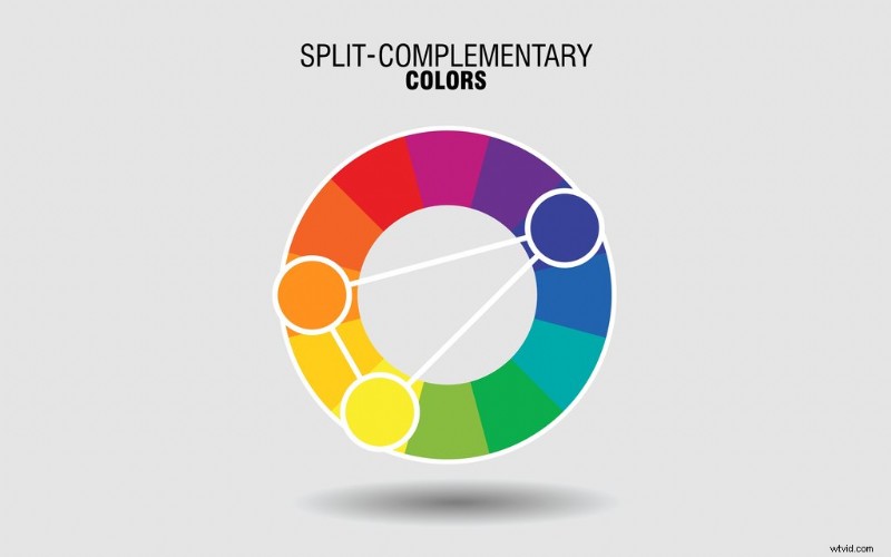
Split Complementary Color Formula
Split complementary schemes are formed by using the colors neighboring the colors’ complement. Modifying the saturation and lightness can offer exciting options within a split complementary color scheme.
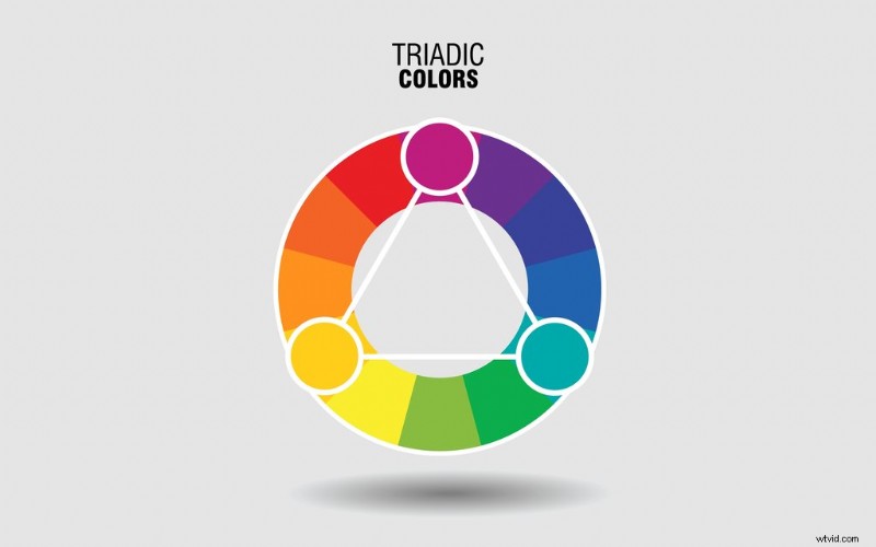
Triadic Color Formula
Triadic color palettes use three equally spaced colors on the color wheel. They form a perfect equilateral triangle.
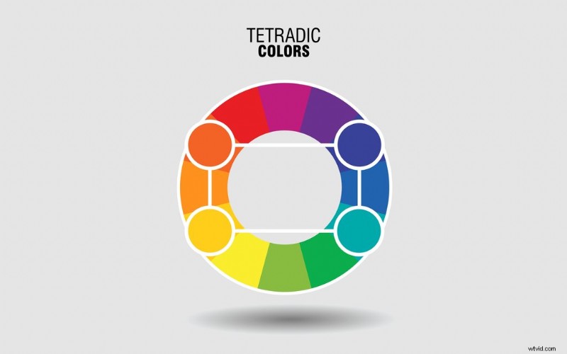
Tetradic Color Formlua
Triadic color palettes are created using two complementary color pairs, and they form a perfect rectangle on the color wheel.
It suggested choosing one color to dominate a tetradic color combo and using the rest as accents.
Combining Colors
Colors should not be too intense to the eye. It can cause a shaking effect (harnessed for good, not evil) which, for the sake of basic color theory, we’re going to recommend you avoid.
You can fix that issue by modifying your colors’ dark and lightness (value). Readability is also key. Sometimes, it’s best for your viewer and/or audience to use no color and display certain elements in gray, black, or white.
Lastly, it’s important not to forget a color’s ability to evoke an emotion. Countless studies have been done on the psychological impacts of colors and how they vary by culture and geographical location.
3. Layout and Composition (Think Like a Designer)
Layout and composition give structure to your design and make it easier for your viewers to navigate the information you’re sending them with your animation.
A poorly composed layout looks messy and chaotic. So, if you aren’t going for that, check out these fundamental design layout and composition considerations.
Proximity
Proximity is how items or groups are items are spaced in relation to each other. A general rule of thumb is that blocks of information related to each other, such as text, illustrations, or icons, should be grouped. Furthermore, those groups should be separated to show their distinct information grouping in an easily identifiable way.


White Space
Another term for white space is negative space. It refers to the spaces between your lines, the outer margin of your composition, or between blocks of icons or information.
If your composition feels cluttered, consider white space.
Alignment
There’s no one way to approach proper alignment, and the key is consistency. Once you decide how you align your composition pieces concerning each other, make sure you keep the alignment throughout the rest of your design choices.
Contrast
Contrast is a visual juxtaposition between items. It’s used to call attention to a specific part of the composition. There are many ways to create contrast.
You can adjust the visual weight of objects by contrasting their sizes. You can pair smooth textures with rough textures.
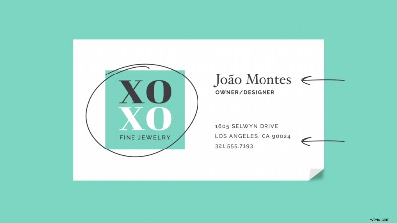
Text is also a powerful way to show contrast. You can mix serif and san serif fonts, or a hand-drawn style with a really clean and modern font.
Contrast is key to building a hierarchy of information easy for your viewer to comprehend.

Repetition
Repetition is the concept that every project should have a defined look and feel by repeating certain elements—color palettes, text formatting, uniform line work, etc. Repetition makes your audience feel comfortable and keeps them in the story.
When the entire animation has a cohesive color scheme or repeats particular icon animations, it’s easier for your viewer to focus on the material without distraction. This is especially important in the world of motion design.
There’s a hidden layer to the repetition of motion work—you should also make sure your animation speeds, velocities, and styles are consistent and only jarring if they need to be for the story you’re telling.
There you have it, the building blocks of graphic design. It takes practice to become skilled and comfortable, but keeping these design theories, concepts, and rules in mind as you go about crafting your composition will take your motion graphics to a higher level.
Cover image via MicroOne.