In today’s tutorial, we’ll run through some helpful tips you can use when color grading video footage to promote the sense of summer.
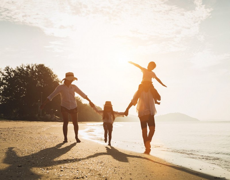
If your composition is filled with a family at the beach having fun in the sea or two young children having ice cream at the fairgrounds under the blistering sun, it might be evident that it’s summertime.
However, there are occasions when it feels as if your clip isn’t exactly promoting what summer feels like. Perhaps that’s due to a camera setting, or the colors at the location. Or, maybe you’ve shot out of season and you need to promote the idea of summer.
In the tutorial below, I’m going to run through a few different tips that you can employ while color grading to promote that summer vibe.
It should be noted that unlike our previous color grading tutorials, this isn’t a typical walk-through. Instead, it’s more of a breakdown of individual tips and why you would use them.
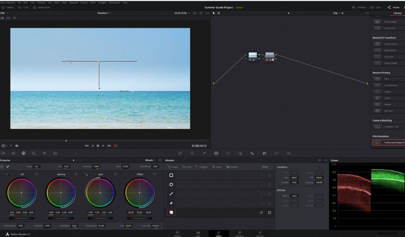
Therefore, even though I’m working in Resolve, you can take this information and apply it to your layer, node, effects panel, or whatever it may be in your software.
1. Let Highlights Be Bright
As consumer cameras are increasingly housing better dynamic range and RAW image processing, filmmakers can now rescue highlights and shadows in a way that wasn’t possible several years ago. However, just because you can recover these details doesn’t mean you should.
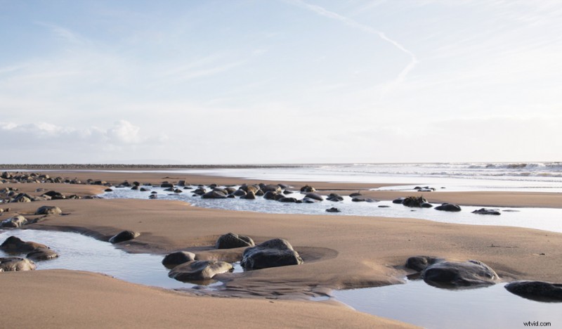
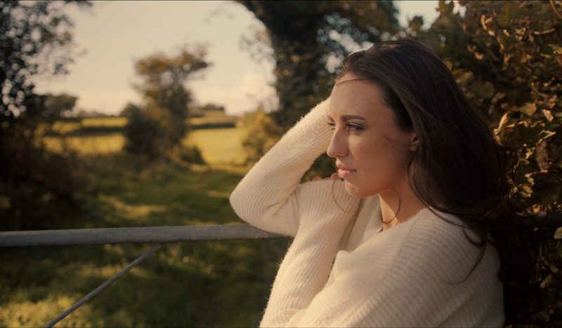
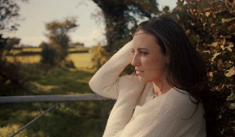
Let’s look at this example. This image was filmed in February. It’s a beautiful, scenic location, and I’ve already set the grade up for where I want it to be.
However, even though there are no winter elements within the frame, the image doesn’t fully project the summer atmosphere. Why is this?
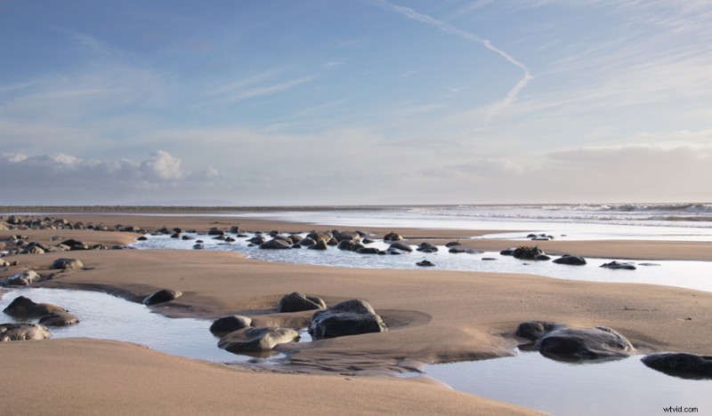
During the summer, the sun is high in the sky for a prolonged period throughout the day. In the winter, not so much. There are only those few hours at midday when the sun is at its brightest and highest.
Therefore, you typically get more dynamic landscapes when photographing during the winter, as the sun ventures towards the horizon quicker than it does in the summer.
With a lengthy amount of time in the sky and the earth tilted closer to the sun, it’s brighter in the summer. As a result, in media filmed at midday into the afternoon during the summer months, we’ll often see a bright sky area when facing the sun. This subconsciously tells us it’s likely to be summer.
Therefore, instead of rescuing the highlights, I recommend safely bringing the highlight level up to a point where this area is somewhat hot. I say somewhat because we don’t want to clip these values.
But, having this area at bright values reinforces the imagery of sunny, summery days at the beach. So, be sure to check the scopes.
2. Make Sure Your Image Has a Warm Touch
A significant component of summer is the warmth of the season. And, if you have a lot of blue sky and cool-colored elements within your composition, it may inherently look a lot colder than it actually was at the location.
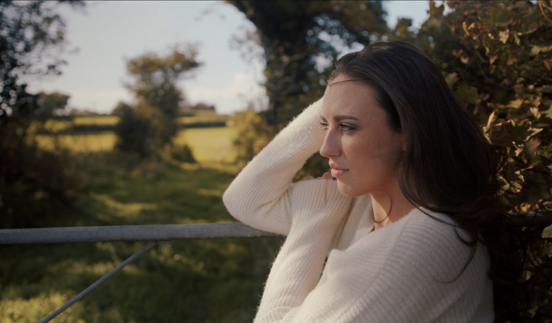
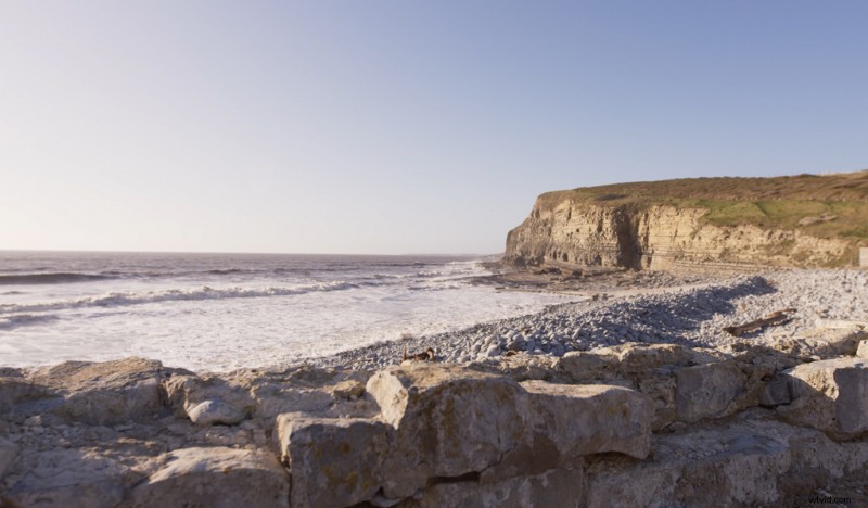
This image was shot during the summer, but I feel like it’s slightly too cold.
You may be initially drawn to adjusting the color temperature tool and warming up the shot. However, you have to remember this tool is primarily used to set the correct white balance.
While it’ll add a warm or cold cast to your image, it doesn’t necessarily look right when used in abundance because we’re adding warmth into all regions of the image.
Therefore, I recommend using the color wheels or the curves to implement warm tones into the highlight and upper mid-tones, not the temperature tool.
I prefer using the curves for this kind of adjustment. First, I’ll bring down the blue highlights to reduce any cool elements in the highlights.
Additionally, I’ll slightly bring down the green highlights to add further emphasis to the red channel. And the red curve will stay put at the top of the curve editor.
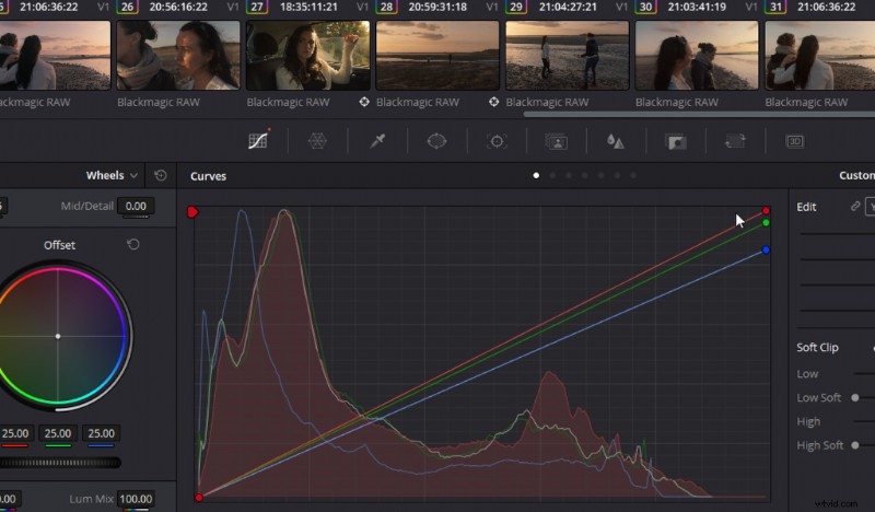
In doing this, we’ve given a pleasant warmth to the brighter elements across the image while leaving the tonal values of the mid-tones and shadows relatively neutral.
3. Genre Conventions of Summer Images
Let’s talk about genre conventions. These are components of a film used so frequently within that genre that the used element is widely associated with that genre only. This allows filmmakers to introduce the theme effortlessly.
If I were to ask you to picture a rolling tumbleweed, we’d often associate that imagery with a western. Or, if I tell you the hero of the film has an older mentor, that will spark the imagery of fantasy films.
You’ll also find these conventions woven into music and even color grading.
However, regarding color grading, it’s become somewhat of a detrimental convention. Western media often portrays the Middle East and Central or South America with a distasteful yellow cast to the image, when these locations don’t look like that in reality.
We also see it in places like London, as the city usually has a cold, steely look to it—again, it doesn’t look like that. But, that’s what we’ve come to associate with these locations.
The same can be said for hot summer locations. There’s a specific grading element that’s sometimes used to reinforce the summer scene—a digital graduated filter. They’re overly used in many American shows situated on the coast.
CSI: Miami is a prime example.
To do this, you want to take your gradient tool, position it half within the sky (not the entire sky), and then bring down the highlights to create the deep, rich blue associated with those endless, hot, cloudless days.
You’re also going to want to bump up the saturation of the gradient. If you’re going for a stylized look, it’s better to keep the gradient line quite hard.
I will say, this isn’t something I typically employ, but it’s something that countless commercials selling summer goods use.
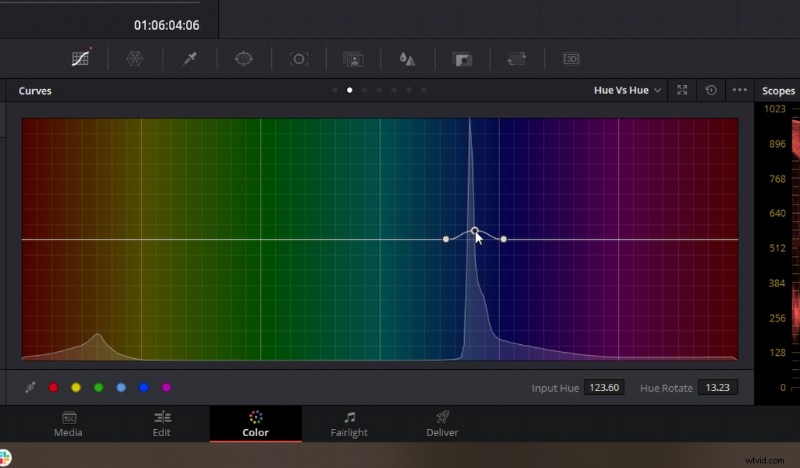
4. A Teal Sky Always Reads Summer
Finally, we’re going to talk about the hue of the sky. Again, falling on the idea of genre conventions, in a lot of music videos and kids’ shows set at the beach on a summer’s day, there’s a slight twinge of teal to the sky.
This will often correlate to the teal and orange color correction that comes from sandy beaches and warm surroundings. That teal is a complimentary color to the warmer areas.
To do this, you need to use your hue vs. hue tool. Select the blue sky, and slightly change the hue until it falls within the teal area. Then, slightly boost the saturation.
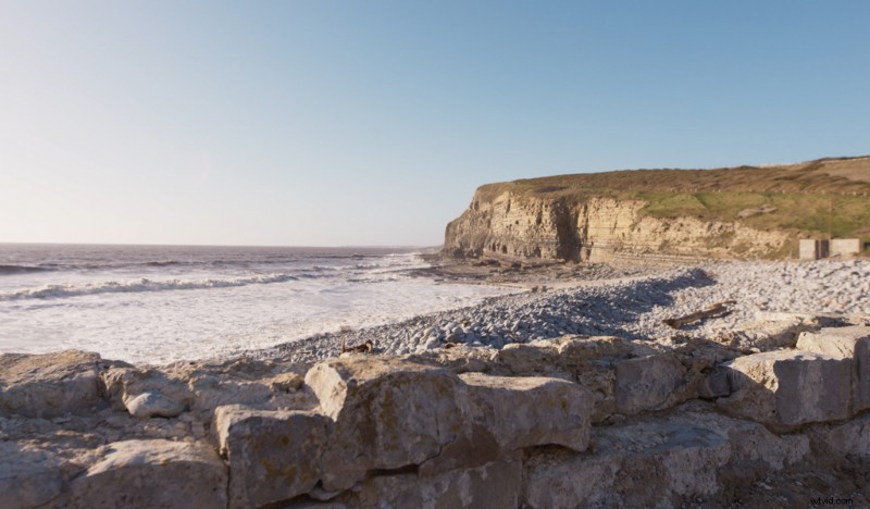
Again, this is more of a stylized element than the first two practical grade adjustments, but one that you can easily use if you’re filming later into the year when it’s not so summery.
When you use these adjustments together, you can emulate a luscious, warm summer’s day.
Cover image via Dmitry Molchanov.