
Last updated on 16th May 2024
According to YouTube, 90% of the best‑performing videos on the platform feature custom thumbnails.
Research from the University of Oklahoma shows that viewers spend an average of only 1.5 seconds scanning a thumbnail before deciding whether to click.
Adding a brief, eye‑catching line of text can give scrolling viewers a clear reason to stop scrolling and start clicking.
Choosing a font that is legible, distinctive, and visually appealing is essential to make your thumbnail stand out.
Below is a hand‑picked list of the seven best fonts for YouTube thumbnails in 2024, complete with practical tips to help you leverage each one.
What are the best YouTube thumbnail fonts?
1. Impact
2. Bebas
3. Badaboom BB
4. Budmo
5. Bernhard Modern std
6. River Drive
7. DK Mandarin Whispers
1. Impact
Impact is a classic, bold typeface that commands attention without overwhelming the image.
Its thick strokes work well across a wide range of backgrounds, and it remains readable even at small sizes.
Insight
Influencer PewDiePie frequently uses Impact, tweaking size, color and placement to match his dynamic style.

Expert Tip
Apply a subtle stroke or drop shadow to the text to improve contrast against busy backgrounds. Experiment with color contrasts to ensure the copy remains legible and eye‑catching.
2. Bebas
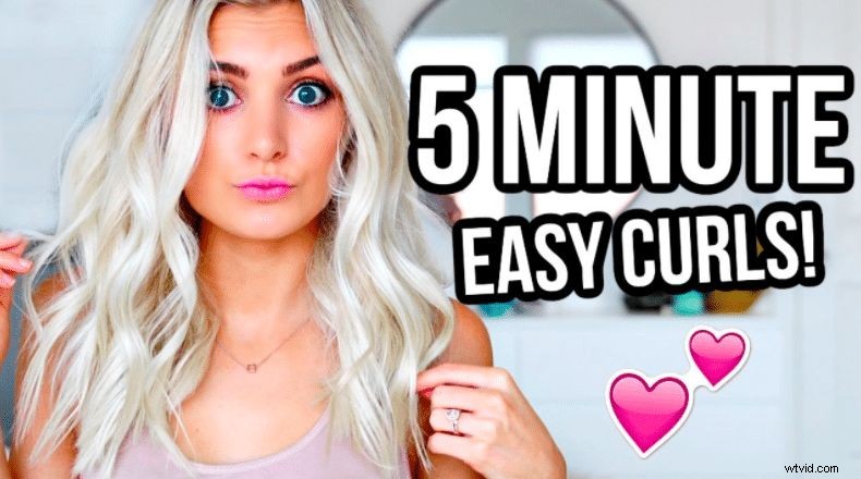
Bebas is a modern, clean sans‑serif that is especially popular in tutorial thumbnails, from makeup to cooking.
Its simplicity makes it an excellent choice for both thumbnails and channel banners.
Insight
Bebas pairs beautifully with a white typeface and a black outline, creating a striking visual hierarchy that instantly draws the eye.
(Aspyn Ovard)
3. Badaboom BB
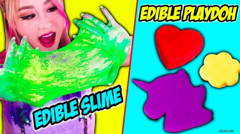
Badaboom BB brings a playful, comic‑style flair to your thumbnail. While it may not be as versatile, it delivers a memorable visual punch.
Expert Tip
This whimsical font works best for content aimed at younger audiences. It conveys a light‑hearted tone but can feel out of place in more serious or technical videos.
(Wengie)
4. Budmo
Budmo offers a neon‑lit aesthetic that feels fresh and contemporary, especially when paired with subtle color palettes.
Expert Tip
Include a captivating snippet or key phrase that highlights the most compelling aspect of your video—something that differs from the title to spark curiosity.

(Liza Koshy)
Did You Know? Budmo is Ukrainian for “cheers” and is pronounced “Budj‑mah.”
5. Bernhard Modern std
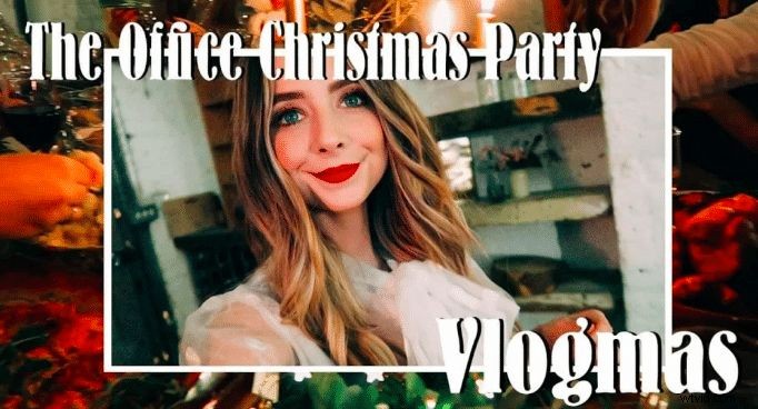
Bernhard Modern std blends elegant serif strokes with a modern flair, offering a sophisticated look suitable for professional content.
Insight
Because it’s the first serif on our list, it works seamlessly with frames and varied background imagery, providing a polished and mature aesthetic.
6. River Drive
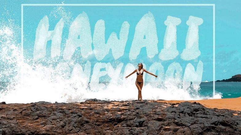
River Drive has a heavy, chalk‑like weight that can appear as if it’s part of the image when paired with the right background.
Insight
This stylised typeface offers high impact but can sacrifice readability. Choose it if you prioritize visual drama; otherwise, stick to simpler fonts for clarity.
(Gabriel Conte)
7. DK Mandarin Whispers
DK Mandarin Whispers is versatile in both upper‑ and lower‑case, and its strong outline effect enhances legibility.
Expert Tip
Keep your thumbnail copy to 4–8 words to balance impact and readability, especially on mobile devices.

(Sierra Vlogs)
Tips & Tricks for Thumbnail Fonts
1. Add Colour
Contrast is king. Use colors that stand out against the background to make text pop. Warm hues like red or yellow signal excitement, while cool tones like blue convey calm.
Choose a cohesive palette that supports the overall design rather than clashes, ensuring readability across all devices.
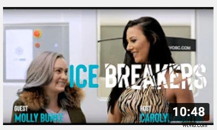
(Carolyn Breaks The Ice)
2. Be Consistent
Consistency builds brand recognition. Using the same font across thumbnails signals professionalism and reliability, fostering viewer trust and higher engagement.
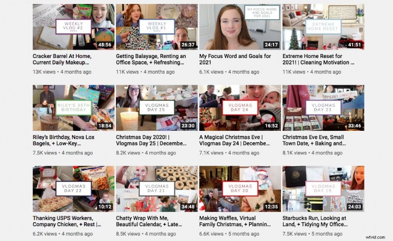
(Blair Lamb)
3. Use Uppercase & Lowercase
Mixing case can highlight key words and add visual interest. For example, uppercase product names can draw the eye while surrounding text remains in lowercase.

(Niomi Smart)
4. Mix It Up!
Pair a bold headline font with a subtler supporting typeface to create a clear hierarchy. Avoid clutter by limiting the number of fonts and colors used.

(Marcus Butler)
5. Background
A colored ribbon or gradient can accentuate the text, but it must not overpower it. Use contrasting hues or subtle textures to keep the focus on the copy.

(Blair Lamb)
Final Thoughts
Choosing the right font for your thumbnails can dramatically improve your click‑through rates and help your channel rise above the noise. Experiment with these seven fonts, and pair them with strong imagery and concise copy to create thumbnails that command attention.
With a wealth of free fonts available online, there’s no excuse not to find the perfect style that reflects your brand’s personality.
Remember, a well‑crafted thumbnail is more than just a picture—it’s your first handshake with potential viewers.
By selecting a font that embodies your channel’s tone, you can supercharge your video performance and accelerate growth.

Jemma is Senior Copywriter for Wyzowl. She writes client scripts and longer‑form articles about video marketing. She has a wealth of knowledge on all things video.