Reading Time: 5 minutes
Published: November 20, 2025 | Last Updated: January 19, 2026

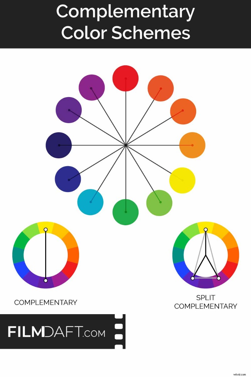
What is a complementary color scheme? It pairs two hues that lie opposite each other on the color wheel, producing a strong contrast that balances visual energy.
How It Works in Film
Complementary schemes rely on opposite hues. When combined, each color becomes sharper and more defined, helping you craft clean, readable frames.
In La La Land (2016), Mia’s bright yellow dress contrasts sharply with the blue‑purple dusk sky, giving the dance a surreal, electric feel. Image Credit: Lionsgate
Common complementary pairs include:
- Blue/teal & orange
- Red & green
- Purple & yellow
Using one color as the dominant tone and the other as an accent keeps the visual focus clear. When both hues compete equally, the image can feel chaotic.
You can download the popular orange‑and‑teal M31 LUT here.
Variations of Complementary Schemes
Adjusting the palette can soften intensity or shift emotional tone while retaining contrast.
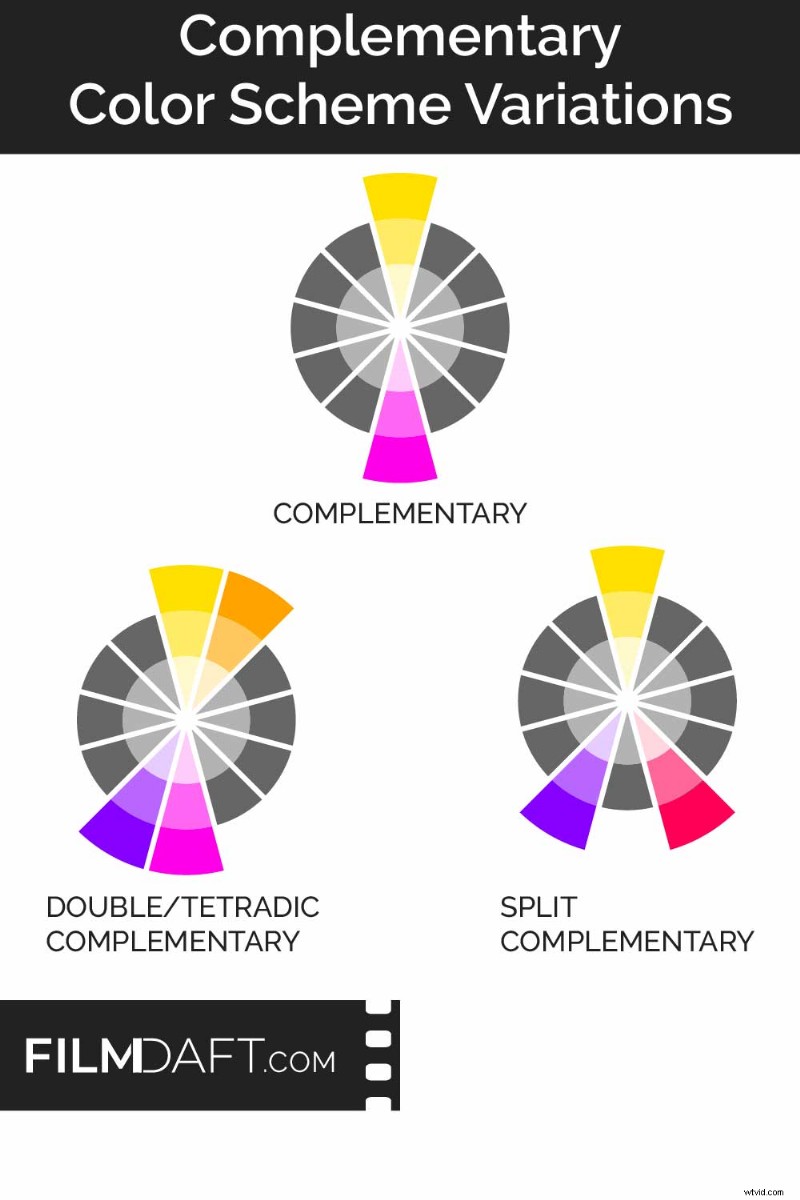
- Split‑complementary: A base hue paired with the two colors adjacent to its opposite, reducing harsh contrast while preserving tension.
- Double‑complementary (tetradic): Two complementary pairs used together, offering a richer mix that can support multiple characters or themes.
Color Models: RYB vs RGB
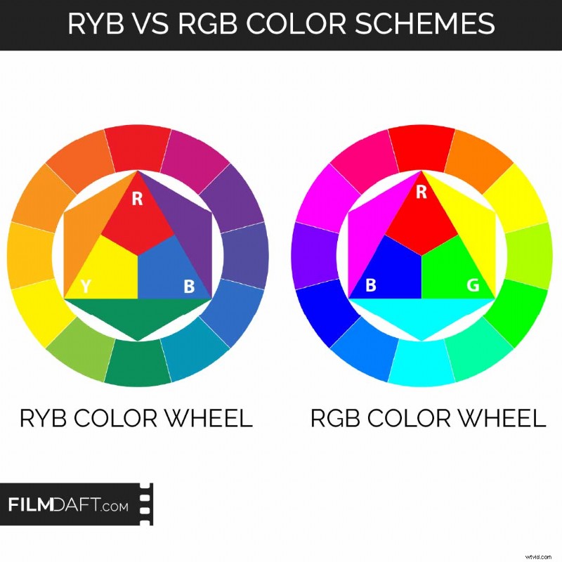
Knowing which model you’re working with is crucial. Traditional art uses RYB, while digital workflows rely on RGB.
- RYB: Blue pairs with orange, red with green, yellow with purple.
- RGB: Red pairs with cyan, green with magenta, blue with yellow.
RYB dominates pre‑production (concept art, set design, costume planning) because it reflects how physical pigments mix.
RGB is used in color grading tools like DaVinci Resolve and LED lighting systems because it defines how light mixes on screens. Consistency across pre‑production and post‑production ensures your complementary choices stay coherent.
Film Examples
Complementary color schemes appear across genres, providing a clear visual identity and emphasizing characters or themes.
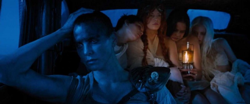
Mad Max: Fury Road (2015, Warner Bros.): Orange deserts and blue shadows separate characters from their surroundings, making the action easy to follow.
Amélie (2001, UGC‑Fox): Red and green dominate the film’s stylized world, reflecting the protagonist’s inner life.

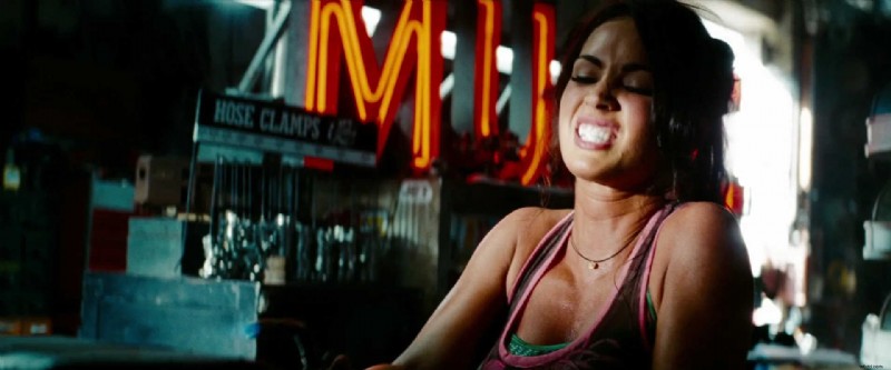
Transformers: Revenge of the Fallen (2009, Paramount): Teal and orange dominate the color grade, separating cool metallic environments from warm skin tones for a crisp, blockbuster style.
When and Why to Use Complementary Color
Complementary schemes enhance contrast, clarify subjects, and amplify emotional conflict—especially useful when you need viewers to focus on a character, feel tension, or notice a tonal shift.
- Make characters stand out clearly from the background.
- Show emotional tension between two forces or ideas.
- Highlight internal conflict through temperature contrast.
- Create a cohesive color identity that guides viewers from scene to scene, ideal for stylized or action‑heavy films.
Warm hues (red, orange) feel intense or energetic; cool hues (blue, green) feel calm or distant. Pairing opposites amplifies these emotions, enabling you to heighten tension or underscore isolation.
Real‑World Challenges and Digital Solutions
Maintaining perfect complementary contrast on set is difficult due to changing light, reflections, and practical lighting constraints.
- Plan the palette early in pre‑production.
- Test wardrobe and materials under actual lighting conditions.
- Use lighting with the correct color temperature to avoid unwanted hue shifts.
- Apply color grading in post to restore hue separation.
Adjust saturation to control energy level: saturated pairs grab attention; muted or pastel versions create a softer tone. If full contrast feels overwhelming, tone down one hue while keeping the palette structure.
Tips for Getting It Right
- Choose a dominant hue: Let one color define the scene or character design.
- Use the complement as an accent: Guide the eye without competing.
- Match your color model: RGB for digital workflows, RYB for traditional references.
- Balance saturation and brightness: Adjust intensity to match tone and pacing.
- Coordinate early: Align choices across costumes, set design, lighting, and grading.
Summing Up
Complementary color schemes provide a reliable method to create strong contrast, guide attention, and reinforce narrative intent. When paired with purpose and planning, color becomes a storytelling tool rather than mere style. The key: early planning, balanced application, and consistent use across departments.
Read Next: How do you design the look of a film?
Visit our Production Design section to learn how sets, props, and color palettes support story, character, and tone from the start.
Want the full picture? Explore the Pre‑Production archive for everything that happens before cameras roll—from visual planning to script breakdowns.