Reading Time: 6 minutes
Published: November 20, 2025 | Last Updated: January 19, 2026

What is a color palette? Definition & Meaning
A color palette is the intentional selection of hues that appear throughout a film—on costumes, in lighting, on sets, and in color grading—to shape mood and steer the audience’s emotional response.
By maintaining visual consistency, a palette defines tone, evokes emotion, and guides the viewer’s focus toward narrative‑critical details. Each hue influences how a moment is perceived, so the palette must align with the intended mood and purpose of every scene.
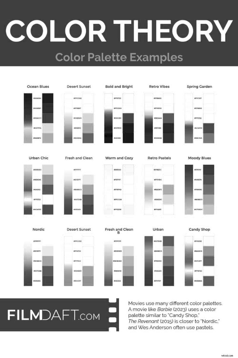
Common Color Schemes Used in Film
A color palette is the set of hues chosen for a film, while a color scheme describes how those hues interact—whether complementary, monochromatic, or another relationship. The palette is established first, and the scheme defines the interplay among its colors.
Most film palettes are built around a specific color scheme. A color scheme is the structure that defines how the selected colors relate to each other, like complementary, monochromatic, or triadic.
Monochromatic: A single base hue presented in varied tones and saturations, producing a cohesive, stylized visual world.
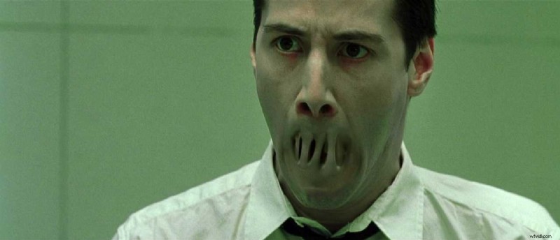 In The Matrix (1999), the green‑tinted monochromatic color scheme makes the simulated world feel unnatural and claustrophobic. Every detail—from lighting to costumes—is filtered through a sickly hue. Image Credit: Warner Bros.
Analogous color scheme: Hues adjacent on the color wheel, offering a natural and harmonious visual flow.
 In Blade Runner 2049 (2017), director Denis Villeneuve and cinematographer Roger Deakins use an analogous color scheme of Orange, Red‑Orange, and Yellow‑Orange to flood the screen with toxic warmth. It creates a haunting, dreamlike version of the future. Image Credit: Warner Bros.
Complementary: Opposing hues on the color wheel, delivering vivid contrast.
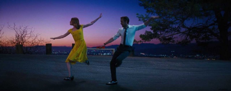 In La La Land (2016), Mia’s bright yellow dress contrasts with the blue‑purple dusk sky behind her. This complementary color scheme makes the dance feel surreal and electric. Image Credit: Lionsgate
Triadic: Three colors evenly spaced around the wheel, yielding a balanced yet striking palette.
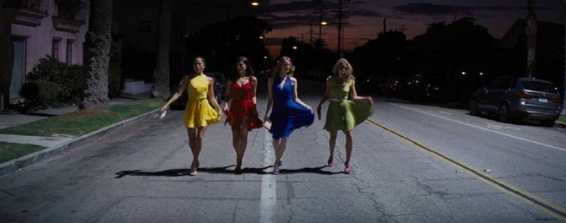 In La La Land (2016), each character wears a bold, primary color—red, yellow, or blue—creating a clean triadic color scheme. This makes each figure pop and gives the group energy and rhythm. Image Credit: Lionsgate
How to Build and Use a Color Palette
Crafting a palette involves coordination across design, lighting, and color grading. Each department contributes a distinct layer of control:
- Costumes: Choose fabrics that complement or contrast the environment to reveal character traits or relationships.
- Sets and props: Employ recurring tones or deliberate contrasts to shape spatial mood and reinforce narrative tone.
- Lighting: Adjust color temperature or apply gels to shift emotional tone or tension.
- Color grading: Fine‑tune hue, contrast, and saturation to cement the palette and maintain consistency throughout the film.
A quick note on the teal and orange color palette
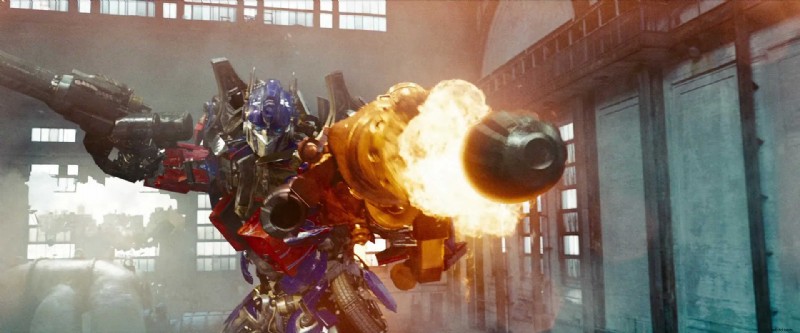
 In Transformers (2007), Michael Bay leverages teal‑orange contrast to thrust the action forward. Cool teal shadows frame the background while warm neon and skin tones dominate the mid‑ground. Image Credit: Paramount Pictures
Action films frequently employ teal‑orange grading because human skin falls within the warm spectrum. Positioning warm skin against cool teal backgrounds sharpens separation, ensuring characters remain discernible amid rapid motion.
 In Transformers: Revenge of the Fallen (2009), Michael Bay uses a teal and orange palette to heighten visual contrast. Warm explosions and red armor pop against cool teal shadows and blue‑tinted walls. Image Credit: Paramount Pictures
Tip: To quickly achieve the teal‑orange aesthetic, consider the widely used m31 LUT—available here.
Plan It Early
Begin palette planning in pre‑production. Moodboards, color scripts, and lookbooks allow you to experiment with hues across varied locations and lighting scenarios.
Animation teams use color scripts to map the emotional tone of each scene, while live‑action production and costume designers assign color conventions to characters or environments. For instance, a protagonist might consistently wear warm earth tones while the surrounding world shifts to cooler hues, underscoring tension or conflict.
A narrative color arc tracks palette evolution throughout the film—beginning with soft pastels that gradually transition to dark, saturated tones as stakes intensify.
Here’s a free Color Palette Planner:
How Color Guides Meaning
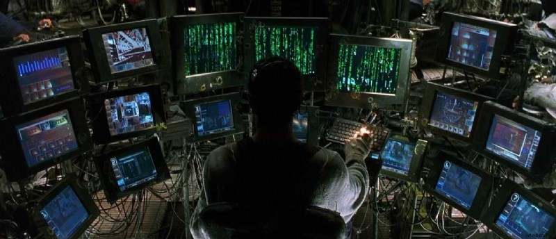 In The Matrix (1999), green hues denote the simulated world, whereas blue‑gray tones represent reality. This visual distinction allows audiences to discern setting before dialogue.
Black Swan (2010, Fox Searchlight) begins with a soft, neutral palette; as Nina’s sanity deteriorates, the visual tone deepens into blacks and reds, mirroring her psychological unraveling.
 In Black Swan (2010), the palette starts soft and neutral; as Nina loses control, the film shifts toward deep blacks and reds to match her mental state. Image Credit: Fox Searchlight
O Brother, Where Art Thou? (2000, Touchstone) employs sepia grading to evoke the texture of antique photographs, crafting a nostalgic, dreamlike portrayal of 1930s America.
 In O Brother, Where Art Thou? (2000), sepia grading mimics old photographs. The film’s color palette builds a dreamy, mythic version of 1930s America. Image Credit: Touchstone Pictures
Genre Expectations
Genre conventions shape palette choices across lighting, costume, and set design. Horror typically leans on desaturated hues or sickly greens to heighten dread; romance favors warm tones and soft pastels; sci‑fi embraces neon blues and greens; fantasy opts for natural earth tones or rich saturation to construct immersive realms.
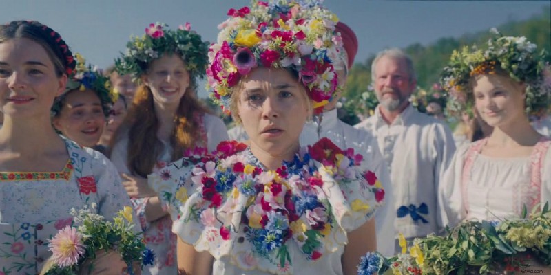 In Midsommar (2019, A24), bright daylight and pastel hues intensify the shock of violence, as the sunny palette leaves no visual sugar coating.
Midsommar defies expectations by pairing daylight and pale tones, making its violent scenes all the more unsettling as the bright palette offers no respite.
Cultural Symbolism
Color symbolism varies by culture and context. While white may signify purity in the West, it can denote mourning elsewhere; red can signal love, anger, or danger. Ensure your palette reflects the specific cultural, historical, and emotional milieu of your narrative rather than generic symbolism.
Evaluate the palette holistically—by integrating costumes, sets, and lighting—to confirm that the hues appear authentic within your constructed world.
Contrast and Discordance
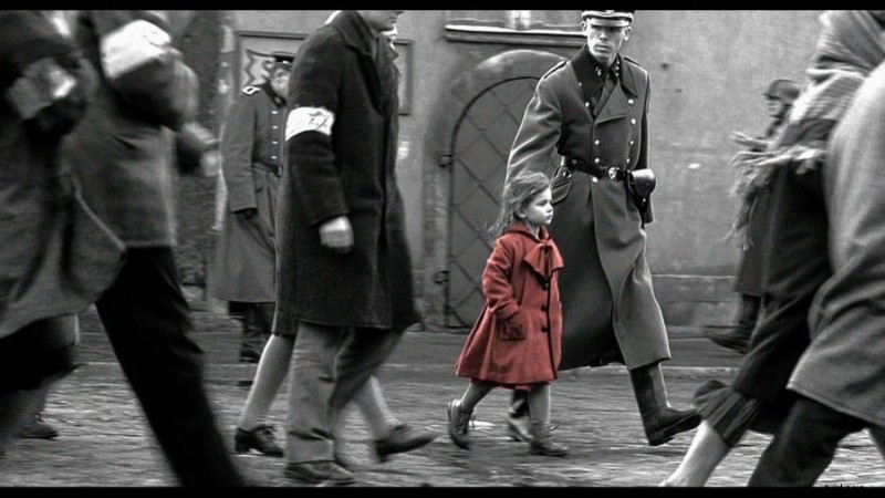 In Schindler’s List (1993), a girl’s red coat cuts sharply against a black‑and‑white backdrop, making the color discordance the scene’s emotional focal point.
Deliberate palette breaks—known as color discordance—serve to spotlight a single element. Schindler’s List exemplifies this, with a red coat standing out in a monochrome world, drawing the viewer’s emotional focus.
Why Color Palettes Matter
Color dictates a scene’s emotional tenor by modulating contrast, brightness, and temperature. Warm hues can evoke safety or intensity, whereas cool lighting signals distance or detachment.
A consistent palette reinforces narrative unity; a deliberate shift signals changes in story or perspective.
Color guides the audience’s gaze: vivid, contrasting tones emphasize pivotal details—faces, props, actions—while muted backdrops keep secondary elements unobtrusive.
Summing Up
A well‑crafted palette unifies a film, steering mood, emotion, and narrative meaning. Start with a clear plan, choose hues early, and apply them intentionally so each tone reinforces mood, setting, or character emotion. When the palette evolves, ensure it mirrors shifts in tone, chronology, or perspective.
Read Next: How do you design the look of a film?
Visit our Production Design section to learn how sets, props, and color palettes support story, character, and tone from the start.
Want the full picture? Explore the Pre-Production archive for everything that happens before cameras roll—from visual planning to script breakdowns.