Reading Time: 5 minutes
Published: November 21, 2025 | Last Updated: December 2, 2025

What is a monochromatic color scheme? A monochromatic palette is built from variations of a single hue—tints, shades, and tones that shift brightness and saturation while maintaining the same base color. In filmmaking, this approach reduces visual clutter, heightens emotional resonance, and directs the viewer’s focus through subtle contrast.
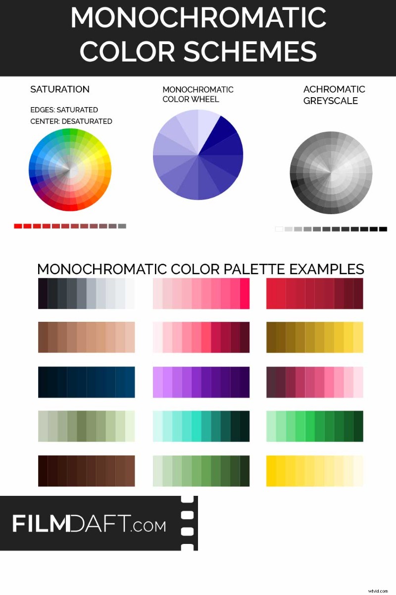 This chart contrasts saturation, monochromatic color wheels, and achromatic grayscale values. The lower section shows how a single hue can be varied in brightness and saturation to create a full monochromatic palette. Image Credit: FilmDaft.com
Why Monochromatic Color Works
Adopting a monochromatic scheme offers several strategic benefits in film production:
Creating a Unifying Look
When all visual elements—costumes, lighting, and set design—draw from one hue family, the frame feels cohesive and intentional. This visual unity helps audiences stay engaged with the story rather than the scenery.
Triggering Specific Emotional or Cognitive Responses
Warm palettes (reds, yellows) evoke romance, nostalgia, or comfort, while cool hues (blues, greens) can suggest sterility, eeriness, or detachment. By adjusting brightness and saturation within a single color, filmmakers can guide the audience’s experience without altering location or composition.
Learn more about color psychology in film.
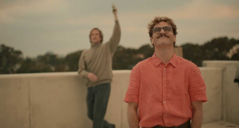 In Her (2013), soft reds and warm earth tones envelop Theodore, underscoring his romantic longing and vulnerability. The monochromatic palette maintains an intimate, gentle tone throughout the film. Image Credit: Annapurna Pictures
Her (2013, Annapurna) uses pinks and reds to weave a consistent emotional world—wardrobe, setting, and lighting converge to reflect Theodore’s yearning.
By manipulating brightness and saturation, a single hue can convey calm, tension, warmth, or distance.
Reinforcing Theme Through Color
Color can underscore narrative themes. The Matrix employs a green monochrome for every simulated scene, instantly signaling an artificial, coded environment even before exposition.
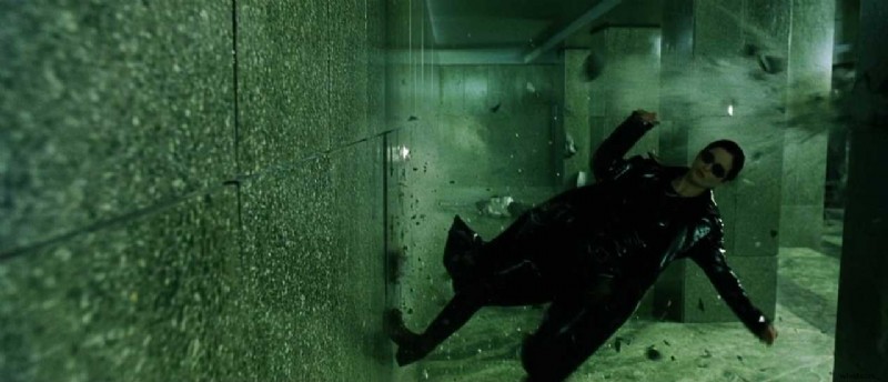 In The Matrix (1999), the green monochromatic palette demarcates the simulated world, visually distinguishing it from reality. Image Credit: Warner Bros.
Moonlight (2016, A24) adopts a blue monochrome in pivotal scenes, reflecting Chiron’s isolation and internal conflict. Soft blues envelop moments of solitude, turning color into a narrative thread across his life stages.
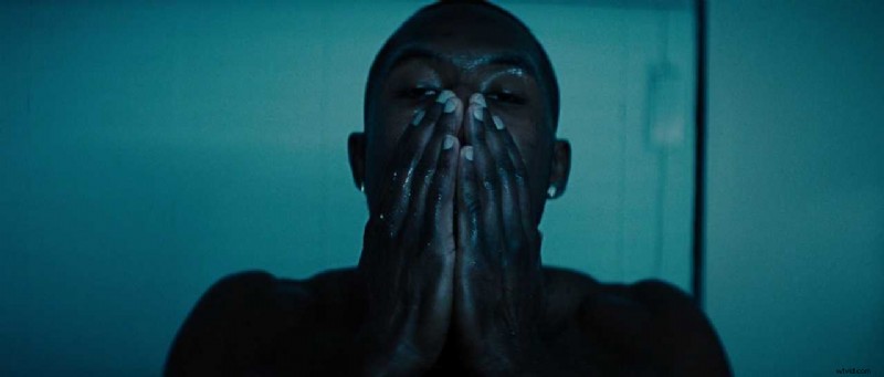 In Moonlight (2016), blue tones dominate as Chiron confronts himself, expressing isolation and tension without dialogue. Image Credit: A24
These monochromatic passages strip away extraneous colors, immersing viewers in the character’s emotional landscape.
Black‑and‑White Is a Monochrome Variant
Monochrome isn’t limited to hue; grayscale (achromat) uses a single neutral shade. Classic and contemporary films—Roma (2018, Netflix) and Schindler’s List (1993, Universal)—leverage grayscale to emphasize period authenticity or emotional depth.
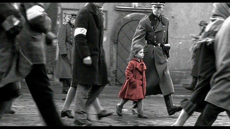 In Schindler’s List (1993), the girl’s red coat punctuates a black‑and‑white world, creating a powerful emotional focal point. Image Credit: Universal Pictures
Strategic color discordance—such as a single bright detail—can amplify impact while preserving visual unity.
Monochromatic vs. Desaturated Images
A monochromatic palette differs from a desaturated image.
A desaturated photograph has low color intensity across multiple hues, often appearing washed out or near gray. Monochromatic images, however, use only one base hue and vary its brightness, darkness, and saturation to create contrast.
For instance, a red monochrome might span scarlet, maroon, and pink, while a green palette ranges from mint to forest. The resulting image can be bold, soft, or subdued, but all tones stem from the same hue family.
Constructing a Monochromatic Palette
Planning begins early: align color across sets, costumes, lighting, and grading to ensure consistency and narrative support.
- Choose your hue early: Select a color that encapsulates the desired emotion or theme. All departments should coordinate around it.
- Vary brightness and saturation: Use light, shadow, and intensity to maintain visual contrast and distinguish characters.
- Limit accents: A single bright detail can focus attention, but excessive accents dilute the palette’s coherence.
- Plan color grading: The final look is often shaped in post‑production. Apply a consistent tint or adjust saturation across shots for a unified visual world.
- Consider cultural meanings: Colors carry contextual interpretations—red can mean love, danger, or celebration. Tailor your hue to audience expectations.
Conclusion
Monochromatic schemes use a single hue and its variations to unify, focus, and convey emotional tone. Whether you aim for warmth, coldness, nostalgia, or artificiality, a monochrome palette offers clarity and expressive power when aligned with the story’s core.
Read Next: How do you design the look of a film?
Visit our Production Design section to explore how sets, props, and color palettes support story, character, and tone from the outset.
Want the full picture? Explore the Pre‑Production archive for everything that happens before cameras roll—from visual planning to script breakdowns.