
Color accuracy goes beyond aesthetics—it guarantees consistency, enabling you to convey the exact mood and message you intend.
Your monitor, whether connected to a computer, smartphone, or tablet, must display an accurate representation of hues, saturation, tonality, contrast, and more. An uncalibrated screen can distort color balance, wash out certain tones, intensify others, or cast an overall hue on your images, as shown in Figures 1 and 2.
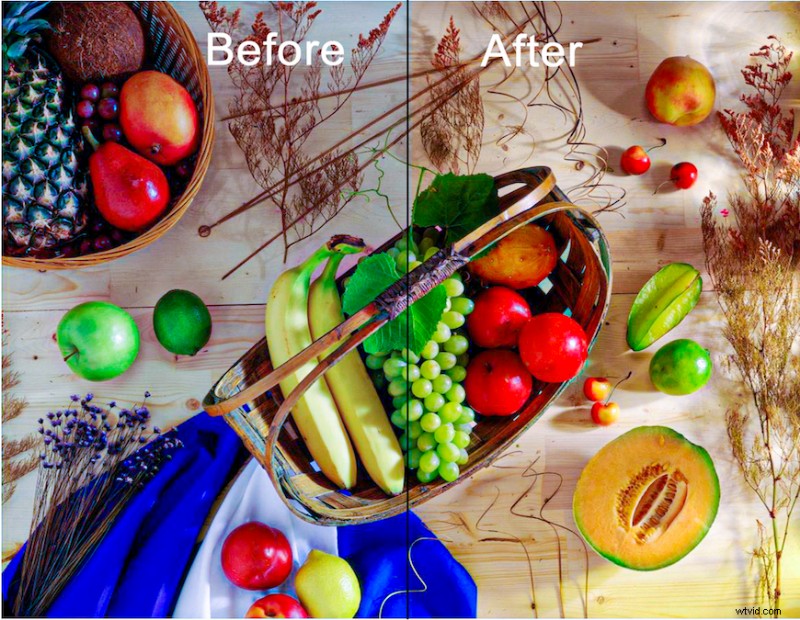 Figure 1. Using an Acer 4K Color monitor, the left side is uncalibrated, the right side is calibrated. Notice the cool tint on the uncalibrated side.
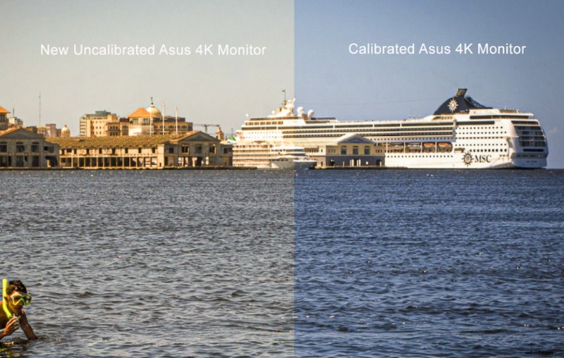 Figure 2. A new ASUS 4K TUF Gaming monitor, fresh out of the box. The left side is uncalibrated; the right side is calibrated. Notice the warm tint on the uncalibrated side.
After purchasing my ASUS 4K TUF Gaming monitor, I set a personal photo as the desktop background, captured a full‑screen snapshot, and then calibrated with a Datacolor SpyderPro. Comparing Figures 1 and 2 illustrates how each monitor’s uncalibrated state skews color differently—cool for the Acer, warm for the ASUS. No two displays are identical, so never assume factory calibration is sufficient.
In workshops, camera club sessions, and private portfolio reviews—often streamed online—I calibrate my monitor before every session. It takes roughly three minutes, analogous to a musician tuning an instrument before a performance. Because a shared baseline is essential for constructive critique, I always confirm that students have calibrated their displays beforehand.
Protecting Your Artistic Legacy
Reading this article signals that you are serious about the images you create. You understand that photography lets you capture and interpret the world, and you want your work to resonate with viewers—so that future curators, gallerists, or collectors see it as you intended.
Assuming those viewers’ monitors are calibrated, an uncalibrated screen on your end can make your images appear too warm or too cool when printed or displayed elsewhere. Professional labs profile their printers, so what you see on their screen is what the print will look like. If you send a photo that looks correct on an uncalibrated display, the resulting print may carry an unintended tint.
Some so‑called “experts” claim they never calibrate because they “like how their prints look.” That approach signals a lack of mastery over color tools and a disregard for consistency. Color calibration isn’t a stylistic choice; it’s a prerequisite for honest visual communication.
Warm and cool tints influence perception—warm hues invite viewers, cool hues create distance. The decision should align with the photographer’s intended message; otherwise, the message risks being lost.
Calibrating Your Monitor
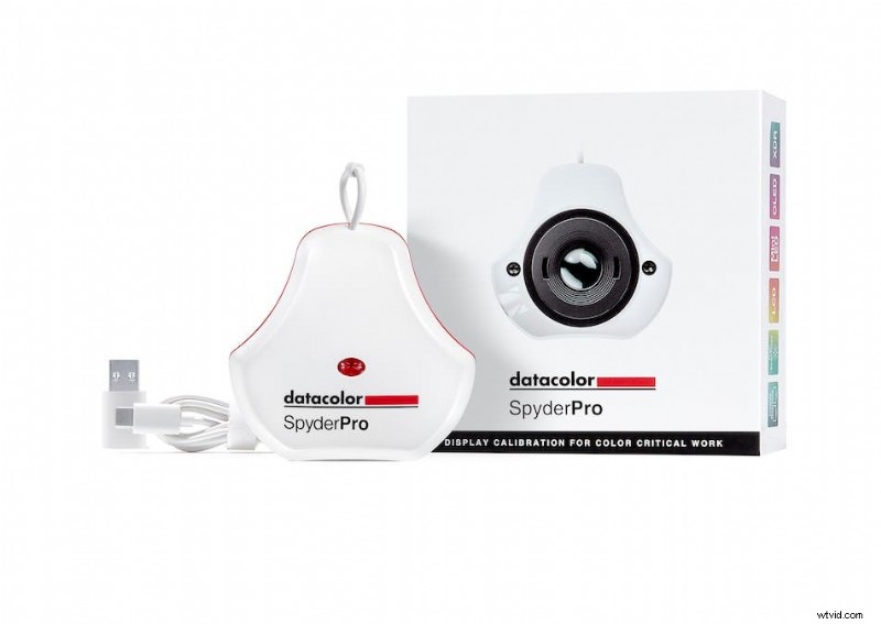 Figure 3. The Datacolor SpyderPro calibration tool.
While several devices exist—Calibrite Display 123, Calibrite Display Pro HL, SpyderExpress, SpyderPro—this guide focuses on the SpyderPro, a system I’ve trusted since Spyder 3’s debut in 2007.
Using SpyderPro is straightforward. After downloading the software and attaching the colorimeter, the program guides you through each step with clear prompts. Your serial number—found on the unit’s box—is required for the first run. The software also detects your display type or recommends one based on the information you provide.
Navigating Brightness Controls
Calibration demands setting your monitor’s brightness to match ambient lighting. If your display has physical buttons or switches, learn their locations beforehand. On laptops or self‑mounted monitors lacking manual controls, open the system brightness panel before calibration: Windows → Settings → System → Display; macOS → System → Displays. Set brightness to 100% and keep the panel open. When the Spyder prompts for brightness adjustment, switch back with Alt+Tab (Windows) or Option+Tab (Mac), lower the slider, then return. Repeat until you are within one to two lumens of the target (≈180 cd/m²). My laptop’s slider allows a tighter match than the function keys.
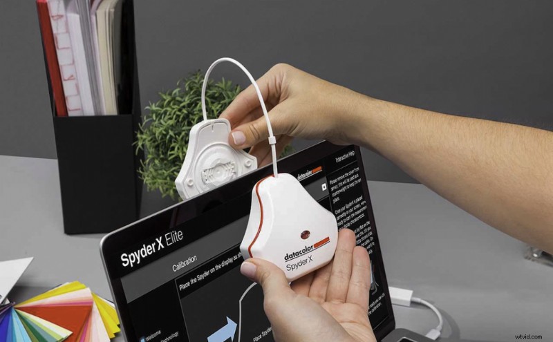 Figure 4. The Spyder’s counterweight design helps position the colorimeter correctly; the cable length can be adjusted as needed.
Ambient Light
In film production, rooms are darkened to replicate cinema viewing conditions, but general photo editing does not require complete darkness. Adjusting ambient light improves calibration accuracy: overly bright rooms cause you to over‑expose edits, while overly dark rooms lead to over‑exposure.
When preparing images for general viewing—where lighting varies—calibrate in a dimmed room, but keep enough illumination to see your keyboard and mouse. I turn off unnecessary lights, close blinds, and use a monitor hood to shield the screen from stray light. A custom hood from PhotoDon or a DIY version made of black Foamcore and duct tape (see Figure 5) works well.
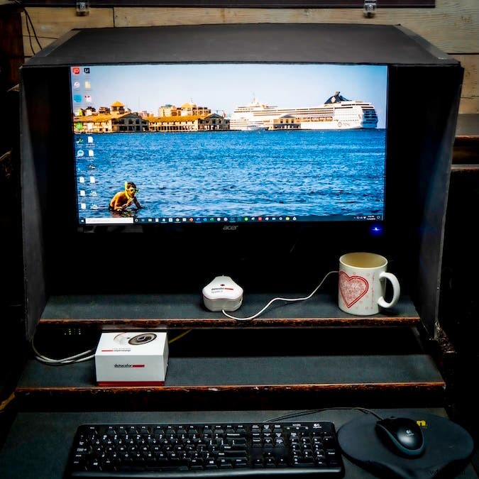 Figure 5. Homemade monitor shield using black Foamcore and duct tape. Cut only the outer skin with a matt knife for easy folding.
Final Recommendations
- Let the monitor warm up for about 20 minutes before calibration.
- Reset the On‑Screen Display (OSD) to factory defaults.
- Disable “Eco Mode,” “Dynamic Contrast,” “Vivid Mode,” and any auto‑brightness features.
- Use FullCAL for a first calibration; ReCAL for subsequent adjustments.
- Apply Datacolor’s recommended presets: gamma 2.2 (Mac / Windows), target color temperature, and brightness.
- Select sRGB as the target color space (Adobe RGB if your monitor supports it).
- Recalibrate at least once a month or before major editing sessions—each run takes about three minutes.
While monitor calibration may seem like an extra step that costs time and money, it is an investment in your creative workflow. Accurate color reproduction ensures your images communicate precisely what you intend—just as SSDs, high‑capacity SD cards, and reliable batteries support the technical side of your craft.
Steve Anchell is an internationally published writer, award‑winning photographer, and educator whose work has been exhibited in more than 61 shows. He authors five photography books with Focal Press—including The Darkroom Cookbook 5th Edition, The Film Developing Cookbook, Mirrorless Interchangeable Lens Camera, The Variable Contrast Printing Manual, and Digital Photo Assignments. Learn more about his workshops and philosophy at www.steveanchell.com.