Create engaging color palettes with these film examples for your next photography, film, graphic design, or art project.
Dorothy was unhappy. Life on the Kansas farm seemed dull. She didn’t know what, but something was missing. She wasn’t sure why, but everything was lacking.
Until, with an emphatic click of her heels, the world glistened and sparkled. Color bubbled up from the fields. It crowded the skies. It bonded itself to everything. Technicolor was born.
1938 is tantamount to the birth of Christ: There were films made before color and films made after color. The Wizard of Oz is considered the first major color movie. At the time, it was a technological breakthrough. It transformed the industry.
Color became the new frontier in filmmaking. And, with it, new worlds were ripe for exploration.
Part Art, Part Science: The Psychology of Movie Colors
We have long understood the power of color on human perception and emotion. Where shriller conversations proliferate is when academics of all shades attempt to claim color theory as their own.
Scientists are adamant color theory is a science, yet artists are adamant color theory is an art.
As if to pour gasoline on the fire, color theory was first described by a poet and a chemist. Firstly, in 1810, by German poet Johann Wolfgang van Goethe, and again—a decade later—by French industrial chemist Michel Eugène.
Their two texts, Theory of Colours and The Law of Simultaneous Colour Contrast cataloged how all colors were created by combining three primary colors: red, green, and blue.
Our understanding of color has mushroomed since the early days, yet it’s these basic tenets that prop up our understanding of color theory today.
Why Is Color Theory So Important?
Painstakingly constructing the perfect movie color palette may seem vanilla. To graphic designers, film-makers, and color graders, it’s like filling your lungs to the brim with mountain air.
Color undoubtedly plays its part in making things look beautiful. But, to dismiss color as a simple exercise in aesthetics is to overlook its biggest asset: To understand color is to understand the human psyche.
Red means danger, blue means mellow, and green means calm, right? These descriptions, while sometimes accurate, are often too one-dimensional.
Think about the dramatic irony surrounding Woody’s insistence that Buzz is only a toy. Or, when Neo enters the Matrix for the first time. What’s responsible for your hairs standing up during those scenes?
These scenes are perfectly filmed and beautifully graded. They fill your eyes and throw your emotions for a loop. It may not be immediately obvious, but the way in which a film is graded has a considerable effect on peoples’ emotional responses.
Movie Colors in The Matrix
You are unlikely to find a greater exposé of color tone in film than 1999’s The Matrix. Not only is it beautiful, it’s purposeful. Every single pixel on screen was considered, and then reconsidered.
Let’s start with the obvious. The Matrix is green. Whether represented in computer code, or as scenes on screen, everything is green. Entire scenes are color graded with electric green filters to project an odd, unnerving feeling.
But, flip to the real world, the environment outside the Matrix, and suddenly, everything is blue. Cold, icy, oh-my-god-smack-me-in-the-face-this-is-actually-the-real-world blue.
This isn’t a mistake. This sharp contrast signifies the emotion you should be feeling in each environment. It also clearly defines where the characters are, emotionally and physically.
Tiny details are also critical to a movie color palette. Remember the pill scene? Neo must choose the blue or the red pill.
The blue pill represents going back to naivety, to a world of simple and uncritical belief. It’s the easy option and it’s blue.
The red pill is fraught with danger. Morpheus even says, “You take the red pill, you stay in Wonderland, and I show you how deep the rabbit hole goes.”
My arm hairs are standing up while writing this. Color grading really works.
Examples of Color Tone in Film
On her blog Movies in Color, graphic designer Roxy Radulescu maps the color palette of stills from a different movie every day, providing a source of both inspiration and insight for other artists.
Here’s how Radulescu describes her process:
“As a graphic designer, my relationship to color is best described as complicated. I’ve spent countless minutes staring at a Pantone book, or on my computer clicking around the color wheel in Photoshop, searching for that perfect shade of blue/green/orange/red that would really make the design ‘pop,’ as clients seem to often demand.’
“In my effort to learn and transform my relationship with color from a sometime struggle into a collaborative partnership, I decided to start a project involving nothing but color. It all suddenly came to me one evening, as many serendipitous ideas do.’
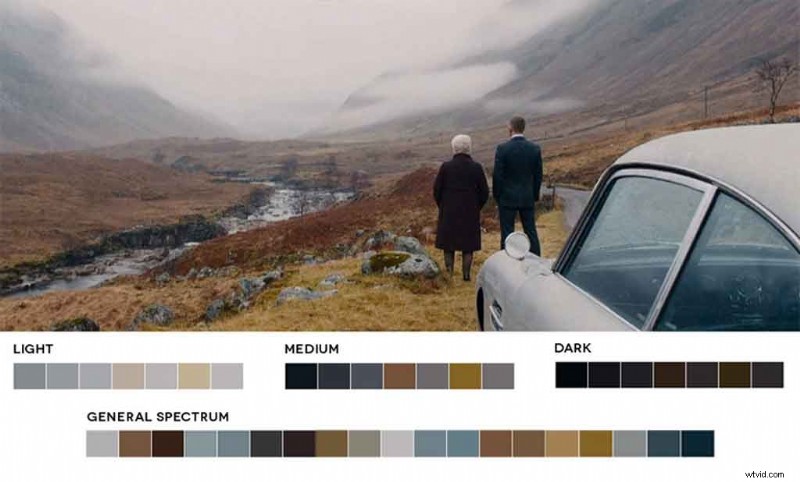
“On this particular evening, I was watching Skyfall. The James Bond film’s cinematography and use of color really caught my eye, and suddenly, everything clicked. I wanted to find out what colors make up certain parts of the movie, and quickly realized that, in today’s share-crazy internet culture, this endeavor would be fairly easy.’
“I was able to quickly find stills from Skyfall and extract colors from them with the combination of a color generator and manually extracting colors in Photoshop.’
“That combination works best, as most color generators tend to miss colors that can make a palette interesting. It also lets me be creative in the final palette process and decision-making.’
“I decided I could take this process a step further and try it with several films, and Movies In Color was born.”
The Evolution of Movies In Color
“Eventually, I used the blog to keep a record of color palettes that I could use in projects, or that I could reference for a few interesting color combinations. I was very excited to find other artists found them useful.’
“This has not only been an aesthetic pursuit but also an educational one. One of the goals is to give artists and designers color palettes they can use in paintings, films, videos, graphic design, and other pursuits.’
“Throughout the lifespan of Movies In Color, I’ve had the chance to post several classic films by renowned filmmakers. I try to choose stills that are particularly interesting compositionally, and those that have colors that catch my eye.’
“While my intent was purely to “practice” the use of color and see it in action in the medium of film, I soon discovered I made up my own mind about what each still represented and why certain colors were used.’
“I’d like to think that certain scenes are planned with color in mind to affect mood and visually influence people’s emotions. It is also interesting that the cinematographer can influence the color palette by overseeing framing and lighting.’
“Here are four deliberate uses of color that I’ve come across while making palettes. . . .”
1. Contrast
“The advent of digital color grading has influenced the look of films since 2000’s O Brother, Where Art Thou?. An overall positive of color grading is that it allows a film to stay consistent from scene to scene, without disruptive changes in color.’
“However, a recently popular development has been the use of teal and orange to create a good color contrast throughout films. Since people’s skin tones most often contain a warm tone, orange becomes the most closely related color to a skin tone.’
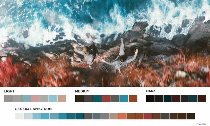
“The opposite color of orange is blue or teal. Opposite colors are used to create the most contrast. Sometimes this practice remains relatively subtle, like in the still above from Sunshine. Other times, it makes actors look like they’ve spent too much time in a tanning bed.’
“The orange/teal phenomenon is often used to make people stand out among backgrounds. It can also have specific meaning. Star Trek, a widely orange/teal film, is an example. The color split can be attributed to warm/cold, danger/safety, or just a stylistic choice that looks good on the screen.’
“There are other directors who have used contrast to create rich and interesting color palettes. Jean-Pierre Jeunet uses complementary opposites for vibrant and quirky palettes that give his films an extra sense of stylized surrealism. Red and green are widely used in Amélie and Delicatessen to emphasize surreal scenes.’
“Contrast is often used deliberately, and while colors can be manipulated with digital color grading, I imagine there is still a lot of planning involved in the creation of a film’s main color palette.’
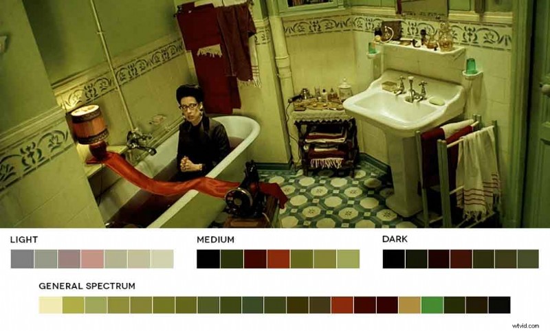
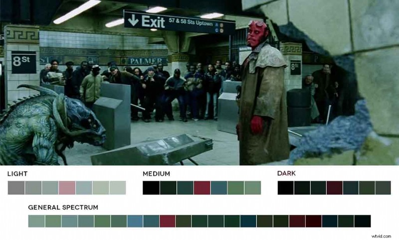
“Any number of things can influence the choice of a specific color palette, from a strong desire for consistency throughout the film (with or without a specific meaning attached) to its use in certain parts of the film to highlight scenes, characters, or objects, as seen below in a still from Hellboy.”
2. Era
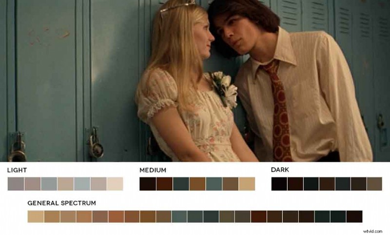
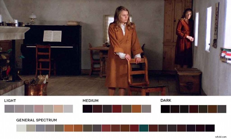
“Oftentimes, movie colors can convey a specific time period. In my experience, movies set in the ’60s and ’70s tend to have more orange, yellow, and brown tones, and warmer and richer colors overall, as in The Virgin Suicides, and Autumn Sonata.’
“A color palette can also draw upon other works of art. In the case of Milos Forman’s Goya’s Ghosts, the cinematographer, Javier Aguirresarobe, specifically took into account the tonalities achieved by classic painters.’
“His palette was heavily influenced by the artist Ribera. It focuses on light and expression, with special emphasis on warm light, a warm tone, and dark densities.”
3. Mood
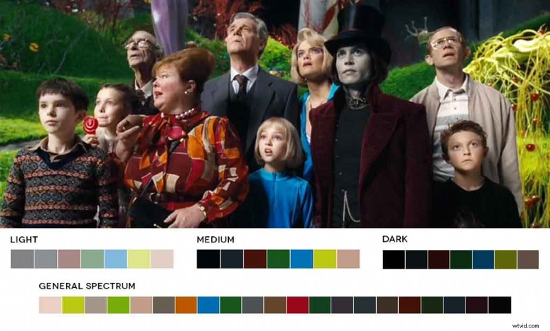
“Color is also often used to denote a mood. The color palette of Tim Burton’s Charlie and the Chocolate Factory emphasizes the film’s underlying creepy vibe.’
“Burton’s already stylized filmmaking prepares the viewer for bright colors. However, there is something unsettling about the brightness surrounding the otherwise pale and subdued characters.’
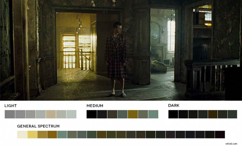
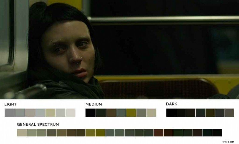
“David Fincher retains a similar look in several of his movies with the help of Jeff Cronenweth, his cinematographer.’
“In Fight Club and The Girl with the Dragon Tattoo, several scenes are dark, but contain many of the same green and yellow tones. Yellow, an otherwise cheery color, looks drab, sick, and denotes an unsettling space.”
4. Meaning
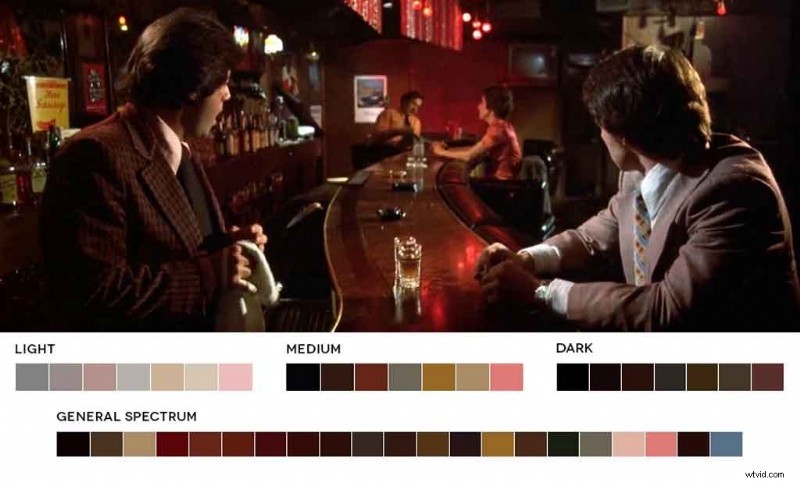
“Often used to emphasize a character’s emotion or decisions, color is closely tied to meaning. In Mean Streets, the strip club/criminal hangout that the characters frequent is always shown washed in a shade of red—the color of lust, blood, and guilt.’
“The club is often the source for the main character’s most sinful activities. As a devout Christian, he gets drunk, gets into fights, witnesses drug use, and expresses sexual desire.’
“Red also symbolizes sin, and the passion of Charlie’s criminal lifestyle is represented by the red shade the scenes are bathed in.’
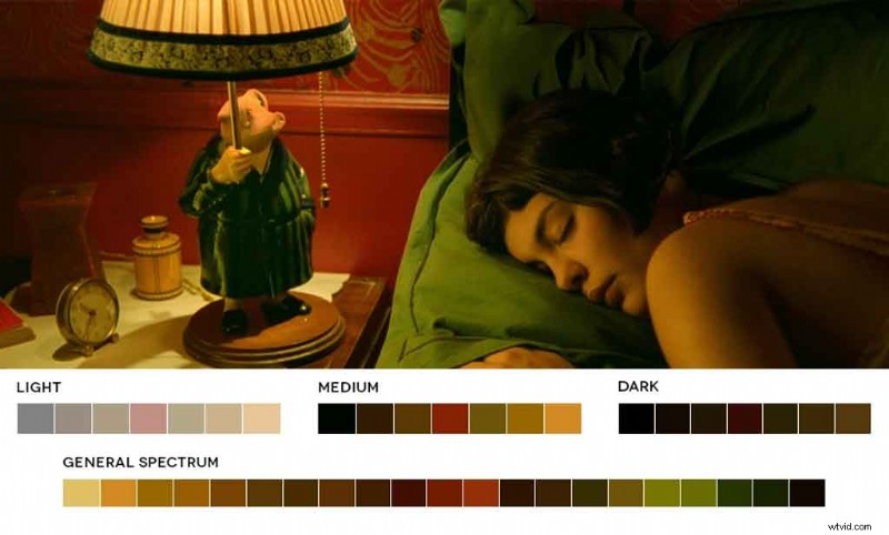
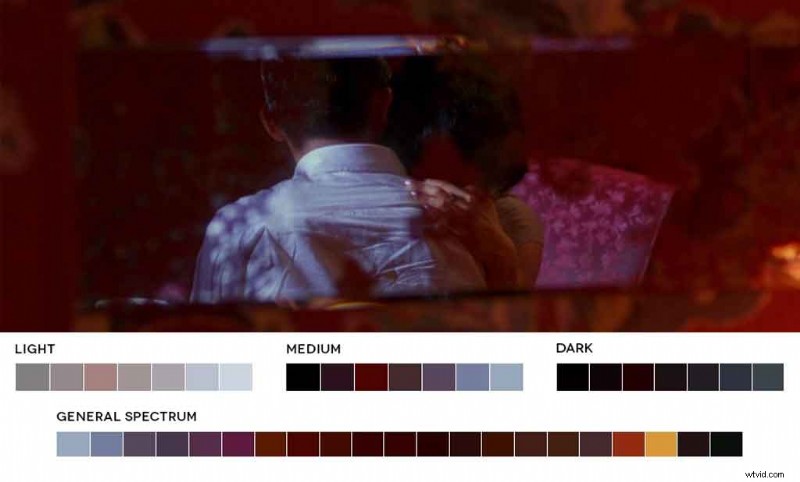
“In The Mood for Love is another example. Shades of red and pink are used to denote sin and love in the context of a socially conservative Hong Kong.’
“Chow and Su are both often lonely and left to their own devices by their cheating spouses. At the time, friendships between men and women bore scrutiny, and the two began to recognize that fact, especially when they developed feelings for each other.’
“The use of color in any medium—photography, film, graphic design, or art—cannot be free of meaning. While Movies In Color will continue to inform my color decisions, it has made me more aware of color throughout the world.’
“I have learned that it takes a discerning eye to observe and pick out what colors seem relevant for the task at hand.”
How to Get Those Film-Ready Vibes
The color wheel is your friend. It will never let you down. Using a color wheel can seem a little daunting at first, but there’s nothing to fear. All you need to know is what type of color palette you’re looking to achieve:
Analogous
A big word that means “colors that are similar.” Pick a shade of green, and you’re going to create a palette of other shades of green, along with colors closest to green on the wheel. This is great for grading harmonious scenes.
Monochromatic
Monochromatic doesn’t mean black and white. Rather, it’s shades of one color. So, go for red, and you’ll only get other shades of red in your movie color palette. This is good for grading scenes so that the entire composition fills a singular purpose.
To use our simplistic example from before, grade red for anger or danger in a scene, blue for mellow, and so on.
Triad
Choosing a triad will fill your palette with colors that are equidistant from each other in the wheel along three axes. Or, less technically, draw an equilateral triangle on the wheel and wherever the corners intersect is the colors you’ll get.
Complementary
Finally, a complementary movie color palette will surface colors that are opposite on the wheel.
Color Tone in Film Summed Up
Color isn’t an accident. As we have evolved, we have come to know that certain colors signify certain things.
The Wizard of Oz was brazen and bold, and will always get credit for being the first film in color. Since then, color tone in film has become an art form.
Treating your footage with colors in mind—and the emotions they evoke—is the single biggest advantage you can have when deploying tools to make a captivating movie.
Make color central to your workflow and you cannot go wrong.
Cover image from the film Lost in Translation via Focus Features.