In a world where visual engagement drives conversion, the fonts you choose can set the tone before a single word is read. By understanding typeface psychology, designers can craft interfaces that feel trustworthy, clear, and emotionally resonant.
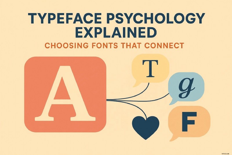
Table of Contents
- What is Typeface Psychology?
- Why Typography Matters
- Eight Typeface Categories & Their Impact
- Using Filmora to Apply Typography Psychology
- Filmora App: Text on the Go
- Practical Tips for Choosing Fonts
- Conclusion
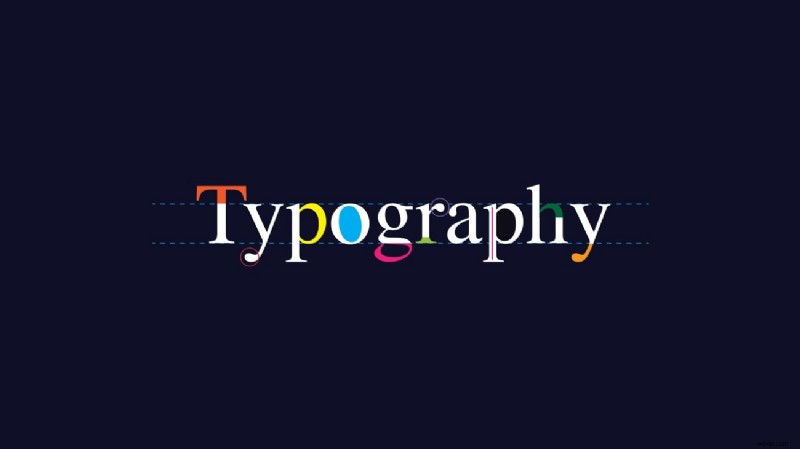
Part 1. What is Typeface Psychology?
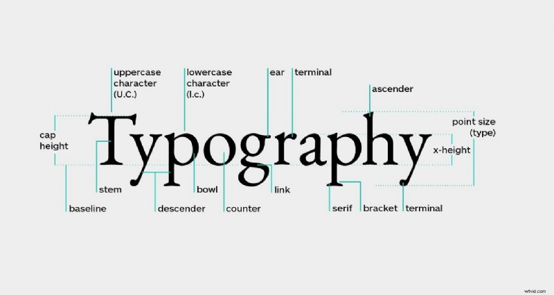
Typography is more than decoration; it’s a subtle language that conveys values and emotions. Research indicates that font choice can influence how users perceive credibility, urgency, and friendliness. Historically, typefaces evolved from simple mechanical forms to sophisticated tools that reflect cultural trends and brand identities.
Part 2. Why Typography Matters
Typography shapes every interaction a user has with your content. Here are the core reasons it’s essential:
- First Impressions Count: The style, size, and spacing of a font often become the first cue users rely on to judge quality.
- Brand Signature: A distinctive font can become synonymous with your brand’s personality and values.
- Legibility & Retention: Clear type reduces cognitive load, making it easier for audiences to absorb information.
- Emotional Cueing: Fonts carry pre‑conscious signals that prime how readers feel before reading the content.
Part 3. Eight Typeface Categories & Their Psychological Impact
Choosing the right category can help you communicate the intended message instantly. Below are the eight main families and the emotions they typically evoke.
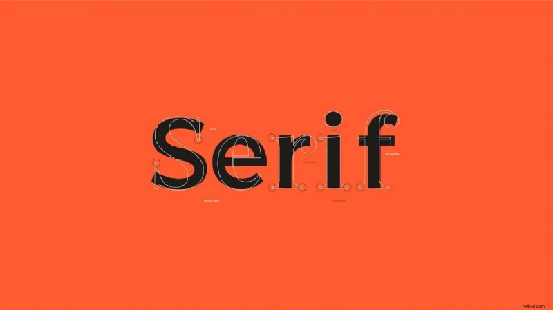
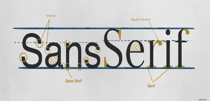
1. Serif
- Emotion: Trust, authority, tradition
- Common Uses: Newspapers, academic books, luxury brands
- Why it works: Serif strokes signal readability and formality.
2. Sans‑Serif
- Emotion: Clarity, modernity, accessibility
- Common Uses: Tech websites, user interfaces, corporate sites
- Why it works: Clean lines promote straightforward communication.
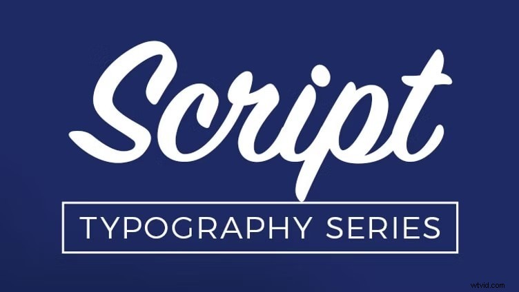
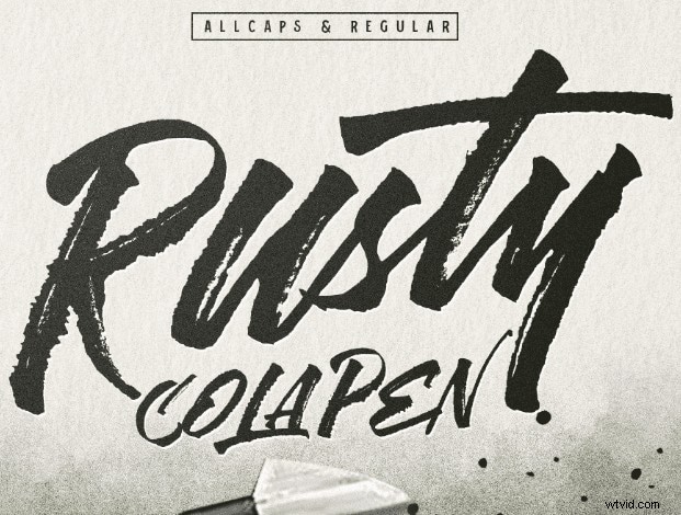
3. Script
- Emotion: Romance, elegance, personality
- Common Uses: Wedding invitations, fashion logos, editorial headlines
- Why it works: Hand‑written strokes create intimacy.
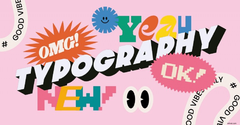
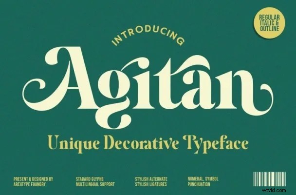
4. Decorative
- Emotion: Playfulness, nostalgia, impact
- Common Uses: Event posters, vintage packaging, creative projects
- Why it works: Bold, stylized shapes capture attention.
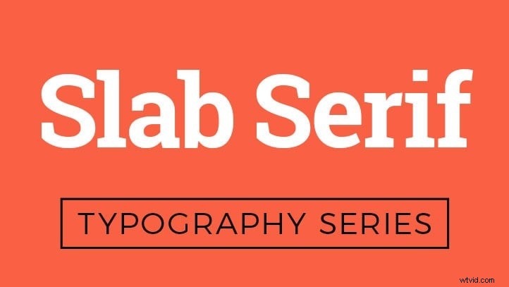
5. Slab Serif
- Emotion: Boldness, strength, urgency
- Common Uses: Headlines, billboards, branding that needs impact
- Why it works: Thick serifs project confidence.
6. Display
- Emotion: Style, nostalgia, uniqueness
- Common Uses: Titles, artwork, limited‑edition releases
- Why it works: Large, artistic forms stand out in visual hierarchy.

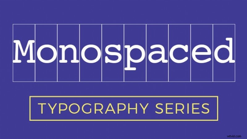
7. Monospaced
- Emotion: Technical, logical, precision
- Common Uses: Code snippets, tech branding, retro designs
- Why it works: Uniform spacing enhances readability for data.
8. Handwritten
- Emotion: Warmth, authenticity, approachability
- Common Uses: Lifestyle brands, personal blogs, creative storytelling
- Why it works: Mimics natural handwriting, fostering connection.
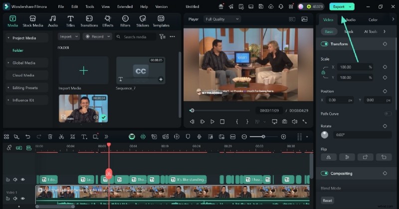
Part 4. Applying Typeface Psychology with Wondershare Filmora
Filmora offers an extensive font library and intuitive customization tools that let you translate psychological insights into visual assets. Whether you’re editing on desktop or mobile, the platform supports color, size, style, and animation adjustments to keep your messaging on target.
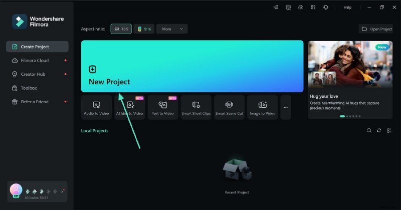
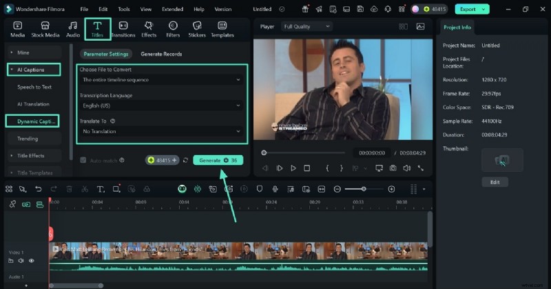
Method 1. AI‑Generated Captions
- Start a new project and import your video.
- Navigate to the Titles tab, select Dynamic Captions under AI Captions, and generate subtitles.
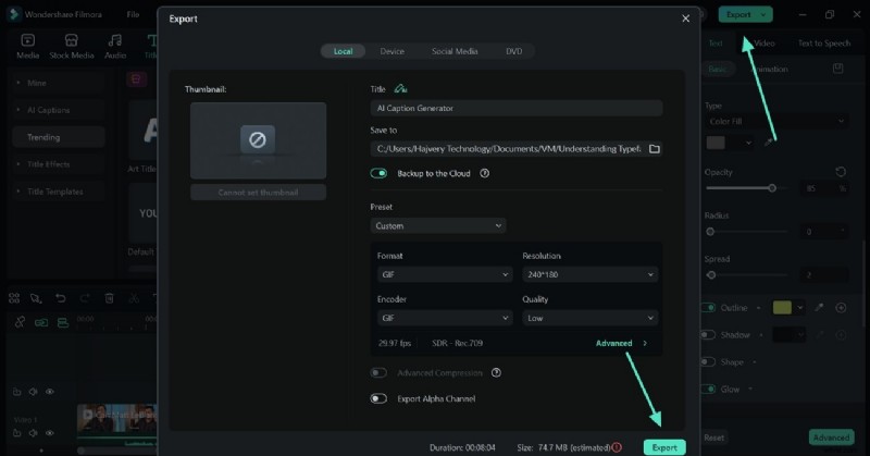
- Preview, fine‑tune, and export the finished video.
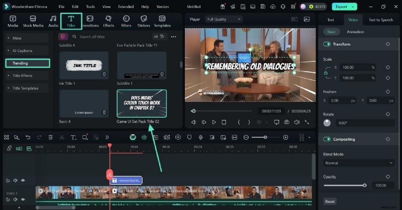
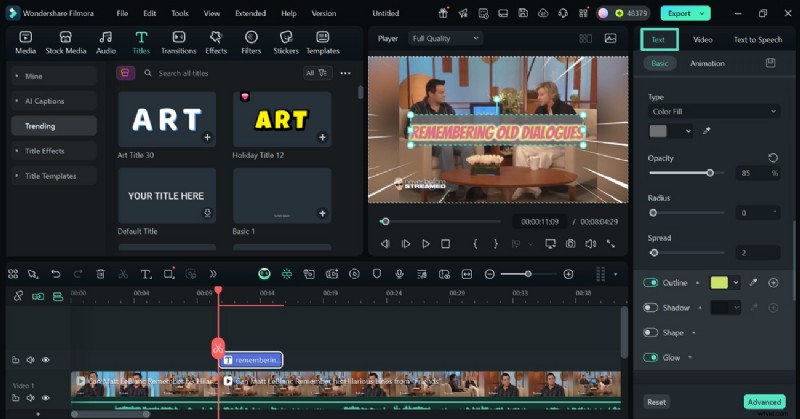
Method 2. Custom Titles Collection
- Select a title from the built‑in library in the Titles tab.
- Adjust font, size, color, and style in the right‑hand panel.
- Export once satisfied.
Part 5. Quick Text Editing on the Go with Filmora App
The mobile app offers the same powerful features, allowing you to generate AI captions or manually add text directly from your phone.
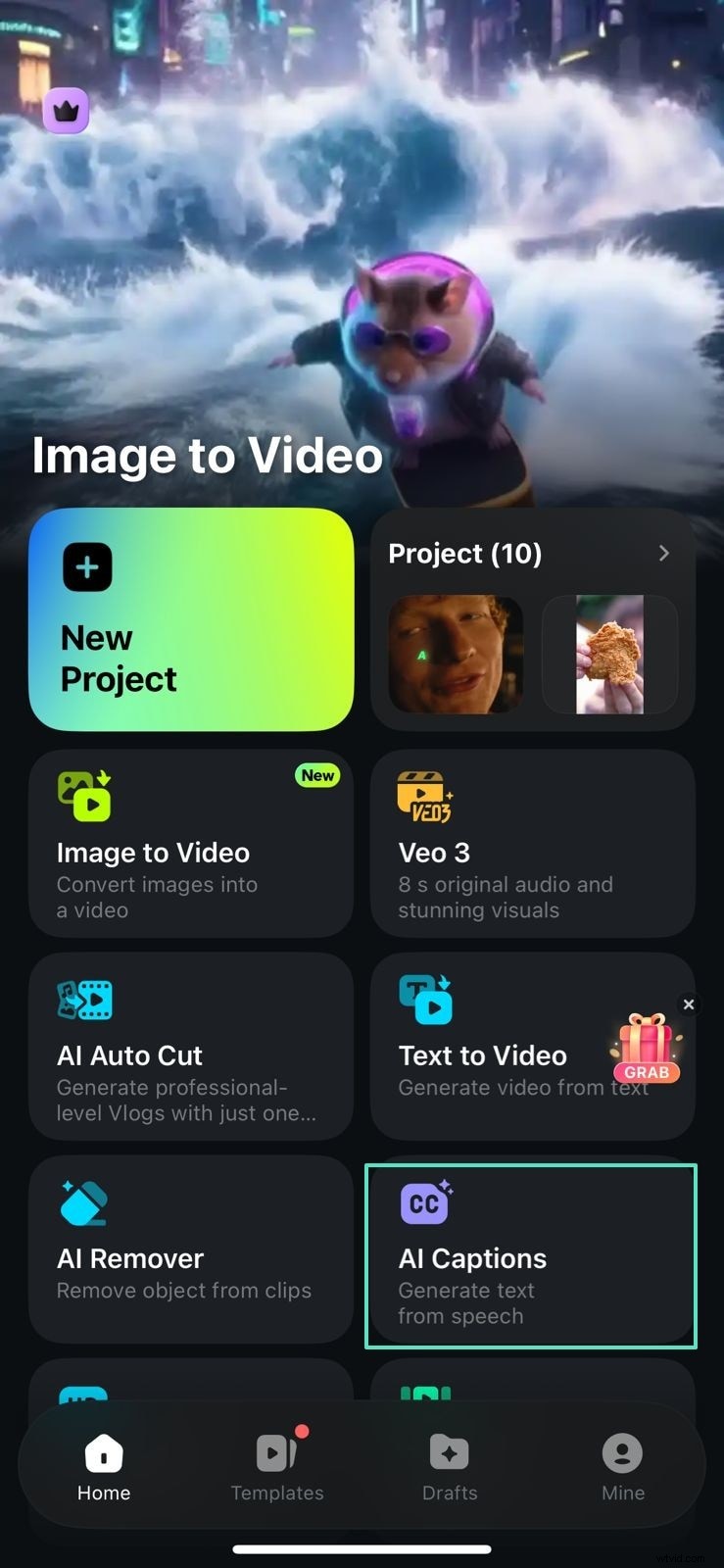
Method 1. AI Captions on Mobile
- Open the AI Captions tab and tap Add Captions.
- Select a template, review the automatically generated text.
- Export to your device.


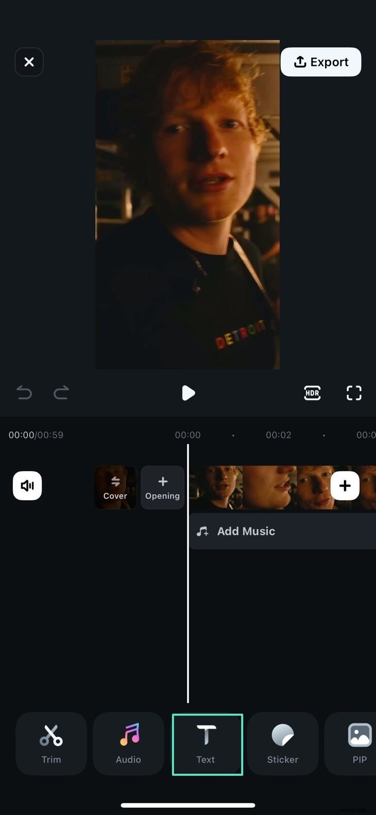
Method 2. Manual Text on Mobile
- Tap the Text tab and type your message.
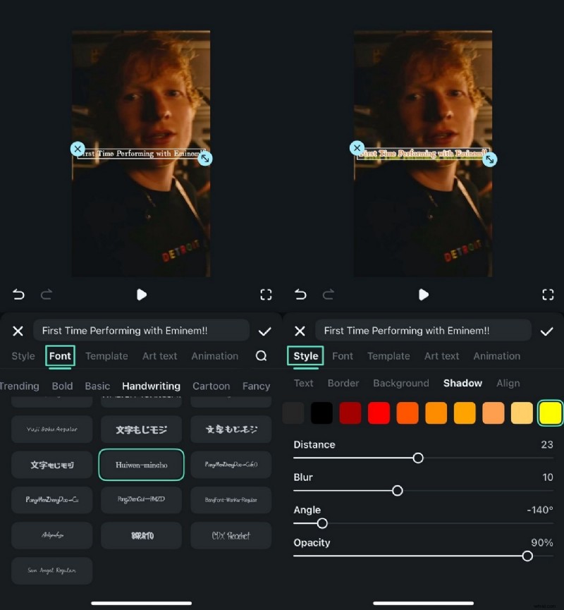
- Choose a font and tweak style settings in the Font area.
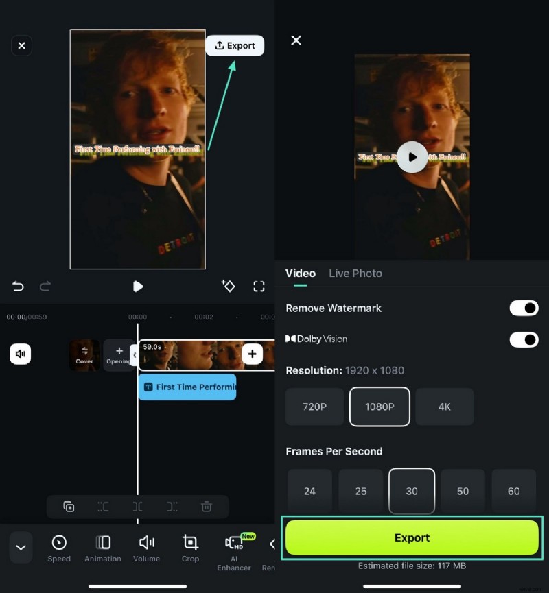
- Export once finished.
Part 6. Practical Tips for Applying Typeface Psychology
- Align with Brand Values: Choose a typeface that mirrors your mission and tone.
- Prioritize Readability: Ensure the font is legible across devices and screen sizes.
- Use Contrast in Hierarchy: Pair fonts strategically to guide the eye.
- Keep It Simple: Limit to two complementary styles to avoid visual clutter.
Conclusion
Understanding typeface psychology empowers you to create interfaces that not only look good but also feel right. By leveraging Filmora’s robust font toolkit, you can effortlessly translate these principles into compelling video content.