Reading Time: 6 minutes
Published: November 26, 2025 | Last Updated: November 27, 2025

What is a color scheme? Definition & Meaning
A color scheme is the planned combination of two or more colors used in a film to create a consistent visual style, mood, or emotional effect. The colors are chosen based on color theory and used across lighting, costumes, sets, and post-production grading. A well-defined scheme helps unify your film’s tone and guide the viewer’s emotional response.
Color schemes are not the same as color palettes. A color scheme is the structure behind your choices, like choosing complementary or monochromatic relationships. A color palette is the full set of actual colors on screen, including neutrals, skin tones, and accents.
How Color Works: Hue, Saturation, Brightness
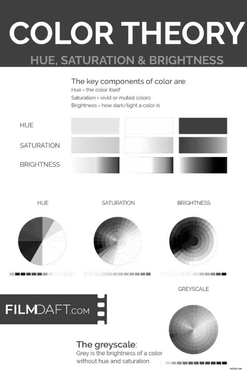
Before choosing a scheme, you need to understand the basic properties of color. These define how each color appears and how it interacts with others in your frame.
- Hue: The base color itself (like red, blue, green, or yellow).
- Saturation: The intensity of the color. High saturation looks bold. Low saturation looks dull or faded.
- Brightness (or Value): How light or dark a color is. This controls contrast and visibility.
By adjusting these properties, you can change the emotional tone of a scene without switching hues. A muted blue feels colder than a bright one, even if both are the same hue.
Types of Color Schemes in Film
Most film color schemes are based on relationships found on the 12-color wheel. Each type sets a different tone and emotional balance depending on how similar or different the hues are.
Monochromatic
In a monochromatic color scheme, a single hue is used throughout the scene, with variations in brightness and saturation. This creates visual unity and emotional focus.
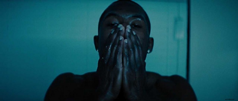 In Moonlight (2016), blue tones take over the frame as Chiron confronts his reflection in silence. The monochromatic palette expresses isolation and internal tension without using words. Image Credit: A24
Analogous
An analogous color scheme is colors that sit next to each other on the wheel and are combined to create harmony. These schemes feel warm, soft, or natural depending on the hues chosen.
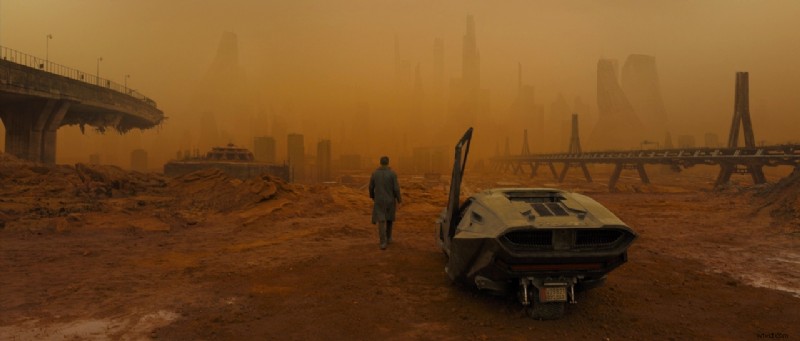 In Blade Runner 2049 (2017), director Denis Villeneuve and cinematographer Roger Deakins use an analogous color scheme of Orange, Red-Orange, and Yellow-Orange to flood the screen with toxic warmth. It creates a haunting, dreamlike version of the future. Image Credit: Warner Bros.
Complementary
In a complementary color scheme, two colors are opposite each other on the wheel. This creates high contrast and tension in the frame.
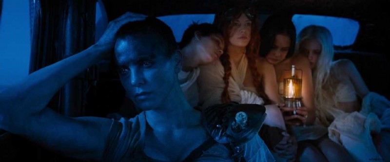 In Mad Max: Fury Road (2015), blue night-for-day lighting covers Furiosa while the wives sit in warm lantern light. The scene uses a strong blue–orange complementary palette that pushes the contrast between cold night and human warmth. Image Credit: Warner Bros.
Split-Complementary
One base color paired with the two hues beside its direct opposite. This softens contrast while keeping visual interest.
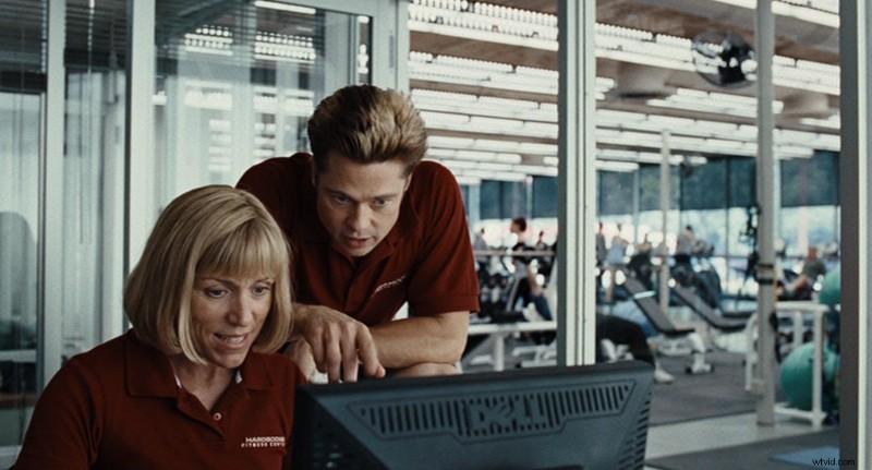 In Burn After Reading (2008, Mike Zoss Productions), the gym setting blends red uniforms with green and teal gym equipment, forming a subtle triadic palette. The Coen brothers use this scheme to give the mundane environment a precise, sterile balance while highlighting character absurdity. Image Credit: Mike Zoss Productions
Triadic
Three colors spaced evenly on the wheel are called a triadic color scheme. This creates a bold, colorful palette with strong balance.
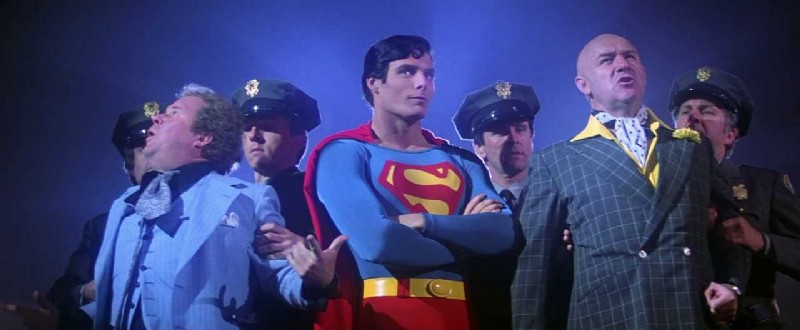 In Superman (1978, Dovemead Films), the triadic color scheme of red, blue, and yellow reinforces Superman’s iconic presence. His costume creates strong visual contrast against the muted police uniforms and Lex Luthor’s green suit. Image Credit: Dovemead Films and Warner Bros.
Tetradic (Double Complementary)
Two complementary pairs used together. This scheme offers variety and depth but can feel chaotic if not balanced carefully.
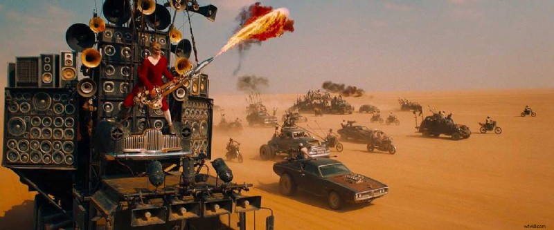 In Mad Max: Fury Road (2015, Kennedy Miller Mitchell), the explosive use of a tetradic color scheme—orange sand, blue sky, red costume, and yellow accents—creates intense contrast across the frame. The film’s bold palette heightens the chaos and energy of the desert chase. Image Credit: Kennedy Miller Mitchell/Village Roadshow Pictures/Warner Bros.
Read more on complementary color schemes in film.
How to Use a Color Scheme in Your Film
Color schemes do more than guide visual style. They carry meaning, shape mood, and help tell your story. To use them effectively, you need to plan ahead and stay consistent throughout production and post.
Understand Color Symbolism
Colors carry emotional weight. You can use these associations to support your theme, character arcs, or setting.
- Red: Love, danger, violence, intensity
- Blue: Calm, cold, sadness, control
- Green: Nature, jealousy, decay, rebirth
- Yellow: Energy, madness, warning, optimism
- Black: Power, grief, secrecy, elegance
- White: Purity, emptiness, isolation, mourning (in some cultures)
Read more on color psychology in film.
Pre-Production Planning
Start with your story’s tone. Choose a dominant hue and build a supporting scheme around it. Then:
- Create a lookbook or mood board for visual reference.
- Share your scheme with production design, lighting, wardrobe, and camera teams.
- Test how your colors look under real lighting conditions and on your chosen camera.
Color design is part of world-building. Every department needs to follow the same plan to maintain consistency on screen.
Color Grading in Post-Production
After the shoot, grading brings your scheme to life. You can adjust hue, contrast, and saturation to match your vision and unify the look.
- Fix inconsistencies between cameras, lighting setups, or locations.
- Push the emotional tone further by warming or cooling the image.
- Emphasize character shifts by gradually changing color over time.
When and Why to Shift a Color Scheme
Most films stick to one scheme for consistency. But changing your palette mid-film can be just as effective, if there’s a reason for it.
Shifting Across Acts
As characters grow or settings change, your color scheme can evolve too. This helps show emotional development or narrative shifts.
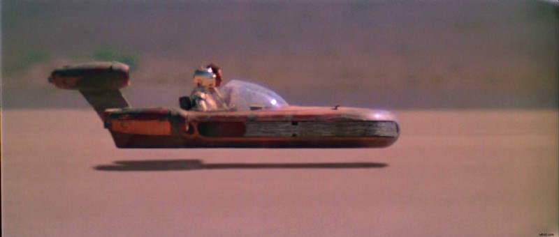 In Star Wars: A New Hope (1977, Lucasfilm), warm desert tones dominate Luke’s early scenes. The earthy reds, tans, and oranges reflect his innocence and isolation on Tatooine. Image Credit: Lucasfilm
 In The Empire Strikes Back (1980, Lucasfilm), the palette shifts to cold blues and harsh lighting as Luke faces Vader in Cloud City. The cooler tones emphasize fear, injury, and emotional conflict. Image Credit: Lucasfilm
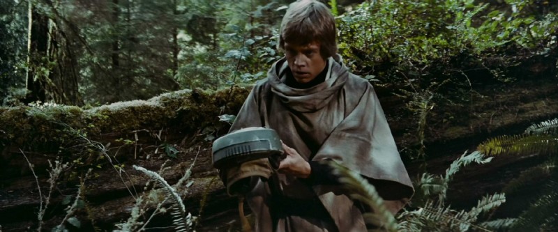 In Return of the Jedi (1983, Lucasfilm), natural greens and earthy browns define Luke’s scenes on Endor. The organic setting reflects maturity, control, and his connection to the Force. Image Credit: Lucasfilm
Example: In the Star Wars trilogy, Luke’s character arc (his hero’s journey) is reflected in color: warm earth tones on Tatooine, cold blues during conflict, and natural greens at the climax, each matching his personal growth.
Using Discordant Color for Emphasis
A discordant color breaks the established scheme to focus attention or create emotional contrast. This kind of visual clash feels intentional; it draws your eye and often signals that something is off, wrong, or important.
 In Sin City (2005, Troublemaker Studios), yellow is used as a discordant color to shock the viewer. The vivid syringe fluid disrupts the film’s monochrome palette, signaling danger, corruption, and obsession. Image Credit: Troublemaker Studios
Example: In Sin City (2005, Troublemaker Studios), the film’s stark black-and-white world is occasionally pierced by bold, unnatural colors. For example, the yellow skin of the character Roark Junior creates immediate disgust and tension. It’s a discordant color that doesn’t just stand out visually; it marks the character as toxic and corrupt within the story’s moral world.
Summing Up
A color scheme is a structured set of color relationships that guides your film’s emotional and visual identity. It helps you control mood, focus attention, and unify the look of your film. Whether you stick to a single palette or shift it with purpose, choosing your scheme early (and applying it clearly) gives your visuals more clarity and meaning.
Read Next: How do you design the look of a film?
Visit our Production Design section to learn how sets, props, and color palettes support story, character, and tone from the start.
Want the full picture? Explore the Pre-Production archive for everything that happens before cameras roll—from visual planning to script breakdowns.