Reading Time: 5 minutes
Published: November 27, 2025 | Last Updated: January 19, 2026

What is a triadic color scheme? Definition & Meaning
A triadic color scheme selects three hues that are evenly spaced around the color wheel, forming a triangle. This arrangement delivers strong contrast while maintaining a cohesive visual hierarchy. In film, triadic palettes are ideal for bold, distinct colors that separate key elements, but they require careful calibration to avoid visual overload.
How Triadic Color Schemes Work
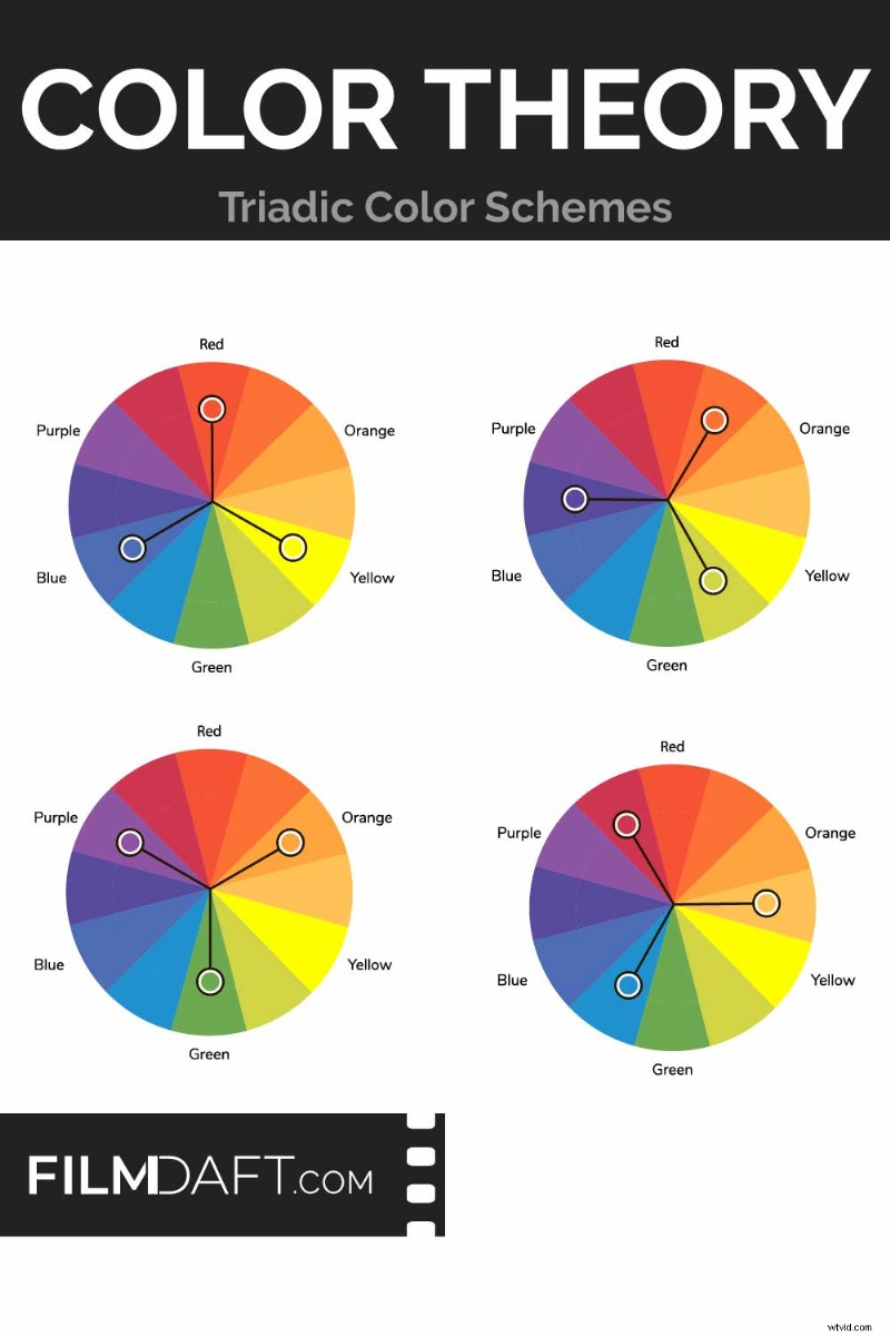 Triadic Color Schemes rely on three hues spaced 120° apart on a 12‑step wheel. Common sets include red–yellow–blue, orange–green–purple, and tertiary variations. These configurations provide contrast while keeping the frame balanced. Image Credit: FilmDaft
On a 12‑step color wheel, triadic palettes are created by selecting three colors 120° apart. You can build triads from:
- Primary colors: red, yellow, blue
- Secondary colors: green, orange, violet
- Tertiary colors: blue‑green, red‑orange, yellow‑violet
Each hue conveys a distinct emotional tone—red signals urgency or intensity; blue feels calm or distant; yellow adds warmth or energy. Combining all three yields contrast that can delineate props, costumes, and environments, such as red props, blue costumes, and yellow backgrounds.
Read more on Color Theory in Film.
Often, One Color Dominates the Frame
In practice, a triadic palette rarely employs all three colors at full saturation. Typically, one hue anchors the scene while the other two serve as accents. Saturating all three creates visual noise; dimming two colors preserves readability and guides viewer focus—for example, a muted background lets a bold costume stand out.
The dominant hue shapes the scene’s mood. A red‑dominated frame feels tense or aggressive, whereas a blue‑dominant version feels distant or cold. Adjusting saturation and brightness can further refine emotional impact—full‑saturation red can appear fierce, while a faded red becomes passive. Bright yellow lighting feels cheerful, but a dimmer yellow can feel sickly or tired.
Color Schemes and Genres: When Triadic Color Schemes Succeed (and When They Don’t)
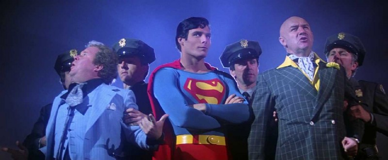 In Superman (1978, Dovemead Films), the triadic red, blue, and yellow reinforce the hero’s iconic presence. The costume contrasts sharply against muted police uniforms and Lex Luthor’s green suit. Image Credit: Dovemead Films and Warner Bros.
Triadic schemes excel in stylized genres—animation, sci‑fi, fantasy, superhero—where clear visual separation is essential. Assigning each hue to a specific element (foreground, costume, background) keeps characters legible amid busy frames.
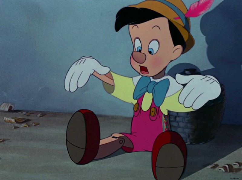 In Pinocchio (1940), Disney uses red overalls, a yellow shirt, and a blue bowtie. These evenly spaced primary hues energize the character against a muted backdrop. Image Credit: Walt Disney Animation Studios
In animation, triadic palettes often guide emotion or signal scene transitions. In superhero films, distinct hues in costume, lighting, and background keep characters prominent. The palette structures space and supports the genre’s tone.
Less Saturated Triadic Schemes for Drama
Realistic dramas or grounded narratives find triadic palettes challenging, as wide contrast can feel artificial. Yet, dialing down saturation can make a triadic scheme work—see Jean‑Luc Godard’s French New Wave film Crazy Pete (Pierrot le Fou 1965).
 In Pierrot le Fou (1965), the red car, blue uniform, and yellow accents form a triadic color scheme. Godard arranges the hues in bold, clean planes—separating character, car, and background with minimal overlap. Image Credit: StudioCanal
How to Use Triadic Color Schemes in Your Work
Begin by selecting three hues 120° apart on a 12‑step wheel. Choose one color to lead the frame, letting the other two support. This hierarchy is common in film, where a dominant hue anchors the scene while others appear in costumes, props, or lighting.
Using equal amounts of all three hues is possible but harder to control. Without a clear visual hierarchy, the image can feel cluttered. Adjusting saturation and brightness helps one hue dominate while the others remain background.
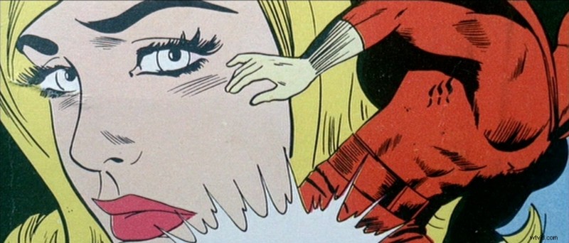 In Pierrot le Fou (1965), this stylized insert mimics comic‑book printing. It uses a yellow‑red‑blue triadic palette with black outlines, flattening the image into pop‑art language. Godard uses it to blur the line between pulp fiction and reality. Image Credit: StudioCanal
Some films and animated works employ more balanced triadic palettes successfully, especially in stylized or graphic scenes where lighting, framing, and costume design are tightly controlled. The key is to keep hues distinct and avoid competition for attention in the same space.
Always Test Your Color Scheme Under Lighting!
Test how colors react under various lighting conditions. A bright yellow may shift toward orange under tungsten; a teal prop can cast onto costumes, upsetting the triadic balance. Triadic color works best when it remains consistent across the frame—from walls and wardrobe to bounce light and shadows.
Read more on Color Temperature in Film.
Coordinate Your Color Scheme with Other Departments
Triadic color requires collaboration across departments. Costumes, lighting gels, wall colors, and grading all influence how hues appear. For instance, a blue costume lit with orange practicals may shift into violet, breaking the triadic spacing. Shared planning is essential to keep the scheme intact during production and post‑production.
Summing Up
A triadic color scheme uses three evenly spaced hues on the color wheel to create contrast and structure across the frame. It functions best when one color dominates and the others support. Control saturation, test under lighting, and maintain consistency across departments. When applied thoughtfully, triadic color helps separate space, guide attention, and tie emotional tone directly to each scene’s look.
Read Next: How do you design the look of a film?
Visit our Production Design section to learn how sets, props, and color palettes support story, character, and tone from the start.
Want the full picture? Explore the Pre‑Production archive for everything that happens before cameras roll—from visual planning to script breakdowns.