Reading Time: 5 minutes
Published: November 27, 2025 | Last Updated: December 2, 2025

What is an analogous color scheme? Definition & Meaning
An analogous color scheme (also called a similar color scheme) is a group of three or more colors that sit next to each other on the color wheel. These colors are close in hue, so they look naturally related, making the frame feel stable and visually connected. For example Blue, Green, and Blue-Green or Red, Orange, and Yellow.
How Analogous Colors Work
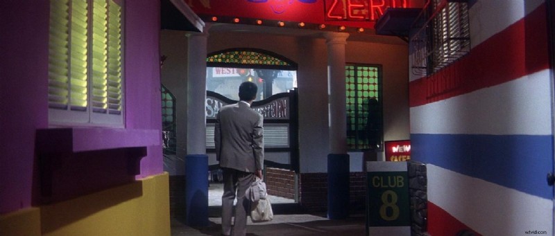 In Tokyo Drifter (1966), violet and blue-violet tones run across the club alley. The analogous colors heighten the stylized world of Tokyo’s criminal underbelly. Image Credit: Nikkatsu
Analogous color schemes rely on proximity on the color wheel. You choose one main color and then use the ones closest to it. This keeps everything visually related but allows subtle shifts in tone and lightness. The colors shift gently between hues, so the frame stays consistent without feeling flat.
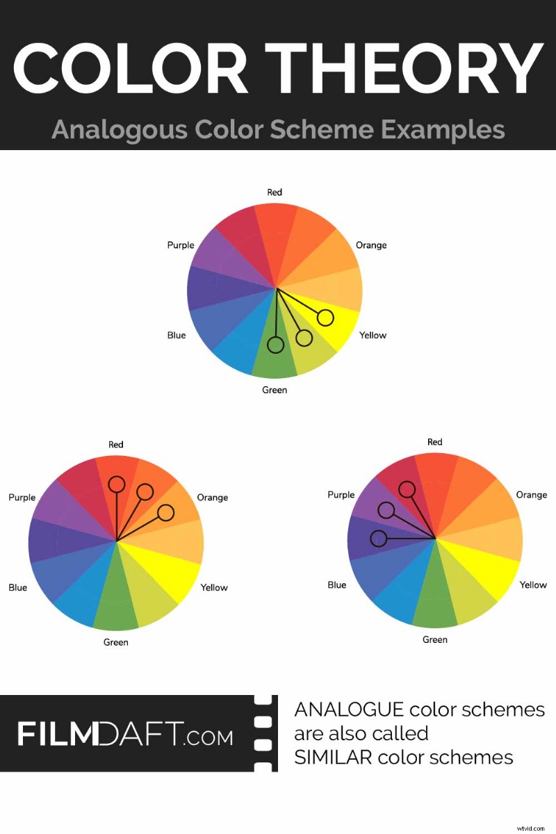 In this graphic, three color wheels show how analogous color schemes group hues that sit next to each other. These combinations — like green-yellow-orange or red-magenta-purple — help create smooth, unified visuals across lighting, costume, and design. Image Credit: FilmDaft.com
Unlike complementary schemes, analogous schemes do not create visual contrast. Analogous colors blend with minimal separation, creating a soft transition from one hue to the next. This makes them useful when you want your lighting, costume, and background to all feel like they belong in the same emotional space.
Common Analogous Palettes in Film
These combinations are common because they match the mood filmmakers want, like warmth in romance or tension in drama. Here are three groupings and how they affect scenes:
Red – Red-Orange – Orange: rich, warm harmony often used in romantic or nostalgic grading
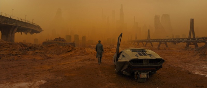 In Blade Runner 2049 (2017), director Denis Villeneuve and cinematographer Roger Deakins use an analogous color scheme of Orange, Red-Orange, and Yellow-Orange to flood the screen with toxic warmth. It creates a haunting, dreamlike version of the future. Image Credit: Warner Bros.
Orange – Yellow-Orange – Yellow: brighter warmth, good for sunlight-heavy scenes
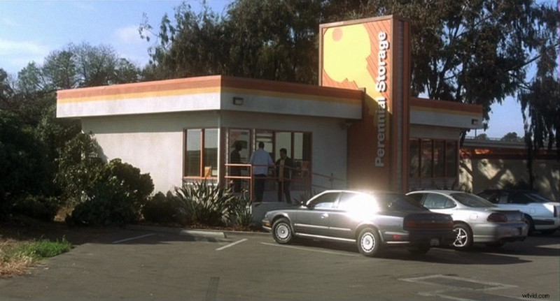 In Traffic (2000), the San Diego storyline uses a true warm-side analogous palette of orange, yellow-orange, and yellow. These hues run through the signage, trim, and sunlight — creating a dry, sun-baked tone that reflects the suburban Southern California setting. Image Credit: USA Films
Green – Blue-Green – Blue: calming cool range, used in many sci-fi or drama films
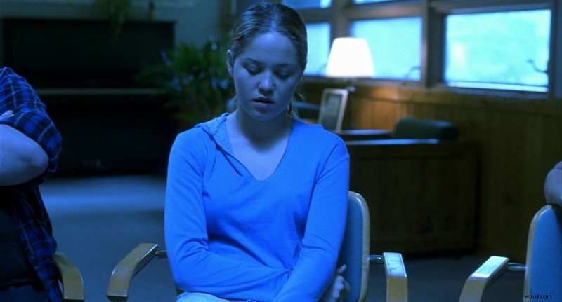 In Traffic (2000), the Ohio rehab scenes use a blue–blue-green–cyan palette. The analogous grading isolates the character emotionally. Image Credit: USA Films
Blue – Blue-Violet – Violet: creates a dreamy, distant tone for fantasy or emotion-heavy scenes
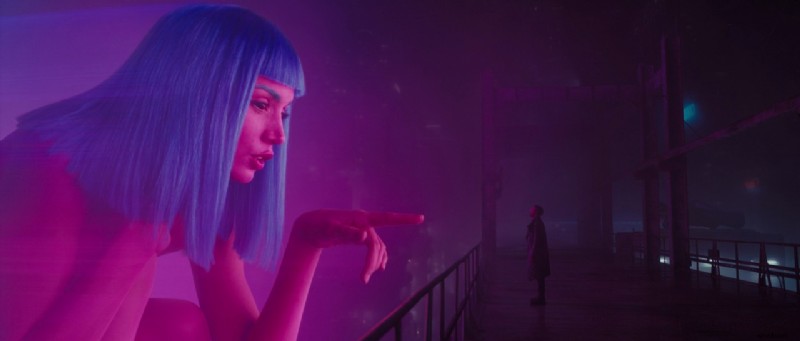 In Blade Runner 2049 (2017), this hologram scene uses a high-saturation analogous palette of magenta, violet, and blue. The cool colors blend seamlessly, creating a surreal, synthetic space that blurs the line between real and artificial. Image Credit: Warner Bros.
Why Analogous Color Works in Film
Analogous color makes each shot feel emotionally stable by keeping the hues consistent. It removes strong contrasts, so nothing distracts from faces or motion. This helps scenes feel like parts of one continuous world. It also helps reflect how characters feel or how the story unfolds over time.
- Warm palettes (red–orange–yellow): suggest intimacy, nostalgia, or desire (or nuclear disaster as in Blade Runner 2049).
- Cool palettes like green–teal–blue: avoid sharp contrast, which helps scenes feel quieter and more internal
- Low contrast: keeps the viewer focused on faces, gestures, or movement
- Dreams or flashbacks: often use soft analogous tones to feel emotional or unreal
Read more on color psychology in film.
Worldbuilding with Analogous Palettes
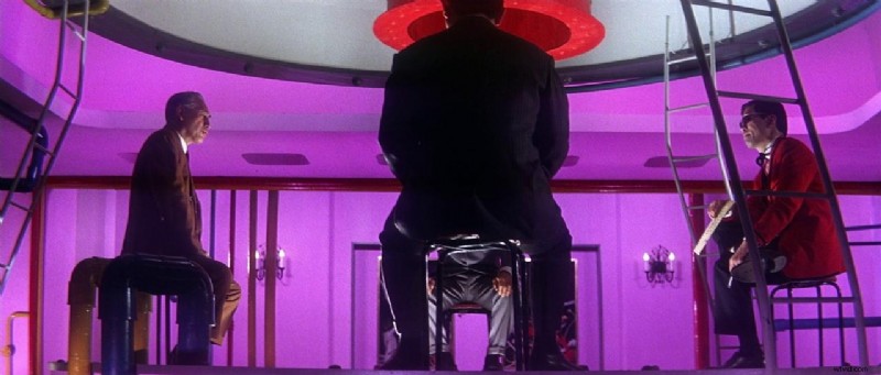 In Tokyo Drifter (1966), director Seijun Suzuki stages a meeting in a room lit with red-violet, violet, and magenta hues. The analogous color scheme gives the scene a surreal, theatrical tone. Image Credit: Nikkatsu
Analogous schemes help set a clear visual identity by repeating similar hues across locations, costumes, and lighting. They make the design choices feel connected across scenes, with no sudden color shifts that break immersion. This makes them especially useful in fantasy, period films, or stylized worlds.
- Unify production design across multiple locations
- Distinguish the film’s world from everyday reality
- Reusing the same set of related colors helps reinforce the film’s mood (such as warmth, tension, or dreaminess), scene after scene
Using Analogous Color in Grading
You can also apply an analogous palette in post-production. Color Grading lets you change how a scene feels (warmer, colder, more distant) by adjusting shadows, midtones, and highlights toward a selected part of the color wheel.
- Unify shots filmed under different lighting conditions
- Apply the same color range (like orange and yellow) to scenes shot in different places so they feel like they belong to the same world
- Make scenes feel distant, poetic, or reflective, like a memory
Here you can find links to free creative cinematic LUTs for color grading.
Tips for Using Analogous Color in Your Scenes
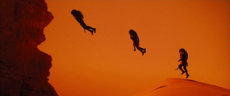 In Dune: Part Two (2024), orange dominates the frame, with red and red-orange used as subtle accents in the sand and cliffs. The narrow color range builds visual unity, while soft shadows and low texture keep the image from becoming overwhelming. Image Credit: Warner Bros.
It’s easy to pick similar hues, but you still need to control how much of each one shows up in the frame. Here’s how to build a palette that works in a film scene:
- Pick one dominant hue to lead the look
- Use adjacent hues as support, never equal strength
- Adjust brightness and saturation for variety
- Use neutral grays or soft textures to avoid overloading the frame
Summing Up
An analogous color scheme uses colors next to each other on the wheel. It helps every element (lighting, costume, background) feel like they belong together. With a soft, consistent color range, you can draw attention to what really matters in the scene, like a character’s face, emotion, or movement. When used with intention, it links color to emotion, so the visuals reflect how a character feels or what the story is focusing on.
Read Next: How do you design the look of a film?
Visit our Production Design section to learn how sets, props, and color palettes support story, character, and tone from the start.
Want the full picture? Explore the Pre-Production archive for everything that happens before cameras roll—from visual planning to script breakdowns.