Meet Adobe’s latest update — the most baffling design choice in recent memory. Let’s take a look at why it’s the complete opposite of optimal.
If you just updated your Adobe Creative Cloud to the latest versions, you surely immediately realized your taskbar now looks incredibly confusing. I’m a PC user, and my taskbar is a pretty sacred place. I like my apps in certain orders, and I want to open them at a glance so I can immediately get to work (or, you know, open up a browser and waste all my time before realizing I’ve lost half a day). Anyway, as you’ve certainly already figured out, I find the taskbar’s new look fairly jarring.
This is what my most frequently used Adobe apps looked like before the new update.

Since I rarely update while in the middle of a project, I was (as you can see above) a few versions behind with Premiere, After Effects, and Audition. So, having recently wrapped up a few projects all around the same time, I seized the opportunity to update the apps, if only to see what’s new. What could possibly go wrong?
Well, quite a bit apparently. This is what my taskbar looks like now.

Ouch! It’s atrocious! To better put this into context, let’s look at it from a full taskbar perspective.
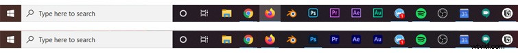
This is an outrage. A travesty even. How am I supposed to tell these already hard-to-read icons apart? For years my brain was trained to click on the appropriate color, and now I have to stop and think before I even begin working. During the entire update process, I could just feel my sanity slipping away. Farewell, old green friend.

This is a controversial design update. Even compared to existing icons, the new icons are smaller and harder to read. Did they even consider users using dark modes? As for opening the programs, I know the order of the apps is based on my preference, but do you know how many times I still manage to accidentally open Audition instead of After Effects? It’s a lot. And this new update makes things even worse.
Now I have to squint at my taskbar just to make sure I’m clicking the proper letters. Even then, all my apps start with the same two letters. How does Adobe not know that those app colors are iconic? They are burned into my brain. They have been for years!
Why the change?
I understand the intent behind this idea: Easily group photo applications together into one brand color while grouping video and motion apps into another color. How, in the grand scheme of things, does that even matter? I think it actually over complicates things. Let’s look at how Adobe themselves categorize things.
I open Creative Cloud to see the Photography category.
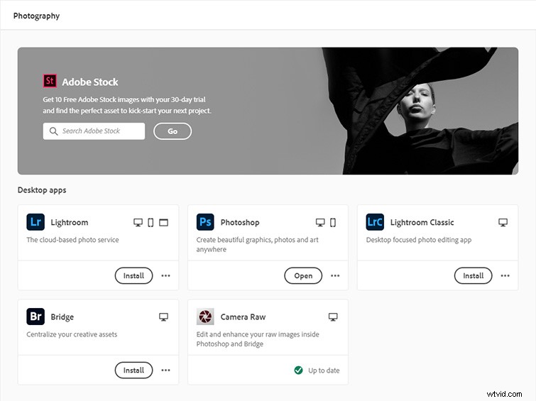
Alright. Mostly blue. This makes sense overall. Bridge is black, but whatever, that makes sense too. Then I look at Video and Motion.
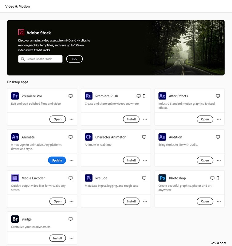
Man, that is a lot of purple. And video editors and motion designers like myself do use Photoshop too, so, okay, it makes sense to see it. But we are now only two categories in, and the color scheme is already breaking down. What’s next? Illustration.
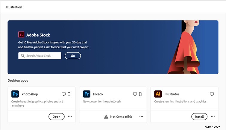
You can already see where this is going — if Photoshop is nearly universal to all categories, this isn’t going to work. What about 3D?

Again, Photoshop. Dimension is green. Not shown? Substance (not yet part of CC), which has a red logo. Sorry, Substance — you’re amazing, for sure, but you’re still next.
Final Thoughts
I’m sure this concept was fueled by the best of intentions, but, ultimately, Adobe is trying to fix a problem that doesn’t exist. How does a company considered a leader in the design community not see the obvious flaws of this new update? It’s all so seemingly half-thought that you’d be forgiven for thinking that the iconic color-based branding we’ve all learned to instantly identify (and build into our workflow muscle memory) was a “happy accident” all along.
Looking for additional Adobe-related content? No problem:
- Cleaning and Mastering Audio in Premiere Pro with Audition
- Speed up Your Editing with a Keyboard-Only Workflow in Premiere
- Exploring the New Lens Distortion After Effects Plugin
- How to Remove the Boom Mic in Resolve and Premiere
- Premiere Pro Is Dead: Why It’s Time to Make the Switch