Viewers are complaining that they couldn’t actually see parts of the latest episode. Is this due to cheap televisions or by design? This article contains spoilers.
Sunday’s “The Long Night” episode left the audience with lots to talk about. Many took to Twitter to lament that they couldn’t make out certain elements of the battle. At first, I thought this might be a case of High Dynamic Range televisions versus Standard Dynamic Range sets. Turns out I was wrong, but also kind of right.
My Test
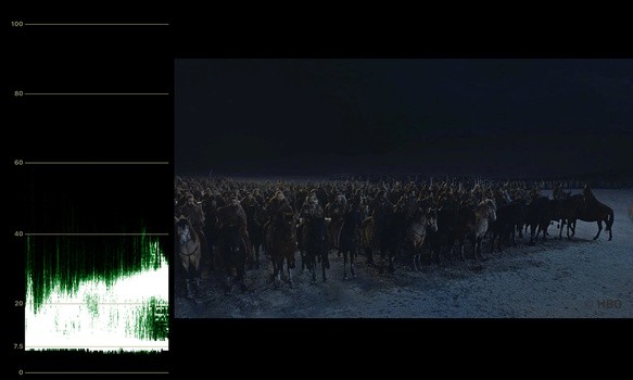
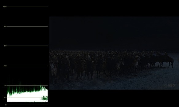
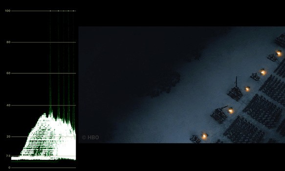
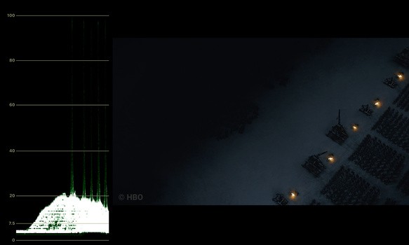
I briefly pulled some screenshots into Adobe’s Premiere Pro, so I could get a rough insight into the Luma waveform (using ScopeBox). I'm reading the IRE levels as 0% and 100% bright for simplicity. My method was to take PNG screenshots of the (heavily compressed) behind the scenes content that HBO has online. There are plenty of shots from the real episode in the above video, and this way, readers can see what I’m seeing.
Understanding that my resulting image is egregiously compressed, I wouldn’t call my testing an exact science. However, it might give us a heads up on what Fabian Wagner, the cinematographer, wanted to get across. Remember that you’re looking at these screenshots on a smartphone or computer monitor, which adds its own unpredictability.
Before and After
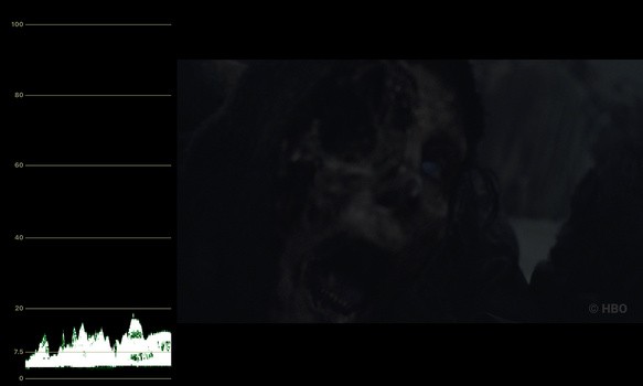
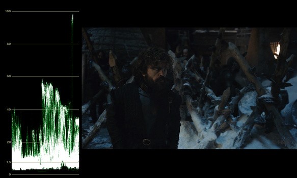
Here are some dark shots, with the exposure brought up about a stop, whites raised, highlights raised a little, and shadows generally left. You’ll see the compressed image breaks apart in my waveform and in general. I’m trying to hone in on what might look good for Fstoppers readers, not necessarily $3,000 TV viewers. Slide over the images to see before and after versions.
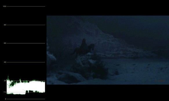
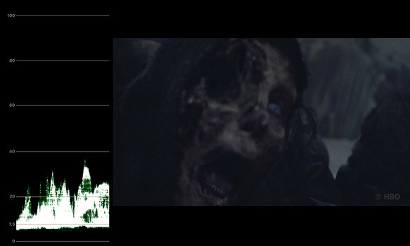
To think that a CG team spent time making this White Walker shot, only for it to be so unnoticeable, is pretty heartbreaking.
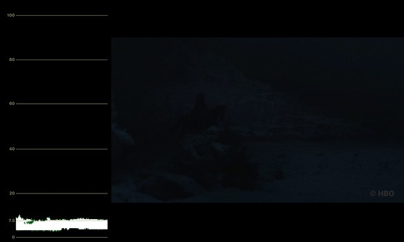
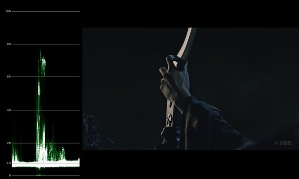
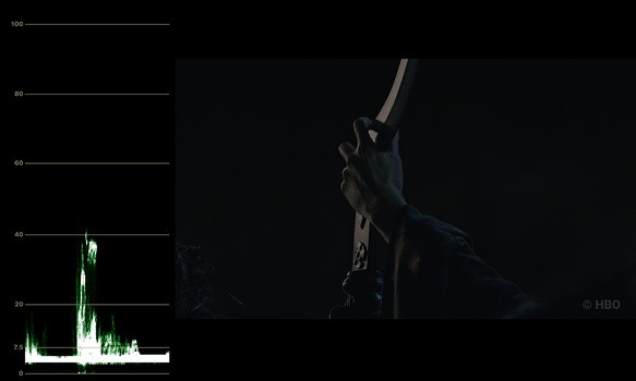
The next two shots I feel were more on the mark and can't imagine how viewers had trouble seeing them. Nonetheless, it's pretty interesting.
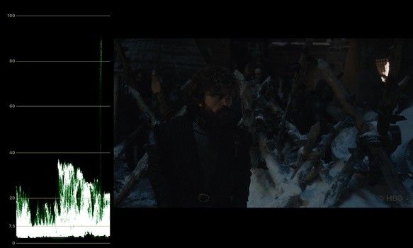
Peter Dinklage's skin tone comes in at around 20 IRE here.
To me, these scopes show that a viewer’s television doesn’t have a lot to work with and misaligned settings could become very apparent. The shadows mix in with midtones at 7.5 IRE, and most often, the exposure doesn't reach above 30 IRE. Usually, one would aim to get skin tones sitting at around the middle of the chart, but that's been cast to the wind like Dany's original plan. An old rule of thumb would be to aim for 70 IRE skin tones, but I wouldn't worry until you get to 40 IRE.
For everybody adjusting your televisions, I wouldn't go too crazy. The stream is compressed too much, and there's only so much extra detail you can pull out before the image falls apart (as you can see from my charts). Besides, you might risk overexposing the shots from within the castle.
This isn’t a corporate YouTube video, it’s a cinematic experience. There's more than meets the eye here, and throwing out the videographer's rule book shouldn't be a problem. I don't have a problem with any creative decision here.
The Reason
Did HBO get this wrong? People are debating whether this is a mistake or not. There isn’t just one issue at play here, and I don’t think it’s anybody’s fault.
They're Professionals
Firstly, to say that the cinematographer and everybody else on set ignored their exposure tools and Flanders for weeks on end is naive. Then, to say that colorists ignored their scopes and didn’t test the image on various screens is laughable. We can speculate on story-related theories all day, but this would be a massive fault on the shoulders of many. Wagner told TMZ: "I know it wasn't too dark because I shot it."
I can’t find any material from HBO, but take a look at Netflix’s submission requirements to get a sense of how conscious a production team would be about technical details. Nobody along the entire pipeline should have any discrepancy.
Feeling Over Function
Secondly, between the cinematographer and the director (Miguel Sapochnik), I don’t think they wanted to audience to see all that much detail. A lot of the screenshots I took are during quick cuts, where the audience is meant to feel how difficult it is to fight without light. Most of these shots don’t last for more than a second, and in a way, they’re the texture during the battle. The editing is superb, so it's easy to follow.
I think the argument could be made that it’s meant to feel dark, and the audience isn’t really missing anything by turning their TV’s gamma up a few notches. You should feel like the Dothraki.
HBO's Limitations
So, taking all of that on board, all that’s left is the user’s television set. HBO doesn’t currently stream HDR (nor 4K) video. Game of Thrones, in this setting, is confined to the Rec.709 color space. That’s not a lot of wiggle room, and some users may have experienced crushed blacks more so than others. It’s definitely too dark for daytime viewing. Season 2 of Stranger Things was available in HDR, and the difference it makes to this scene is pretty stark. Note that Steve's skin tones in the first shot sit at around 30 IRE when I tested, and you'll also want to watch it on Netflix for the full effect.
Checking the scopes in this Game of Thrones episode, I think they look obscenely underexposed. Viewers would absolutely need to mitigate glare and make an effort to check their TV’s settings. While a more contrasting, brighter look could have saved the day, I don’t think HBO should change the final look to suit more televisions. Personally, I felt it looked fine on a pretty standard TV in a dark room. All in all, I’m excited for the next episode and glad that overzealous lighting didn’t get in the way of realism.