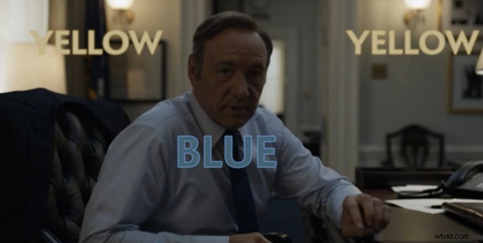
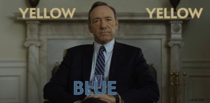
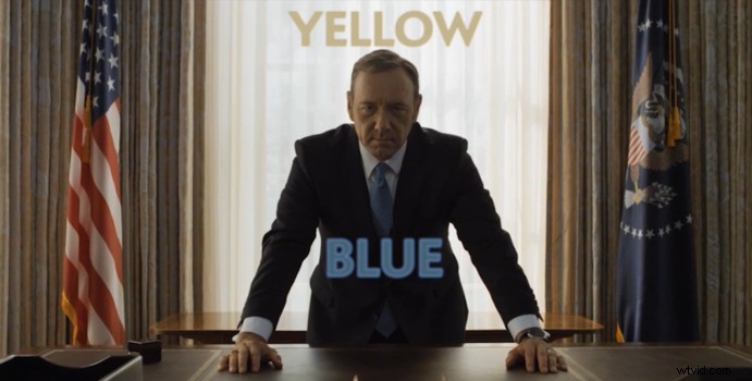
House of Cards, in my opinion, is one of the best shows available to stream on Netflix - if not anywhere. Their breakout drama series exploded on the scene just a few short years ago well before their original content became synonymous with high quality shows, movies and documentaries currently on the network. House of Cards' true appeal (outside of the hilariously twisted Frank Underwood) is the way it's artistically shot. This video demonstrates just how powerful two colors can make a show about corrupt American government that much more beautiful.
In this breakdown of each of the first two seasons of House of Cards, the guys over at The Slate show us how powerful the colors blue and yellow can add such a dynamic and creative pallet to the show's overall tone. Having seen all three seasons myself, no I wont spoil it for you, but I have finally found a new appreciation about how the show was creatively shot. To create a consistent color pallet and overall tone to a show of this nature is no easy task. The soft ambient look and feel feeds to the political drama perfectly, though this small trick of a blue foreground and a yellow/orange background truly blew me away in how a show is perceived. Its basic separation of each brings forth a great primary and secondary focal point. Outside of the obvious extreme depth of field the show already puts forth, I am even more appreciative of the thought that goes into a production like this.
Check out the photos below along with the video to explore scenes from the show that take advantage of this seemingly basic tactic. Also be sure to call out more small details you may have noticed in the show and leave them in the comments below!
Now that I have finished three full seasons of House of Cards, it's my new goal to run back through the seasons and find how much I missed in the details of this incredibly artistic show.
[via Slate]