If you haven’t studied the posters for the latest Marvel blockbusters, you’re truly missing out on the movie poster renaissance.
Independent films have long been the place to see more intricate or experimental design choices. But, in the past few years, a major movement has returned the glamour of movie posters to major blockbuster films.
The rise of boutique poster printers like Mondo has helped reinvigorate the love of movie poster design, and major studios have finally returned to their creative roots with better designed poster campaigns.
In recent years, Marvel has been one of the most successful movie studios, not only producing wildly entertaining and successful films, but also a series of stunning posters.
This should come as no surprise, given the company’s history in comics—but the colorful designs of their posters is mostly related to Phase 2 of their films.
Let’s break down these design concepts evolutionarily by year, starting with perhaps the most iconic poster, Guardians of the Galaxy. We’ll also give some side-by-side examples for comparison.
Let’s do this!
Guardians of the Galaxy Marvel Movie Posters: Then and Now
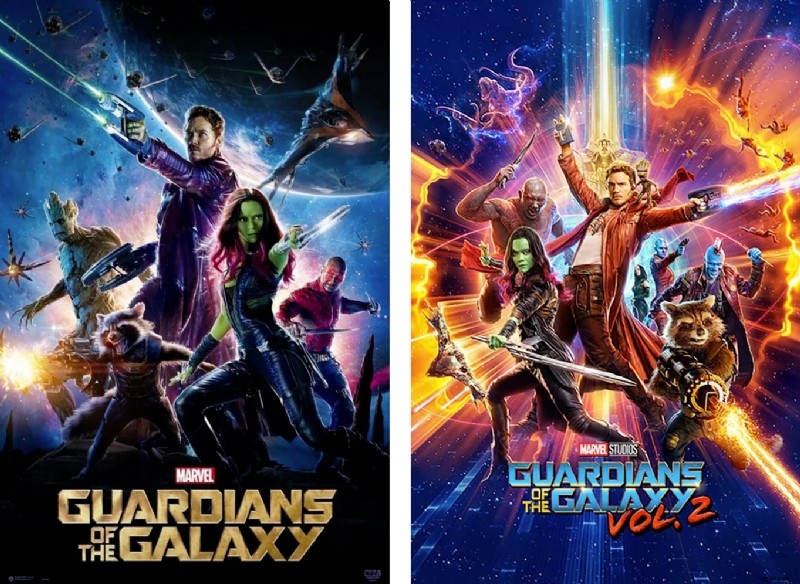
If you walked past the display of posters at your local theater in 2014, you were likely to see overused and stale color palettes and layouts, as shown on the left.
The first Guardians of the Galaxy poster broke the mold with its nebulous purples, intergalactic blues, and striking gold typeface.
It was also one of Marvel’s first movie posters that really nailed the look of a large ensemble cast. This balance is difficult to achieve, given that nearly every studio wants to repeat its success with as many well-known characters as possible—most don’t achieve that goal in a visually pleasing way.
This first Guardians poster has truly altered the look of Marvel’s films and posters since, specifically in their more cosmic franchises. While the Earth-based films like Ant-Man and Captain America: Civil War stay rooted in a (darker) realistic world, the cosmic films have brought comic book color to life.
When it came time to revisit Guardians of the Galaxy for round two, director James Gunn challenged his designers and VFX artists to stray from the purples that became associated with the first film. For Guardians of the Galaxy Vol. 2, he states:
The Guardians of the Galaxy Vol. 2 poster ties the color scheme of the film into various portions of the artwork. It also includes the ensemble cast by featuring characters throughout the foreground and background.
Guardians of the Galaxy Vol. 3 is expected to release in 2023.
Doctor Strange Marvel Movie Posters: Then and Now
One of Marvel’s films that depicts a dark Earth reality and also reaches out to the cosmos is Doctor Strange.
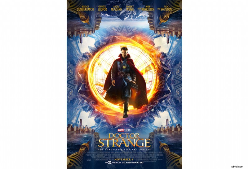
While this first poster keeps the traditional orange and blue palette, its use of reflection and symmetry invites a second glance from viewers. It has a stunning balance, and the manipulation of the New York skyline is attention-grabbing.
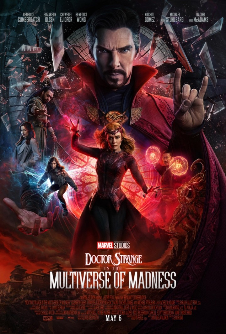
Similarly to Guardians of the Galaxy, the second Doctor Strange: in the Multiverse of Madness hosts an entirely new look. Given that colors do prompt a particular message and psychology, changing this one element holds a massive impact.
Often, when movies or brands rebrand, it creates curiosity, shock, or even intrigue. Using secondary color palettes can make it so you don’t stray too far from center.
Or, select an entirely new palette, as this one does, for optimal impact. Boost colors, textures, and effects, and you’ll have everyone on the edge of their seats.
Thor Marvel Movie Posters: Then and Now
The second Guardians film introduced more bright colors into the Marvel Cinematic Universe, and that might be most apparent in the latest Thor film, Thor: Ragnarok.
In the original films, the Norse god was forced into Earth-based conflicts, but as he returns to the cosmos in this third installment, audiences are treated to an incredibly refreshing film—and was arguably the most colorful movie poster in this roundup—until the latest release this year.
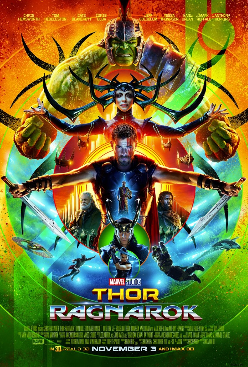
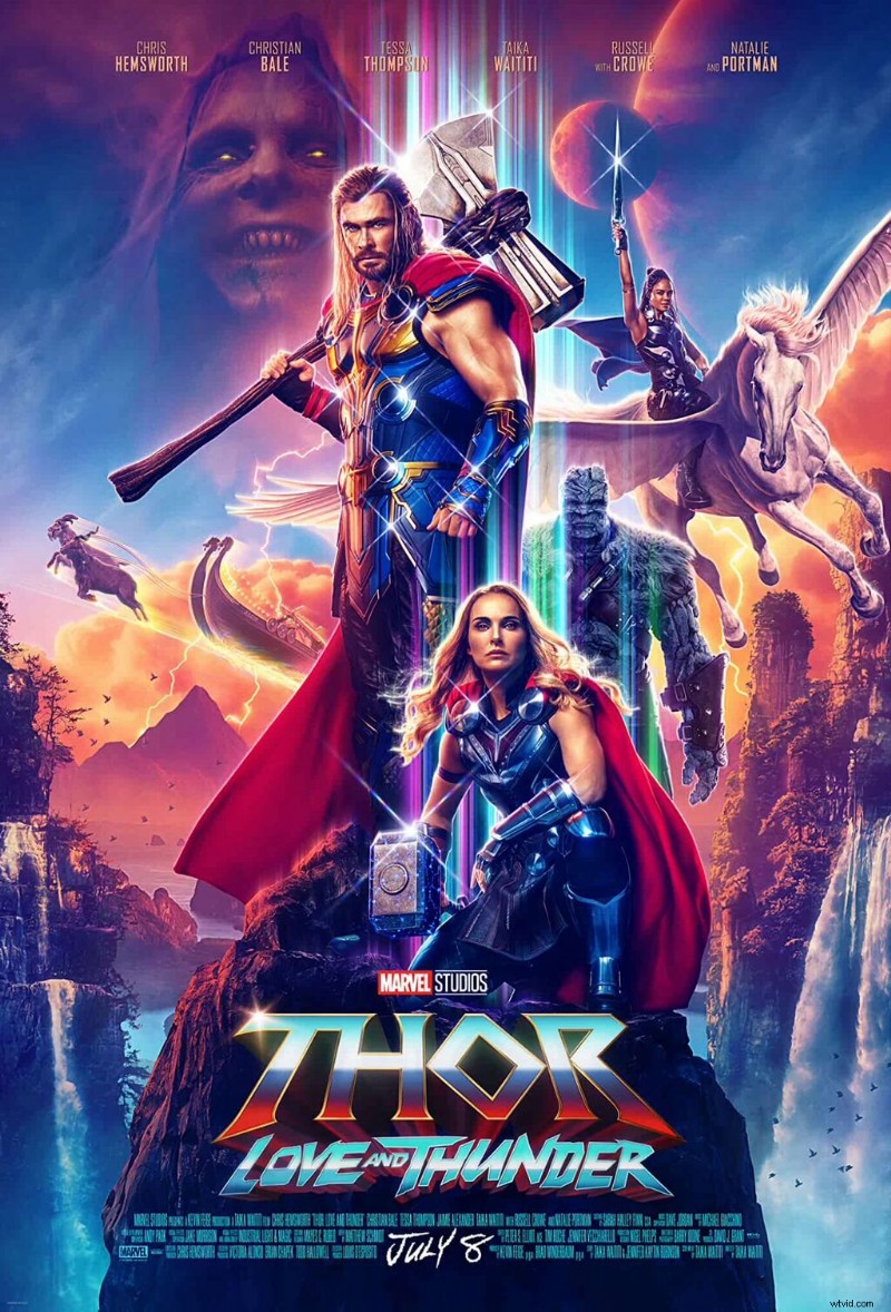
Only beginning in 2017 did the color palettes for these films entirely change. It’s a drastic departure. The use of neon colors, symmetry, and concentric circles give the Ragnarok poster a plethora of eye-catching details compared to their original styles.
Ragnarok (2017) had the highest ratings up until the new 2022 one, as well as being the highest grossing Thor film. The 2022 Thor: Love and Thunder just released a few days ago, so stay in touch for those ratings, as well.
To appreciate the drastic marketing pivot, here are the previous few posters.
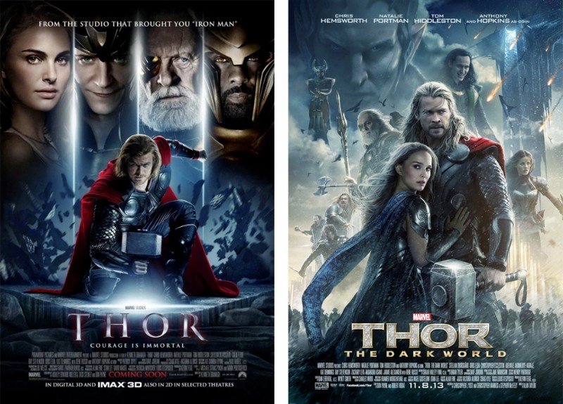
While these 2011 and 2013 Thor posters go hand-in-hand, the 2017 and 2022 images begin to stray. Whatever stylistic choices you make, be intentional about them.
Do you want your audience to expect the upcoming sequel, or stay invested by way of the unexpected?
For movies that come out several years apart, it makes sense to switch up the entire design concept to help folks remember the old, while investing in the new.
Black Panther Marvel Movie Posters: Then and Now
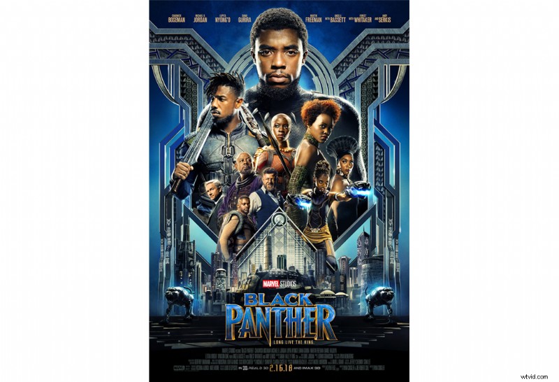
The 2018 Black Panther film takes place on Earth. The protagonist lives in the hidden world of Wakanda, which embraces an Afro-futuristic lifestyle. It’s much more in line with Marvel’s cosmic films in its treatment of color.
As for the poster, there’s a beautiful mix of African design and 1920s Art Deco. Blue and gold accent the grays and blacks—and, once again, symmetry amplifies the design, with the film’s cast highlighted in the center.
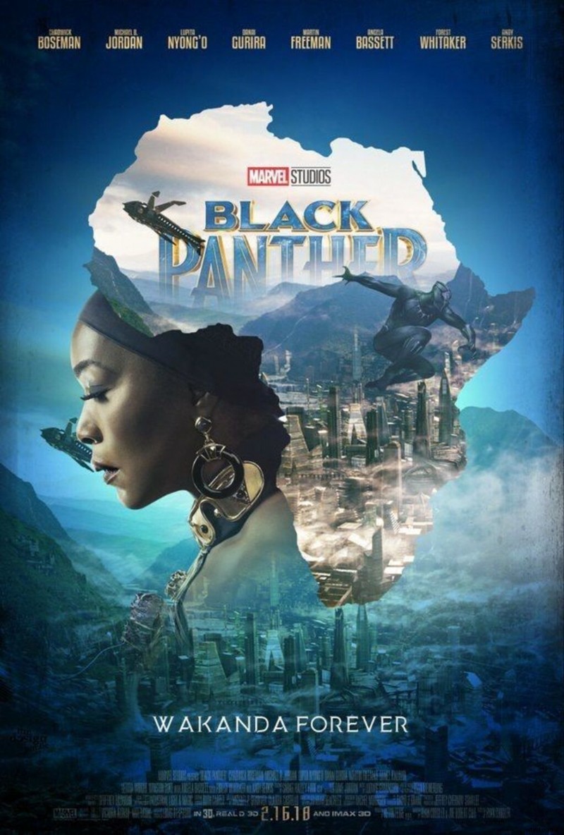
As for the newest poster, Marvel decided to highlight a particular character’s story. If one poster seems intentionally busy, simplify the other with softer shades and fewer focal points. This way, you have cohesive themes from then and now, while maintaining different concepts.
Ultimately, Marvel fans should be able to distinguish each movie by name, no matter how specific.
The Marvel Studios movie posters hearken back to the posters of old, complemented by a refreshing burst of color. This makes for a more appealing poster that draws in audiences and sells more tickets.
Would you rather see a movie with an engaging, thoughtfully designed poster, or see a film that uses a poster you’ve already see a hundred times before?
Avengers Marvel Movie Posters: Then and Now
Ah, Avengers, how we never tire of you. Similar to Thor, Avengers has seen many orbits around the sun. Let’s take a peek at its movie poster design evolution.
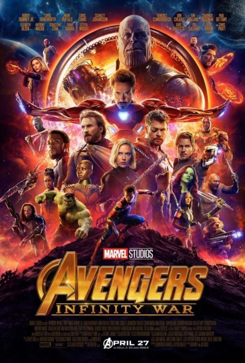
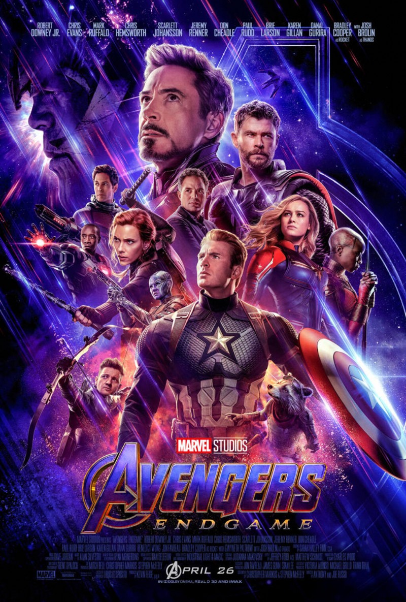
In the last two Avengers movies, these movie posters vary in color, but remain consistent in looks. You see the characters positioned in a similar way with different characters as focal points.
Maintaining consistency in this way still gives fans tons to look at, while differing enough. Want to time travel back further? Let’s take a look at the original Avengers movie posters.
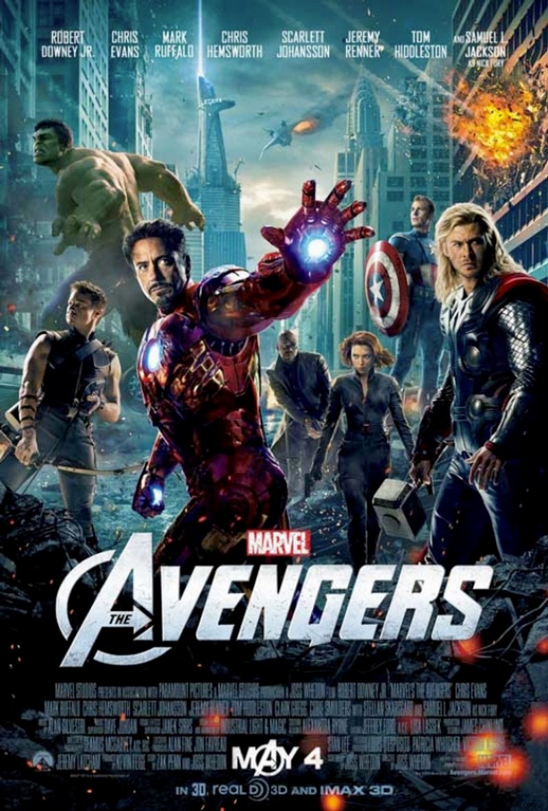
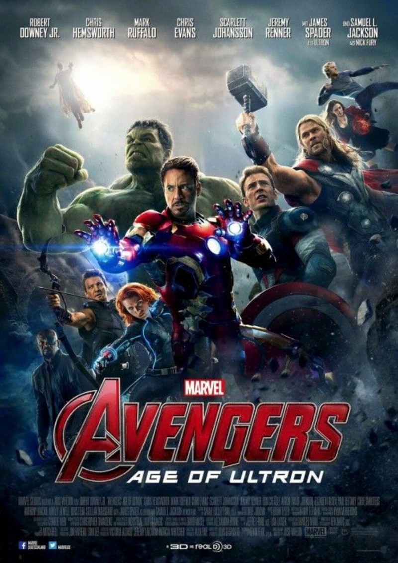
Similar to the evolution of Thor, The Avengers‘ first two movie posters prove to be far more cohesive than the last two. It poses a similar story in that seven years that passed since the second and third films came out.
For that reason, instead of seeing these movies as a quadrilogy (four in a row)—although you can—some may experience them as two different sets of sequels.
No matter your stylistic choices, you can stray as far as you wish, so long as you don’t confuse the audience. There’s nothing worse than a new release let-down, so don’t let that happen with your movie posters!
Now, speaking of, if you’re looking to make your own. . . .
Make Your Own Movie Poster in Create
Now, there are infinite more Marvel movies to compare and contrast, but you get the gist.
If you’re ready to make your own movie poster in Create, there are two main ways to go about it: pre-designed templates or start with a blank canvas.
No matter which you choose, your customization options remain the same. Let’s run through it.
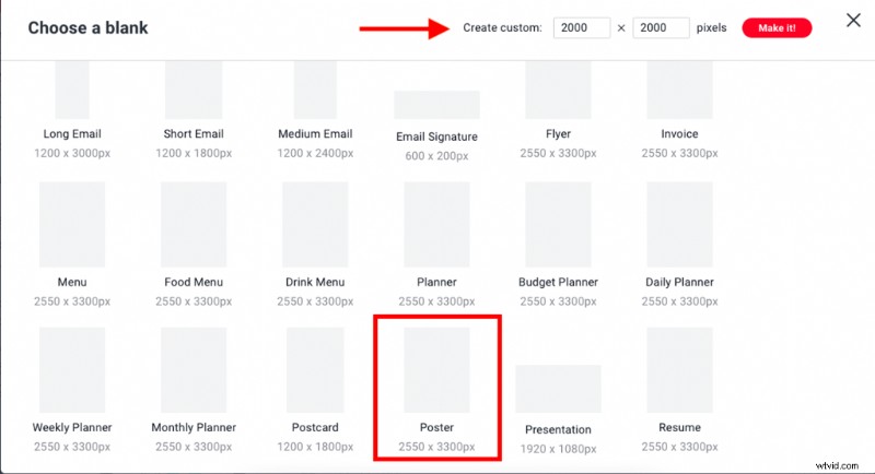
To select from a blank canvas, simply click File > Create new > Blank canvas. Scroll to Formats or CTRL + F to find the poster template. You’ll see the specs are auto-applied at 2550 x 3300 px.
If you need another size for some reason, select a different template that suits you. If not, you’ll have Resize canvas options in the tool, or Smart Resize (available to Pros).
If you’re starting with a pre-made template (even if it’s not movie-specific), simply click File > Create new > Templates. Type in “Poster” or scroll to find the category. Click to apply.
From here:
- Add background colors, images, textures, and effects.
- Infuse text and editable graphics to suit your niche.
- Adjust layers and elements for proper sizing and placement.
- Click the red Download button to save to desktop, or upload straight to social.
Your work will always be auto-saved in our cloud storage for you to return to anytime. If you want to make a copy of your work, simply click File > Edit a copy so as not to override your changes.
That’s it!
Create is intuitive, so if you want to upload personal images or select stock photos, click Images and follow the prompts from there.
Find movie-relevant graphics living in the Graphics tab. Peruse textures and film-like effects (like Film Stock, Film Grain, Insta Film, etc).
There’s even the Posterize effect to make any creation poster-worthy. Select one, layer multiple, that’s it!
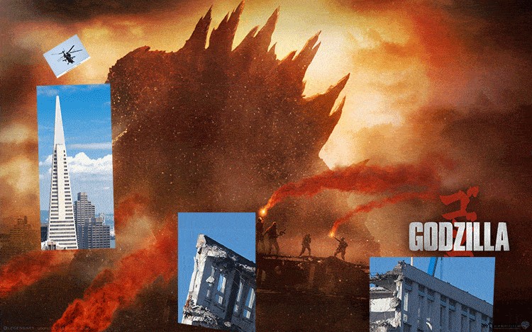
In a different article, we previously showed you how the designers at Ignition Creative created Godzilla movie posters using Shutterstock assets. It’s just proof of the many things you can do with our assets.
See the GIF below for a quick look behind the design.
We have also showed you how to recreate six popular movie posters and elements from films like La La Land, Moonlight, and Nocturnal Animals. You can read that step-by-step guide here about the design secrets behind movie posters.
For additional reference on movie poster design through the ages, check out this piece: “Comparing Modern Movie Posters and Their Retro Counterparts.”
With the right Shutterstock images, a free movie poster Photoshop template from PremiumBeat, or Create, you can create a movie poster in no time.
Here’s a quick glance at three movie posters that were made in just minutes with Shutterstock images and a free movie poster template.
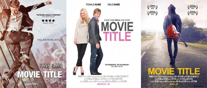
You can read more about using this free movie poster template on the PremiumBeat blog. You’ll learn how easy it is to customize the laurels, change text, add star ratings, and more.
While you can go about your poster any way you choose, we’re proud to encourage Create as the tool that helps you express your infinite creative potential, without needing a design background.
Hop into it and get started! Experiment, study posters for info, look back at this guide, whatever works. You got this!
Cover image via Marvel Studios / Walt Disney Studios.