With the advancement and affordability of video technology available to consumers now, the number of budding and aspiring film and video makers has seemingly raised exponentially. One of those advancements has most definitely been in regards to how the color correction process is handled. There's certainly no one path to success sort of idea with this either, but there are some things that you can do to help simplify and organize your process in order to work quicker and more efficiently.
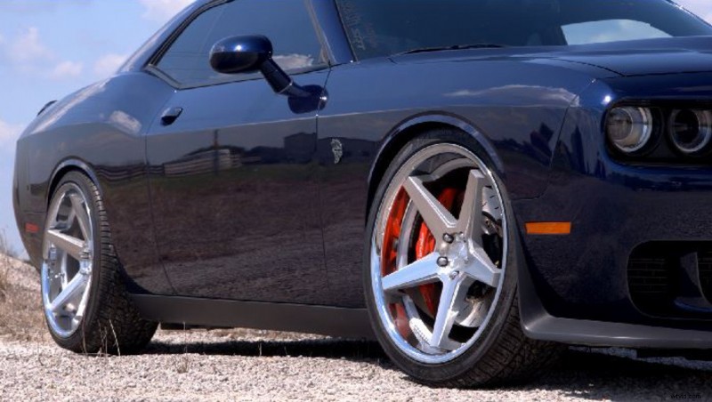
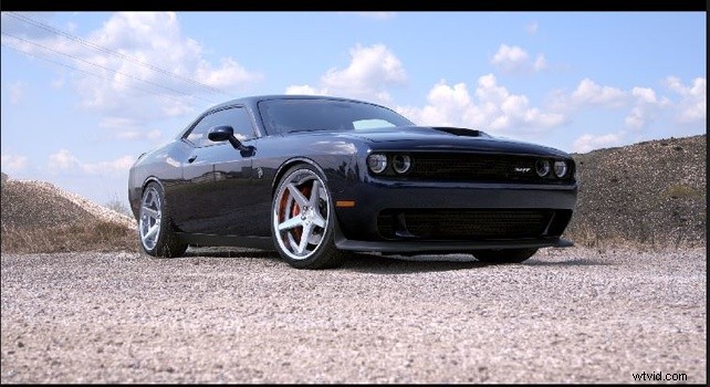
Now if you just shoot videos on your GoPro to put together a fun highlight reel from your weekend spear fishing or like to make videos of you terrorizing your cat around the house, you can disregard this article, as this is aimed more towards creatives that want to create the best possible image from their videos. Additionally, this is not a plea to use one software platform over another, only to share with you one method I've adopted into common use to improve my workflow on projects. In this example I'm going to show you the finished frame that is what was considered 'ideal' for the particular project I was working on. Beautiful Sunny day with some nice clouds for background elements and a Blue Dodge Charger Hellcat, nothing wrong there.
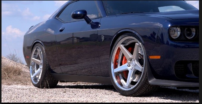 Pretty pleased with the image overall, however, Mother Nature as well all know sometimes can be a difficult element to work with as just minutes later a large cloud would cover the scene and cast everything in to a soft low contrast lighting situation which did not by any stretch match this shot. Which caused it to look like this:
 Is it a bad look? It's a little dull, but more importantly the difference between this shot and the previous is so stark it would risk throwing off the continuity of the project. So what do we do? Begin by comparing the original image to the image you wish to correct to. Pretty obvious right? Where do you see the biggest differences? Start big and work your way to smaller sections.

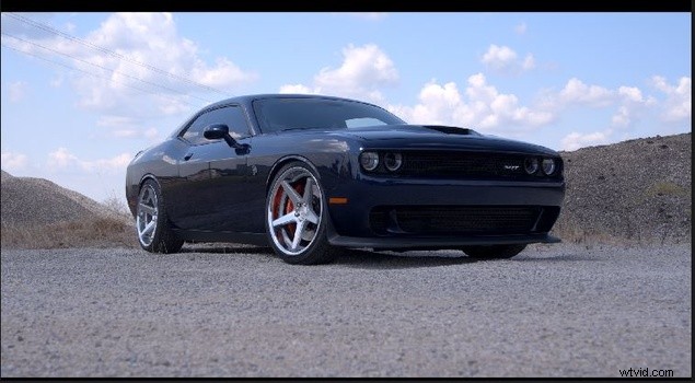
The bit that jumps out to me the most from the two scenes is the ground and the piles of gravel framing the car. (On a side note, after disturbing the top level of those stones, we discovered that the stones were in fact black but the upper level had been bleached due to their being exposed to the hot Texas sun day in and out.) So identifying that as the most offending difference, the ground and gravel piles became labeled as Zone 1. Following suite down the line, I identified that the Car was Zone 2, the wheels Zone 3, and the sky needed no adjustment really but could tentatively be Zone 4.
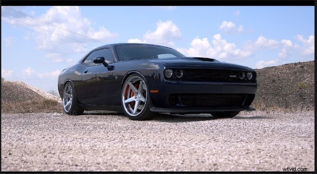

That definitely helps bring up the tone and contrast of the scene as a whole and helps it transition between the pinned scene and this, but it's still not quite right. On to the next zone, the Car, it definitely needs to be brightened and possibly some added saturation and contrast.

Pretty big difference if you ask me, and while it's not perfect for the brief moment it is on the screen it's a vast difference. You could definitely break it down farther and make it much more exact but it depends on your project and purpose. For those of you that may ask, I separated the zones for correction through the use of Power windows and Keying in Davinci Resolve from Black Magic Design. However, everything I've done can be done in any number of software programs out there on the market. The main take away from this should be simply to stay organized, and treat each scene like a puzzle, and it'll make your correction process simpler, quicker, and much more efficient.