In our previous article on the Develop Module in Adobe Lightroom, you learnt about the six tone controls on the basic panel. This article will discuss the colour temperature and ‘presence’ controls.
Rendering True Colours
A digital camera processes your photos in terms of separate red, green and blue images that are designed to mimic the spectral response of the colour receptor cells in your retina. Our eyes are much more complex than that, and do all this automatically. Digital cameras, however, need a little help.
A typical DSLR camera only sees light reflected from the scene. It makes assumptions about the brightness and colour of the illumination in order to work out the exposure.
The only way to know the correct exposure for sure, is to use a light meter. This calculates an appropriate shutter speed and aperture based on the light falling onto the scene rather than the light reflected from it.
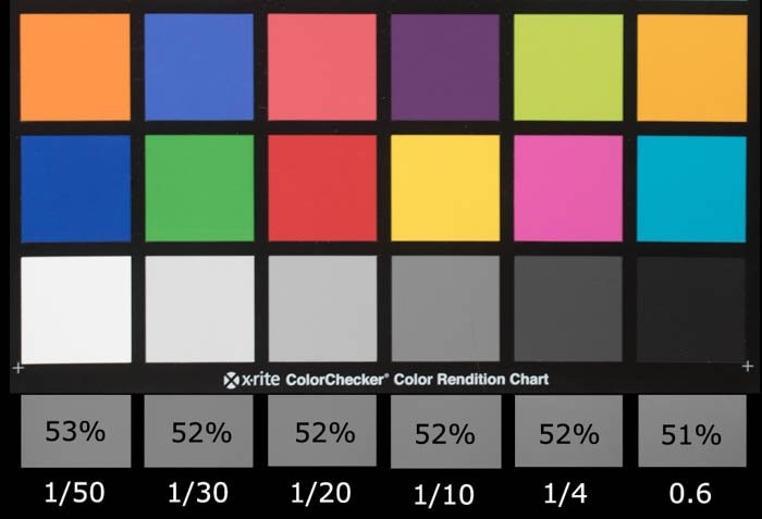
Without an external light meter, your camera will assume it should expose for 50% grey (not 18% as some people think). It will also make assumptions about the nature of the light illuminating the scene and adjust the colour balance accordingly. Here are the percentage grey values my camera assumed and the shutter speeds it calculated to get the mid-grey exposure.
Colour Temperature and White Balance
Different light sources vary not just in brightness but in the distribution of the colours they emit too. Just as you sometimes need to compensate an incorrect exposure value, you also need to compensate for different colour tints in the light so that a white object really does appear white. This adjustment is called ‘setting the white balance’.
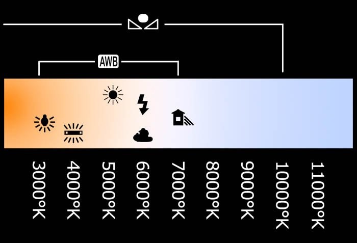
The term ‘colour temperature’ derives from the effect of heating up a ‘black body’ (one that reflects no light) until it begins to glow. As the temperature increase, the colour of the light will change from a dull red through orange and on to a blueish white. This is expressed in degrees Kelvin.
What are degrees Kelvin?
The Kelvin temperature scale provides a scientifically standard scale that isn’tbased on some arbitrary point such as the freezing point of water but rather on the coldest possible temperature.
The atoms in a material vibrate more as temperature increases and less as temperature decreases. When all vibration stops, the material cannot get any colder and has achieved ‘absolute zero’. Lord Kelvin calculated absolute zero to be -273.15 degrees centigrade and so the scale gets its name from him.
The temperature increments in the Kelvin scale are identical to the centigrade increments so a temperature change of ten degrees K is the same as a temperature change of ten degrees C.
If you shoot JPEG, your camera must be set to the colour temperature of the incident light to give the correct colour balance. Auto White Balance (AWB) usually works but if it fails, you can select a preset value or even dial-in the temperature in ºK.
If you shoot raw, it doesn’t matter what in-camera white balance you set. You will set this through the Temperature slider in the develop module when post-processing. It is, however, recorded in the raw file so you can select it later to give you a starting point for your adjustments.
Setting the White Balance in the Develop Module
Using the White Balance Selector
The most intuitive way to fix a white balance problem is to click on the eye-dropper icon next to the Temperature and Tint sliders to un-dock it. Then, you sample a known grey in the image that needs correcting.
In my example, yellowish incandescent lights illuminated the musician. These were too far off white for the camera’s auto white balance to work.
To fix this, simply click on the white balance selector (or hit the W keyboard shortcut) and move it over an area you know should be a neutral grey.
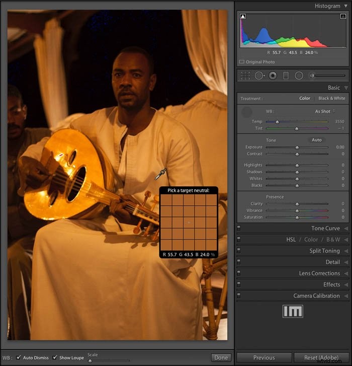
Click on the chosen point and Lightroom will adjust all the colours in the image to force the point’s red, green and blue values to create a neutral grey. If you ticked the ‘Auto Dismiss’ box, the white balance selector will re-dock. Otherwise it will stay active for you to try clicking different sample points until you find one that works well (you’ll then need to dock it manually).
Here’s the photo after I adjusted white balance and tones:
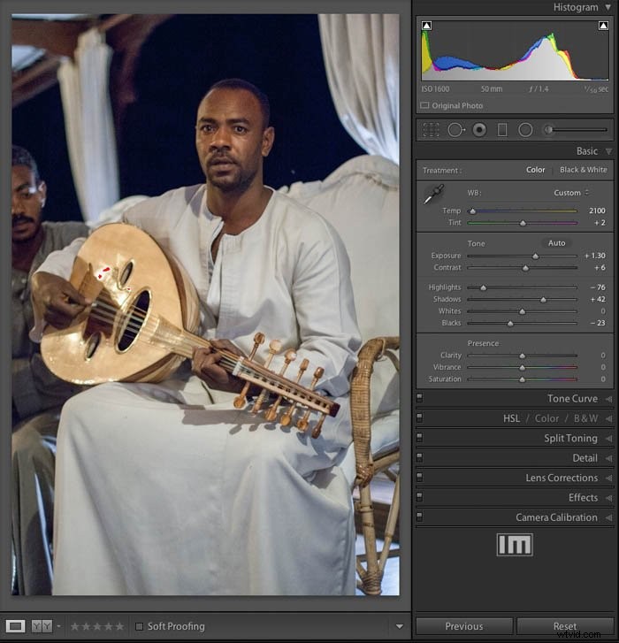
Note the temperature control has moved towards the blue (hotter colour temperature) but the temperature indicated has decreased. This is because the control is working to compensate for the error in the temperature rather than to set it.
Adjusting the temperature slider between yellow and blue can compesante for most light sources. Not all sources act like black body radiators though. The Tint slider allows you to adjust over a magenta-green range. You generally won’t need to adjust this control very much.
It’s there for situations where the light source has a strong spectral component in that range – fluorescent strip lights for example.
When You Can’t Find a Neutral Point
Here’s an example where there’s no obvious neutral point to sample:
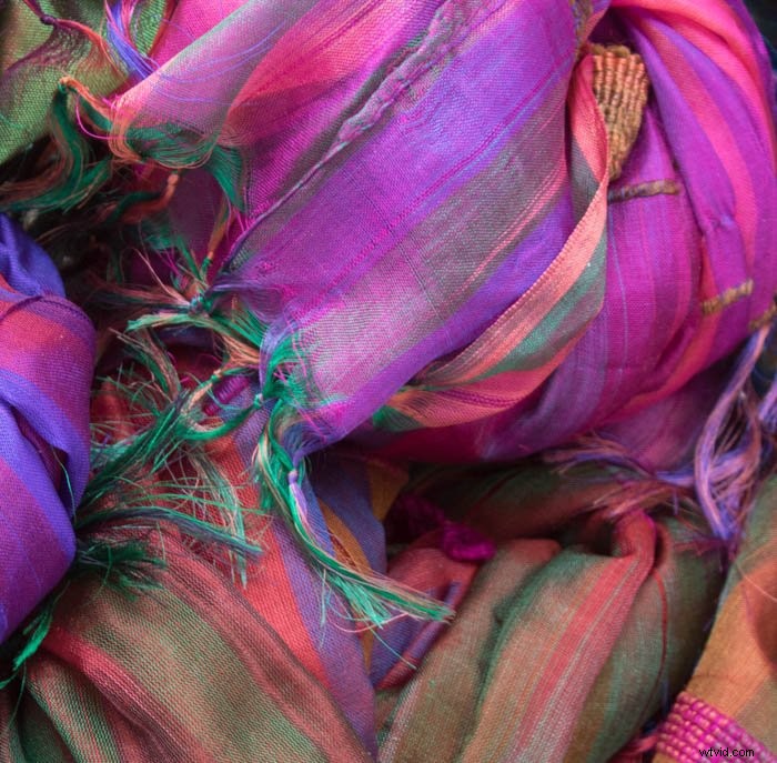
If you can’t find a known neutral point, the white balance selector is not much help. In such cases, it’s useful if you can remember under what conditions you took the photo. If you shot raw, all the white balance presets are still available to you in post processing.
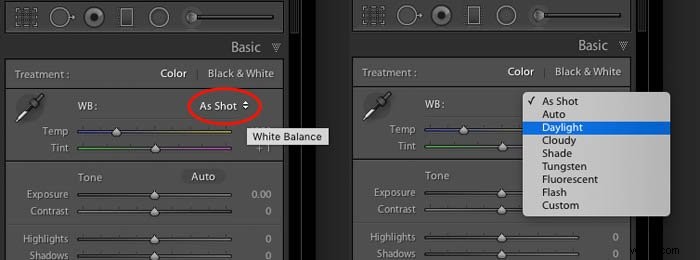
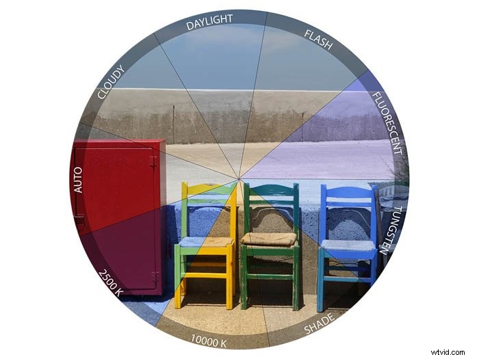
If you know this photo was taken in full sunlight, select Daylight and if it was cloudy, select Cloudy, etc. The colours will then be adjusted accordingly.
Presence Controls
Clarity
This control looks for details and edges in the photo and either accentuates them or smooths them out over a small distance. In the test image below, the clarity slider is at its maximum of +100.
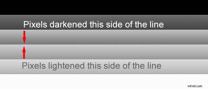
Where solid areas of grey meet, the clarity adjustment darkens the lighter shade and lightens the darker shade. It only does this along a narrow strip (typically around ten pixels) where they meet. This creates the illusion of a sharper transition between one shade and another.
Increasing the clarity value helps bring out texture and gives a ‘gritty’ feel. But it can also increase noise and produce halos around the edges if overdone.
Most DSLRs have a filter over their sensor meant to blur the image over a small area. This avoids the ‘Moire effect‘ when photographing fine details.
When shooting raw, it’s generally worth applying a small amount of clarity (eg +20) to the whole image to compensate for this slight softening.
Remember to zoom into your image at least 1:1 to properly see the effects of your adjustments. If you notice any odd halos or too much loss of detail in shadow areas, back the clarity off slightly.
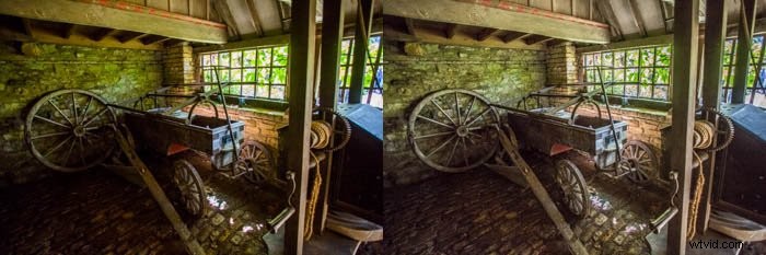
At the opposite extreme of -100, the transitions between tones are reduced. This can produce a soft, dreamy feel. If you overdo it though, it can result in flat images with loss of detail.

You can sometimes selectively apply reduced clarity to skin. If done sparingly, it can be quite effective. It’s better to perform skin retouching in Photoshop though, using techniques such as spatial frequency masking.
Saturation and Vibrance
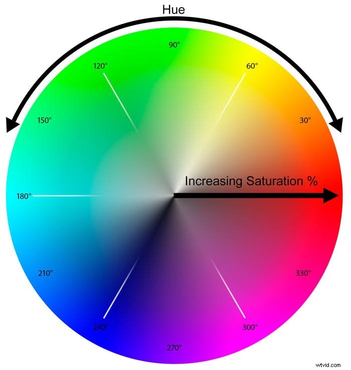
You can think of any colour as having two main components: hue (where on the spectrum the colour is located) and saturation (how ‘pure’ the colour is).
In the illustration below, the hue is expressed in degrees around a colour wheel and the saturation is shown along the radius.
Fully saturated colours appear around the rim and become less saturated as they approach the centre.
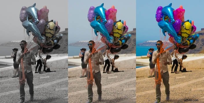
Saturation
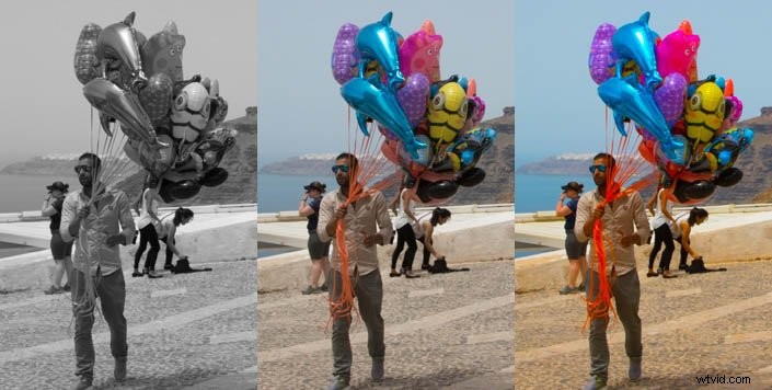
The saturation slider applies a percentage change to the saturation of every colour and has a range of plus or minus 100%. When set to its maximum of +100, the saturation of each colour doubles.
In terms of the colour wheel, every colour moves toward the rim. Any colour originally at 50% saturation or more is clipped to the rim of the wheel. Your picture can lose subtle variations in colours and caucasian skin turns orange.
When set to -100%, it removes all colour and your image will become black-and-white. Since you have no control over how the colours map to the grey shades, it’s not a good way to produce a black-and-white image.
Here are the effects of both saturation extremes:
Vibrance
Adobe came up with the term ‘Vibrance’ to describe a more intelligent way to adjust image saturation. Rather than just multiplying all the saturation values by the same amount like the saturation slider, vibrance is more selective.
In order to stop the saturation values from clipping, it applies a smaller adjustment to colours that are already close to the edge or centre of the colour wheel.
The effect is a more even-handed saturation adjustment. It can make a photo more vibrant while at the same time protecting skin tones from becoming unnatural.
Here is the same photo but this time adjusted using just the vibrance slider.
How you use these controls will of course depend on the photo. It’s often helpful to use the vibrance slider first to even out any extremes of saturation and then to make a small global adjustment to the saturation.
Remember that the sliders in the Basic panel affect the whole image at once. Usually, it’s best to make fairly conservative adjustments at the start of your editing workflow. You can target specific areas of the image later on using the brush, gradient or radial selection tools.